Introduction
This is a public manual for the HUB portal.
About this document
Purpose
The HUB portal is a user-friendly web application meticulously designed to seamlessly connect with your SolarGatewaySE. With this powerful connection, you gain unparalleled control over your energy plant, enabling effortless configuration and real-time monitoring.
This comprehensive document aims to be your ultimate guide, walking you through the myriad of possibilities and options available within the HUB portal. By the end of this guide, you’ll be empowered to make the most out of your renewable energy resources, optimizing their potential like never before.
Intended Audience
This document is intended for installing personnel, as well as end-users, using the HUB portal to visualize their energy systems.
Symbol conventions
The symbols that may be found in this document are defined as follows:
Used for general notes in this documentation
Used for expressing warnings in this documentation
Used for important notes in this documentation
Used for general tips in this documentation
Used for caution notes in this documentation
Change history
v1.22.0 - Support mode, yield improvements, and quarter-hourly data in widgets.
Dashboard Improvements:
- Added the ability to display yields in the plant chart widget.
- Introduced a quarter-hourly period for data in charts.
Devices Application Improvements:
- Added the ability to set a device to support mode.
v1.21.0 - License improvements, device settings enhancements & bug fixes
Devices application improvements:
- Improved license functionality to automatically activate on the linked device.
- Enhanced remote configuration to support passwords (for the Wi-Fi release).
- Improved UID:ADDR selection when creating API tokens.
Dashboard and CDN improvements:
- Corrected plant power calculations in plant widgets.
- Added an error message display within widgets when devices are unlinked from the namespace.
- Introduced a notification bar to display errors more clearly.
- Enhanced the data fetching mechanism for EPEX to improve stability.
v1.20.0 - Public API improvements & manual translations
- Improved HUB (enterprise) manuals with dutch translations
- Improved Public API documentation
- Improved Public API with new endpoints and better error logging
v1.19.1 - [HOTFIX] Widget improvements & bugfixes
Widget improved with better querys for faster render times.
Widget status changes.
Redesign of enterprise token input field
Bugfix in remote config to handle duplicate inputs
Bugfix for load time when adding pricing schemes
v1.19.0 - Dashboard templates
Dashboard improvements:
- Added the ability to select a template when creating dashboards.
Enterprise improvements:
- Added the ability to create dashboard templates which can be selected by linked namespaces.
- Added the templates overview plugin.
v1.18.0
Portal improvements: - Last namespace is now saved without need of opening apps - website URL will update correct when selecting namespace
Dashboard improvements:
- Last opened dashboard is now saved for each namespace.
- String addresses are now displayed correct within the widget device configuration.
Energy pricing improvements:
- Warning for active pricing schemes which are about to expire (1 week / 1 day before expiring).
- Added ability to unset device pricing scheme end date, allowing them to be active indefinitely.
Other improvements:
- Bugfix for maintenance banner
- Added missing translations
v1.17.0 - Notification and mail improvements
Portal improvements:
- Rework of notification and mail handling.
- Created five different types of notifications.
- Extended account settings with notification and mail preferences.
Devices improvements:
- Devices will now trigger an error when going offline.
- Devices will now trigger an warning when a linked pricing scheme is expired.
Other improvements:
- Bugfix for namespace limit.
- Namespaces can now receive custom notifications from their linked enterprise.
v1.16.0 - Dashboard en enterprise improvements
Enterprise improvements:
- Added combined view for all devices connected to the enterprise.
- Improved the theme form with more styling.
Dashboard improvements:
- Improved CSS based on themes within the dashboard application.
- Improved all charts to use graph colors based on selected theme.
- Extended plant (chart) widgets with EV charger power and battery power.
Other improvements & bugfixes:
- Bugfix for remote config sync mode, a cancel butten is also added.
- Namespace color is removed from the namespace settings.
- Invitation improvements.
- Empty namespace limit is added.
v1.15.0 - Release of the enterprise ability
- Added the possibility to create, join and manage enterprises.
v1.14.0 - Plantcontrol improvements (Energy pricing app)
- For, When and Between configuration blocks added to plantcontrol.
- CSS improvements in all applications.
v1.13.0 - Devices, Settings and Dashboard app improvements
Devices improvements:
- Improved device status cards and added device overview including licenses.
Settings improvements:
- Improved css in roles and users page.
- Added option to remove a namespace.
Dashboard improvements:
- Hidden information in several widgets when on certain screen-size or widget size.
- Option to set a preferred unit for values inside overview widgets.
- Added decimals and improved scaling to Gauge meter widget.
v1.12.0 - Dashboard improvements and Licenses
- The dashboard app is improved with a better grid.
- All widgets are updated in the new dashboard styling.
- Licences added to device settings.
New widgets added:
- EV Charger
Other improvements:
- Redirection from devices in combined views to the namespace.
- Configuration status improvements.
v1.11.0 - Max widgets and bugfixes
- Several bug fixes are solved
- Max widget amount added
v1.10.0 - Plant control and dashboard improvements
New widgets added:
- Inverter group
- Inverter groups
- Gauge meter
Improved widgets:
- Plant chart (added actual reduction)
Status indicators added to the following widgets:
- Inverter overview
- Meter overview
- Plant overview
- Last value
Other improvements:
- Widget status explanation
- Mobile app installation
v1.9.0 - Combined views and bugfixes
New application added:
- Combined views for devices
Other improvements:
- Bugfix: in remote config regarding entering an IP range using commas.
- Improvements in the widget lables for meter and inverter widgets.
Public API improvements:
- Extended plant control response with
epex_configuredstatus
v1.8.0 - Overview widgets expansion
New widgets added:
- Inverter overview
- Meter overview
Other improvements:
- Bugfix: in the date picker component
v1.7.0 - Widget expansion and api improvement.
New widgets added:
- Plant overview
- Plant chart
- Plant consumption pie chart
- Actual EPEX price
- EPEX chart
Widget improvements:
- Bar chart can support more than 4 data series now (up to 10 series).
- Widgets are categorized now.
- Line chart can now be configured as area chart.
- Bugfix: when adding more data series to the charts, existing graphs won’t change color anymore.
- Colors for negative values is added to the chart legenda.
General:
- New icons added.
Public API improvements:
- GZIP enabled for public API.
V1.6.0 - Enegry pricing application is added.
New features added:
- Pricing schemes
- Plant control
V1.5.0 - Remote config improvements and maintenance announcement banner.
New features added:
- New maintenance banner, can be shown on top of the HUB to announce scheduled maintenance.
Improvements:
- Improved remote config inputs with validation checks
- Added more information at some of the inputs
V1.4.1 - Several new features and improvements.
New features added:
- Remote device configuration
- Plant control
- Default namespace roles
Improvements:
- Ability to resend invite emails
- Remember me option at login formn
- Several small bugs fixed
- API improved with better status codes.
V1.4.0 - First release of the HUB manual 24/05/2023
the HUB in general
Introduction
The HUB is an online portal used to monitor, configure and control your SolarGatewaySE devices. Each SolarGatewaySE can be connected to a single namespace, where a namespace can hold multiple SolarGatewaySE devices. The namespace can be shared with multiple users, where each user has there own privileges.
Extra licenses are always bought for a single device, regardless of the number of devices in the namespace.
Maintenance
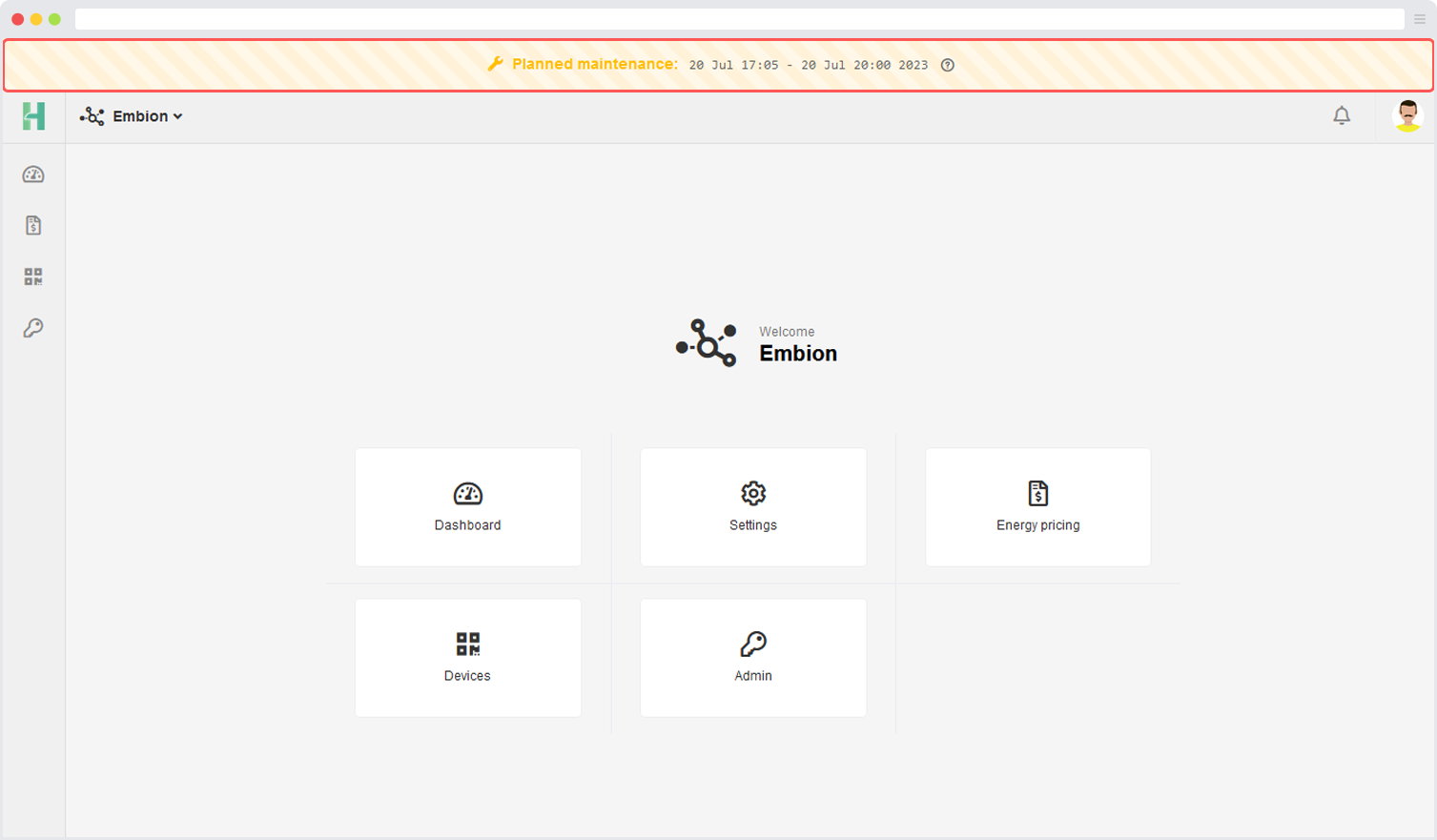
The best possible experience on the HUB Portal is aimed to be provided by Embion. To achieve this, periodic maintenance will be required to ensure the platform’s smooth functioning and reliability.
Scheduled maintenance will be conducted to implement updates, security enhancements, and necessary improvements. The maintenance banner will be prominently displayed days before the maintenance period to provide advance notice to users, serving as a notification that maintenance is scheduled to take place.
During these scheduled maintenance periods, the HUB may experience periods of being offline or running slower than usual. This is a normal part of the maintenance process, as certain features or services may need to be temporarily taken offline or optimized to ensure the smooth functioning and reliability of the platform.
The importance of keeping users informed about any temporary changes that may impact their portal experience is understood. Embion apologizes for any inconvenience caused during this time.
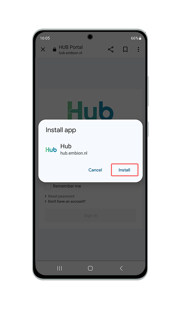
Mobile app installation
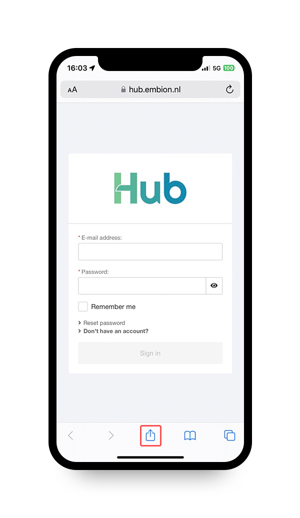
By following the instructions below, users can enjoy a cleaner, more immersive view of the HUB portal on mobile devices.
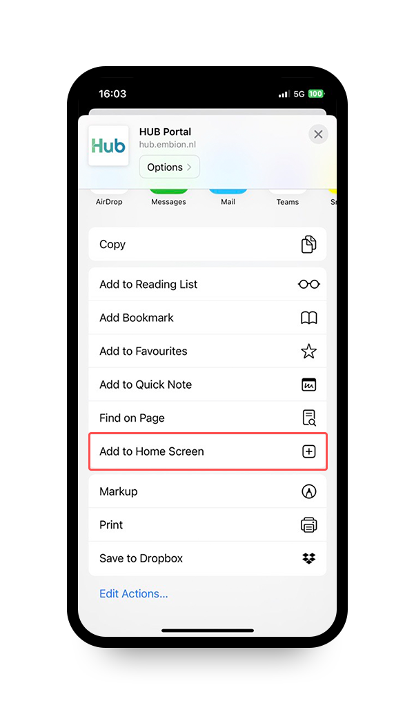
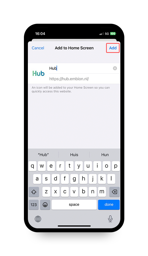
iOS (Safari)
To install the HUB web application, users should follow these steps:
- Browse to https://hub.embion.nl
- Click on the “Share” button
- Click on “Add to home screen”
- Click on “Add”
Android (Google Chrome)
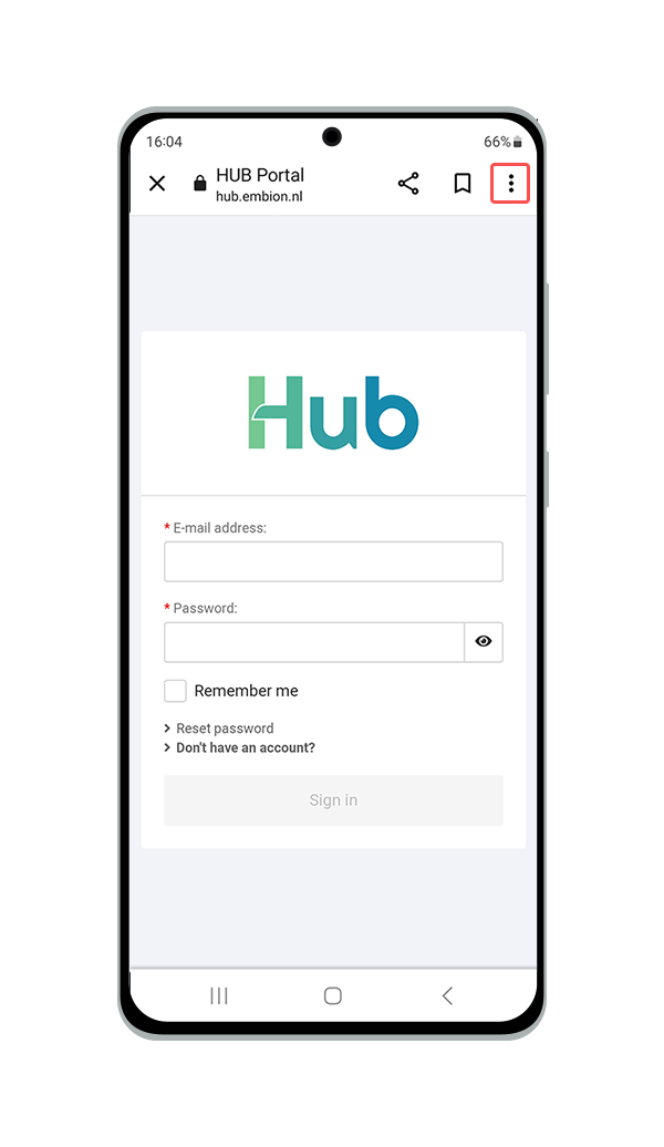
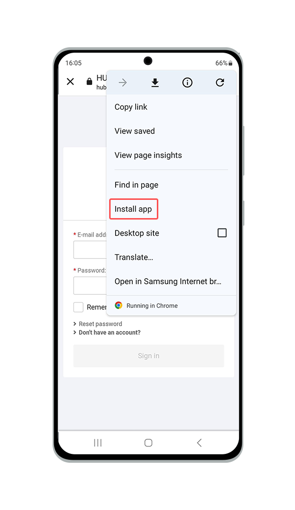
To install the HUB web application, users should follow these steps:
- Browse to https://hub.embion.nl
- Click on the “Options” button
- Click on “Install application”
- Click on “Add”
User account for the HUB
Every user making use of the HUB should create their own account. Per account your specific settings like country and language can be set. Each user account can create a new or join a excisting namespace.
Create account
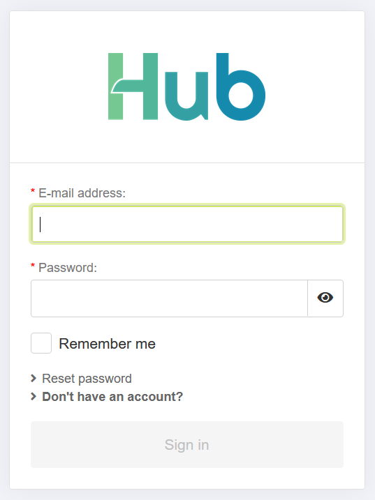
To create an account only a name, a valid email address and a safe password are required. To proceed with creating your account please visit https://hub.embion.nl and click on “Don’t have an account?”.
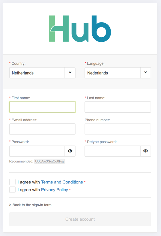
A registration form will open, allowing the user to supply all the required information for the new HUB account. A phone number is not required. If needed, two factor authentication can be enabled once the account has been activated.
Please carefuly read the terms and conditions and the privacy policy before agreeing with them.
When all fields are correctly filled, the “Create account” button becomes active and the account can be created.
An email with the account activation link is sent to the entered email adres. Please open the email and press the “activate account” button. This will guide the user to the HUB, logged in to the user’s account.
If the user is not added to a namespace yet the user has the option to create a new namespace.
Account recovering
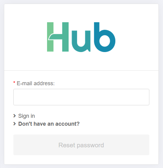
When a user has forgotten their password, they can recover it by pressing the “Reset password” button. This will open a pop-up requesting the user’s email address. Please provide the email address associated with the HUB.
If the entered email address is recognized, an email containing a reset password link will be sent to the provided email address. By clicking on the link, the user can enter a new password.
If you do not have access to the email address associated with your account, please contact your sales representative for assistance.
Account settings
Once a user has created and logged into a HUB account, they can change their account settings by pressing the profile image in the top right corner of the HUB portal and navigating to ‘My Account’. These settings include personal information, notifications, and security settings.
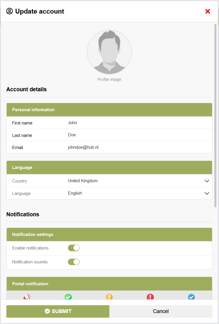
Personal information
In the Personal Information section of account settings, users can update the following details:
- First and Last Name
- Country
- Language - This language will be displayed on the HUB portal.
Notifications
In the Notification Settings section of account settings, users can control whether or not receive notifications. If users choose to enable notifications, they can fine-tune their preferences for different types of notifications. Additionally, when enabling sounds on the HUB, notifications and alert will play a sound on receive.
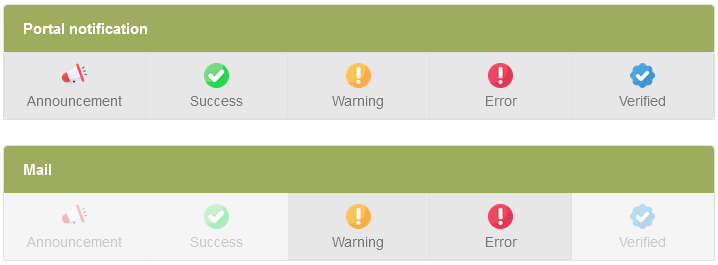
Users can define settings for the following five notification types:
- Announcement
- Success
- Warning
- Error
- Verified
For each type, users can choose to receive notifications through the portal and/or via email. This allows users to customize how they stay informed based on their preferences.
Notifications can be accessed by pressing the bell icon in the top right corner of the HUB portal.
When a notification is received, the bell icon will display the number of unread notifications. Each notification will show an icon indicating the type of notification.
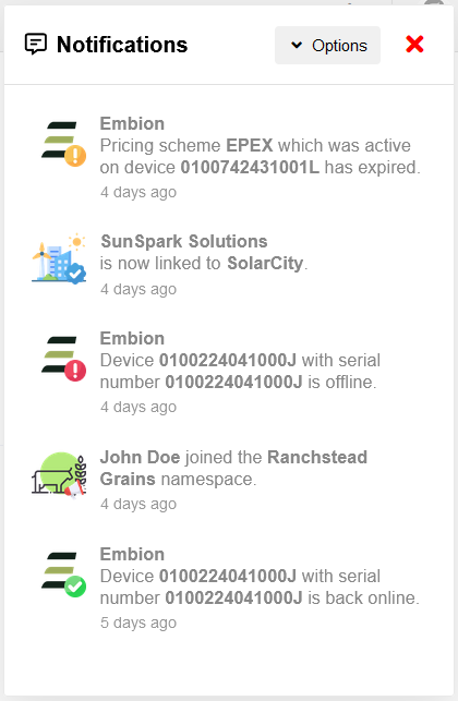
The notification types are defined as:
Announcement
- Namespace invite
- An user joined namespace
- An user left namespace
- An user creates a join request for namespace
- An enterprise users unlinks namespace from enterprise
- General portal announcements
Success
- You joined namespace successfully
- You left namespace successfully
- You created an enterprise join request successfully
- Device went (back) online
Warning
- Pricing scheme expire soon (1 week and 1 day before expiring)
- Pricing scheme expired
Error
- Device went offline
Verified
- Namespace successfully propmoted to enterprise
- Namespace successfully linked to enterprise
2FA Security
Two-factor authentication adds an extra layer of security to users’ accounts by requiring not only their password but also a second form of verification. To set up 2FA for their HUB account, users should follow these steps:
Download Authenticator App: Users need to download either the Microsoft Authenticator app or the Google Authenticator app on their mobile device. These apps generate unique verification codes that users will use along with their password when logging in.
Scan QR Code: Once users have installed the authenticator app, they should navigate to the Security section of their HUB account settings. Here, they will find a QR code displayed. Users should use the authenticator app to scan this QR code.
Verify Code: After scanning the QR code, the authenticator app will generate a unique verification code. Users should enter this code into the appropriate field within the HUB portal to complete the setup process.
Once two-factor authentication is enabled, users will be prompted to enter a verification code from their authenticator app each time they log in, providing an additional layer of security to their HUB account.
Namespaces
A namespace is basicly a group of users, where each user has there own permissions based on their role inside the namespace. Multiple SolarGatewaySE devices can be connected to a namespace and the device data can be monitored on dashboards which can be created or read by the users with correct permissions. This way a namespace can be created and managed by a company who invites their customers to their namespace and provide roles based on their preferences.
When a user who does not have access to any namespace logs in, they will be prompted to create a new namespace. Additionally, a namespace can be created by clicking on the “Create Namespace” button located in the top right corner of the user menu.
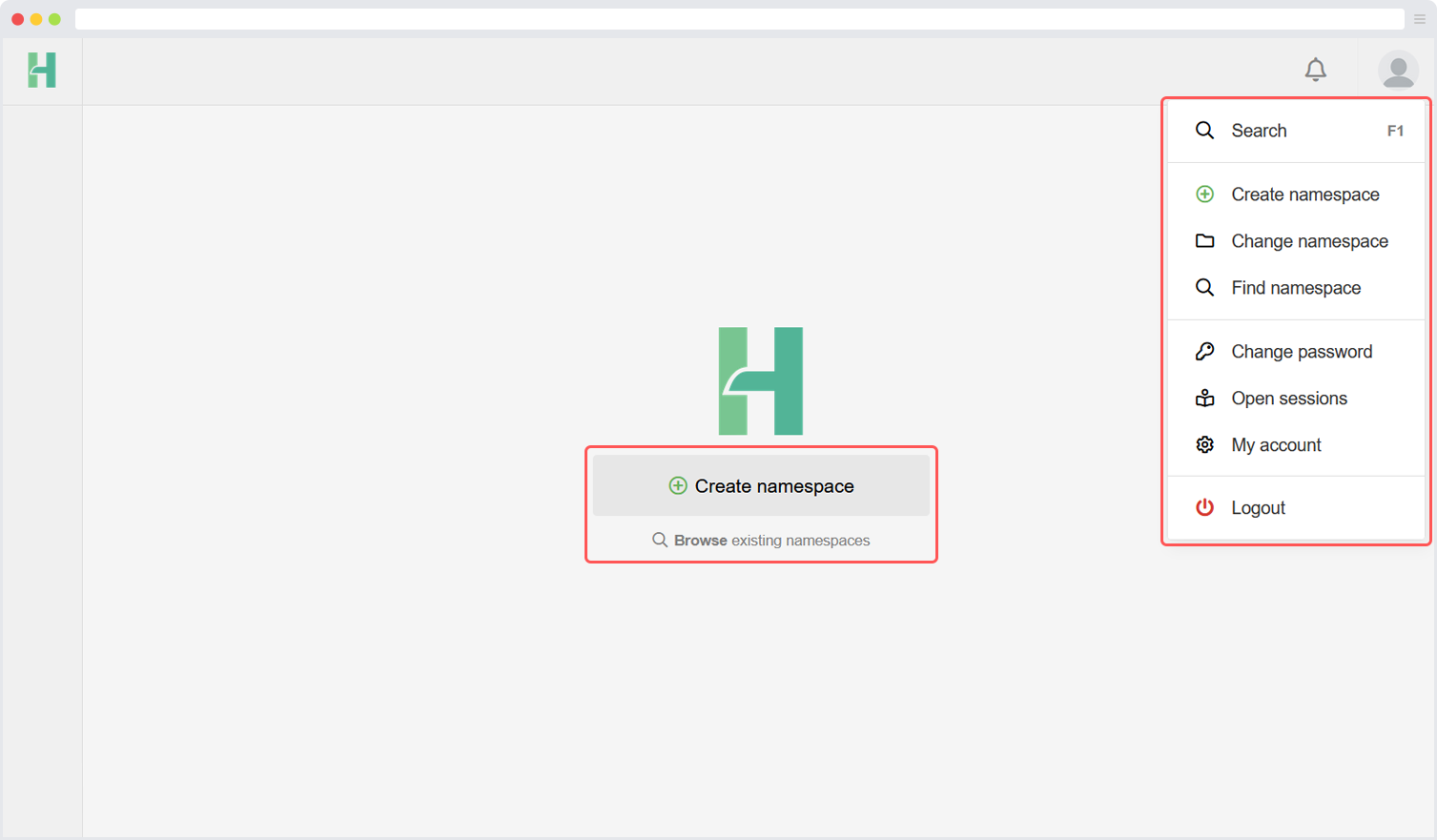
Create a namespace
When a user without access to any namespace is logged in, it will be prompted to create a new namespace. Also, a namespace can be created by clicking on the “create namespace” button in the top right corner user menu.
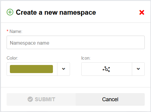
During the process of creating a namespace, you have the freedom to choose a name for the namespace. It is advised to select a distinguishable name that helps to differentiate it from other namespaces. You are free to use any name of your choice.
Additionally, you have the option to select a symbol and color to enhance the visibility and divisibility of the namespace. This allows you to customize the appearance of the namespace according to your preferences.
If required, the namespace can be made public. By checking the “public namespace” checkbox the namespace becomes visible for all HUB users. All HUB users can see the namespace and request access to the namespace. The namespace administrator should still accept the requests.
When the namespace is created the current users becomes namespace administrator of the namespace. The administrator can invite, accept and create new administrators within the namespace. Each namespace should have at least one administrator.
Join a namespace
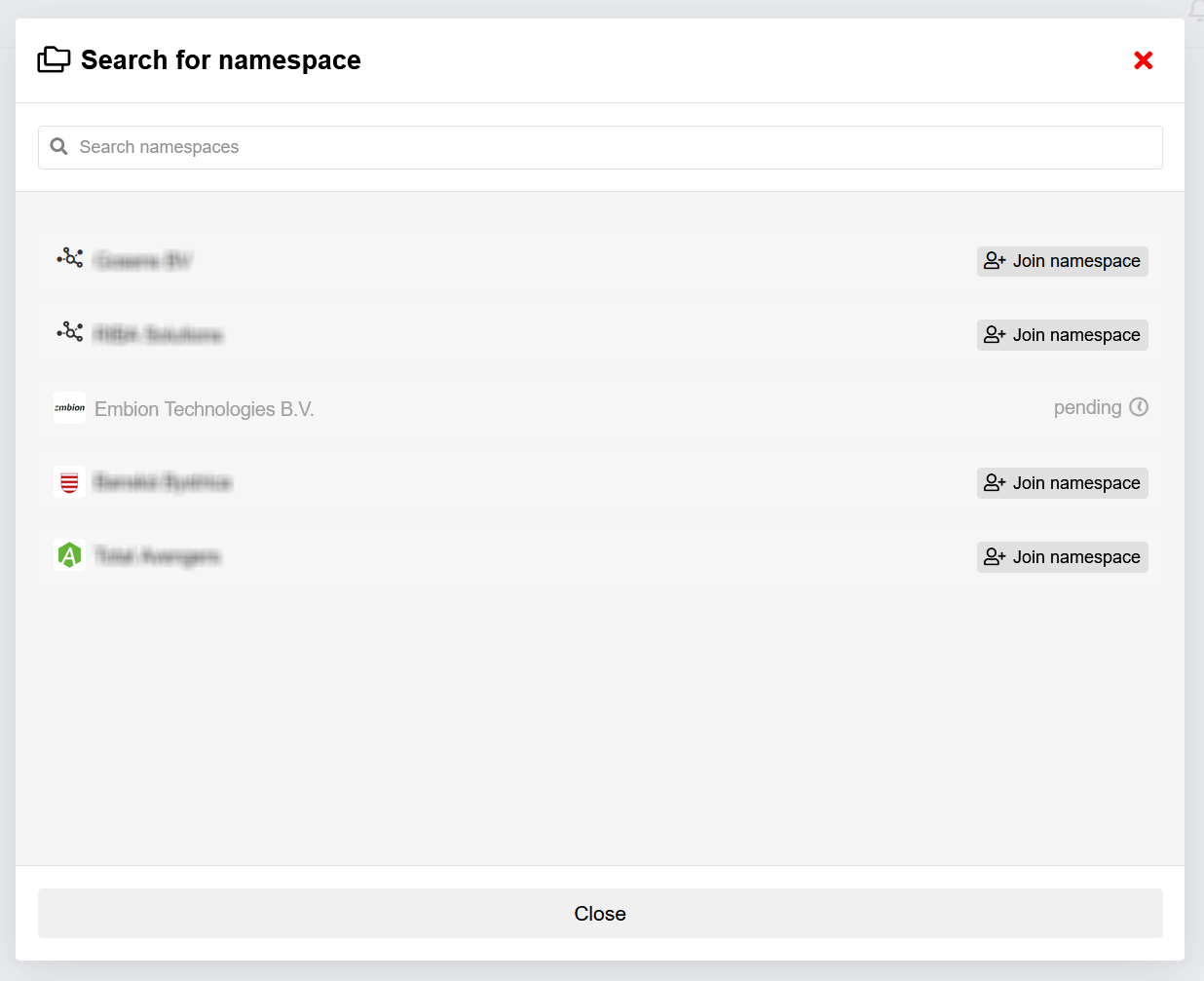
When a namespace is public, it is possible to join. An administrator of the joined namespace has to approve your request. When a namespace isn’t public, another user with the correct permissions has to invite people to let them join.
Change namespace
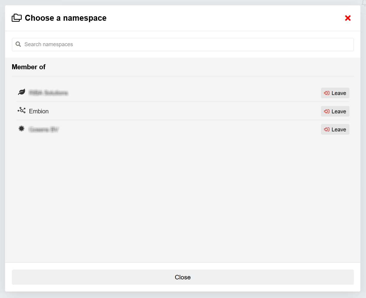
When a user wants to switch between namespaces they are already a member of, the following steps should be taken:
- Locate the namespace selection button situated in the top left corner of the interface.
- Press the namespace selection button to initiate a pop-up window.
- Within the pop-up window, all the namespaces accessible to you will be displayed.
- Identify the desired namespace from the list and click on it.
By selecting the namespace, you will be instantly switched to the chosen namespace, and the interface will be updated accordingly. By following these steps, users can seamlessly switch between the namespaces they are already members of, granting them access to the specific content and features associated with each respective namespace.
Namespace settings
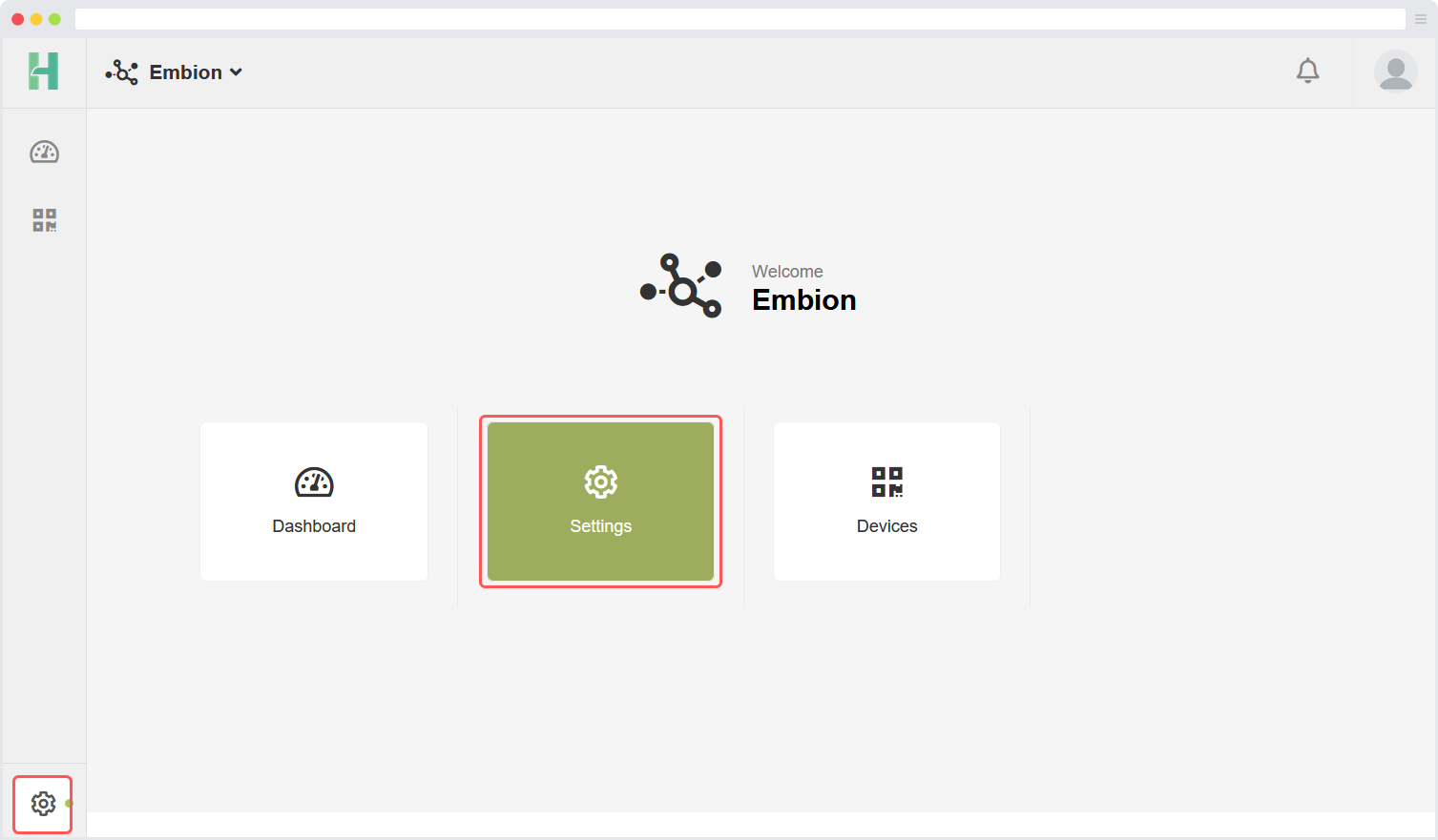
Namespace settings can be reached by clicking the settings symbol at the bottom left corner or the buttons on the homepage. In this application users can manage their namespace based on their permissions. The namespace settings application offers the following settings:
Users: Users can invite or approve users to their namespace and assign roles to them.
Roles: User roles can be managed here, different roles can be made with their own permissions.
Devices: All devices that are connected to the namespace are listed in a table view for easier access.
Settings: Namespace settings like the name and image can be changed here. It is also possible to create an enterprise join request here.
Namespace users
The Users page shows all active and pending users within the namespace. By pressing on the username the user roles can be applied. By pressing the settings icon the user can be made admin or can be removed.
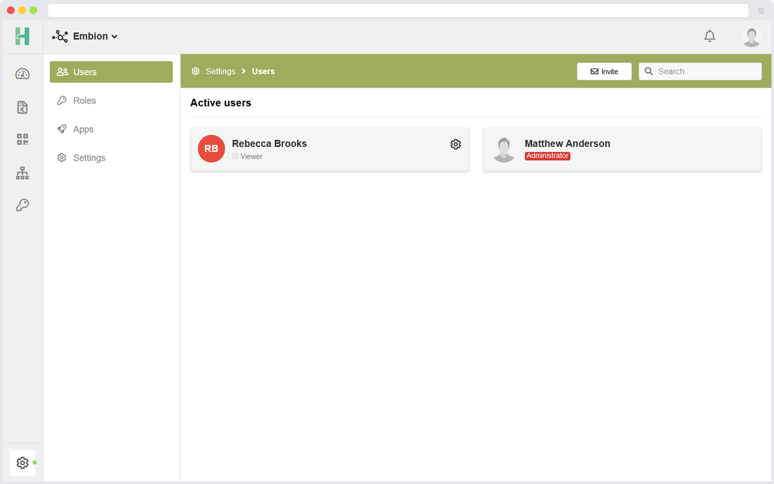
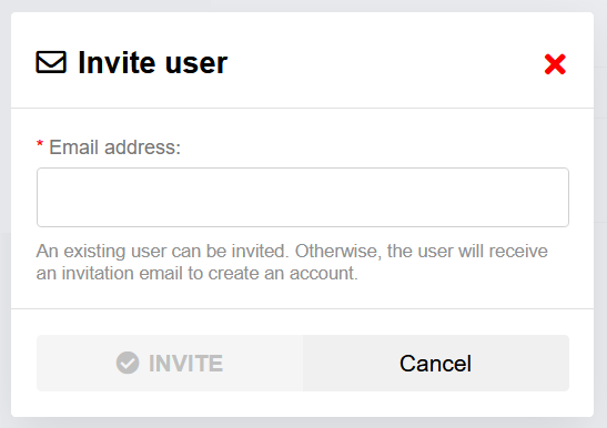
Invite user
New users can be invited by pressing “Invite” in the top right corner. A pop-up will appear asking the users email address.
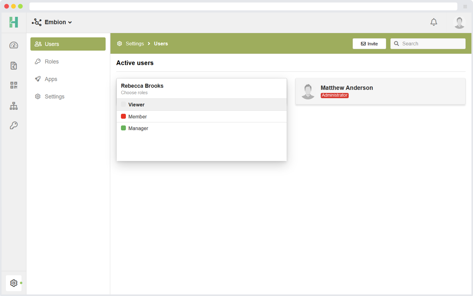
Assign user role
By pressing on active or pending users, one or more roles can be applied to the selected user.
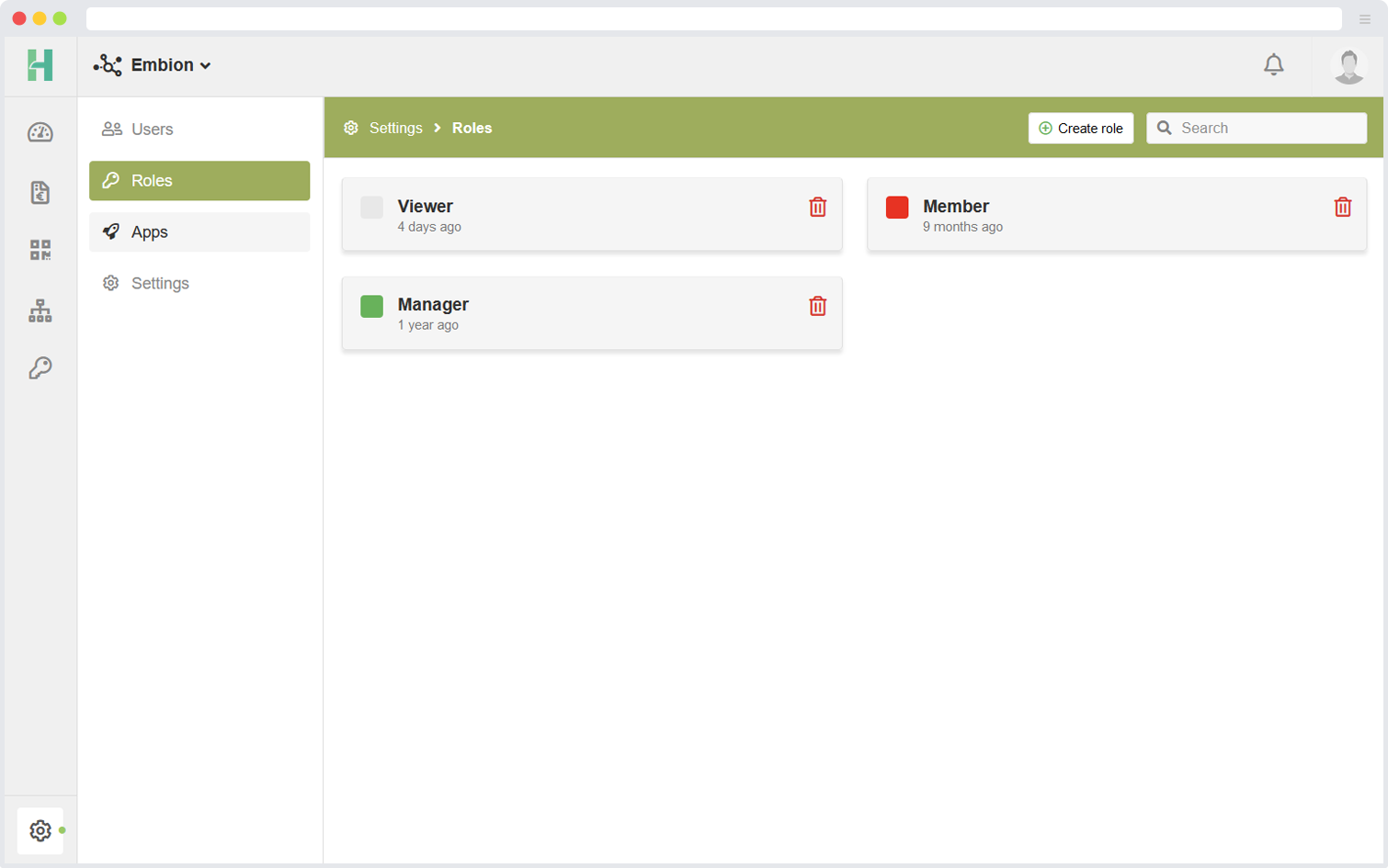
Namespace roles
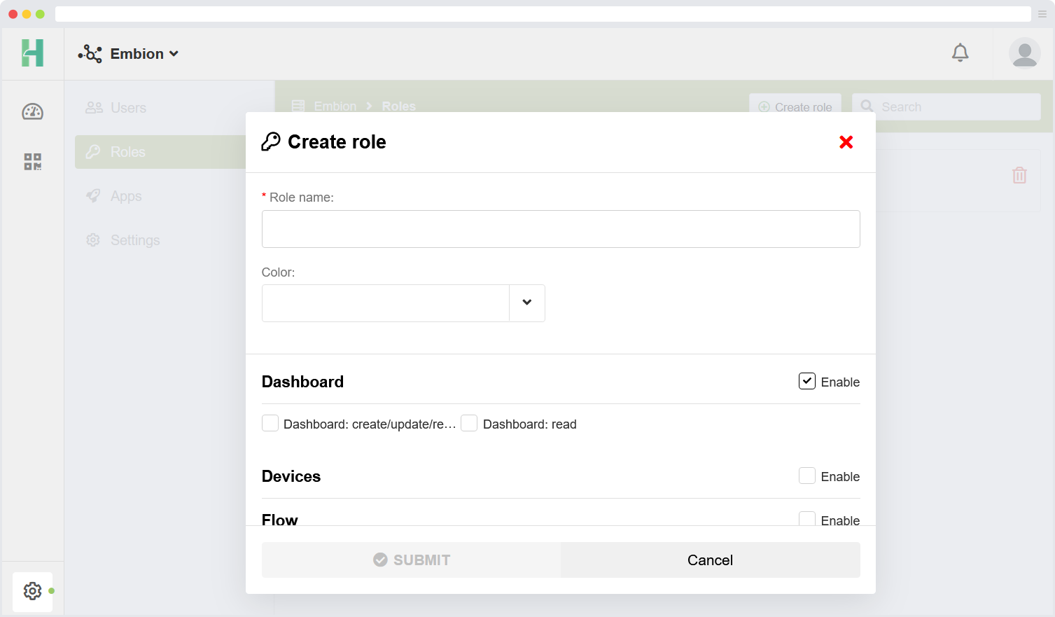
In each namespace, custom roles can be assigned to users. By default, certain roles are available, but they can be modified as per the requirements. If needed, new custom roles can be created.
Make new roles
New custom roles can be created by following these steps:
- Click on the “Create role” button located in the top right corner of the interface.
- This action will initiate the role creation process.
- Provide a name and define the specific permissions and access levels associated with the new role.
- Save the created role to add it to the list of available roles within the namespace.
By utilizing the “Create role” functionality, you can tailor the roles within the namespace to suit your specific needs. This allows for fine-grained control over user permissions and ensures that each user has the appropriate access and privileges based on their assigned role.
Settings
Namespace settings like name and image can be set here. By pressing the image a new avatar for the namespace can be uploaded, the recommended size of the avatar is 150x150 pixels.
Enterprise options can also be found within the namespace settings.
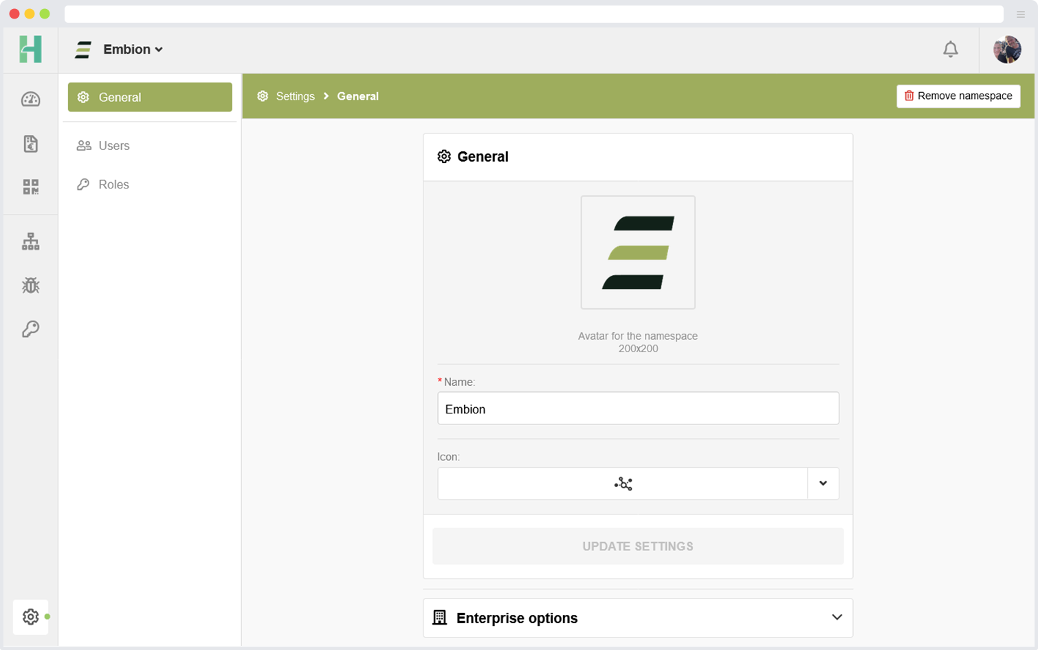
Remove namespace
The namespace can be removed only by administrators within the namespace. It can be done by clicking the “Remove namespace” button in the right corner of the namespace settings.
All devices should be removed from the namespace before it’s possible to remove the namespace.
Enterprise
Enterprise options can be found within the namespace settings.

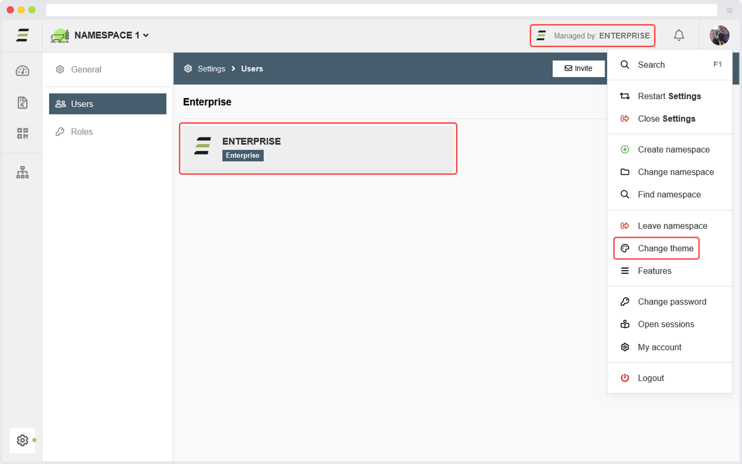
Within the enterprise options a join request to an enterprise can be made. Once accepted by the enterprise, the enterprise gains access to manage settings, devices and users (all with administrator privileges).
Once the namespace has been accepted by the enterprise, it will be displayed in the header and namespace users overview of the namespace which it is managed by the enterprise. Users within this namespace have the ability to switch between themes specially created by their managing enterprise. The image below displays a namespace managed by an enterprise.
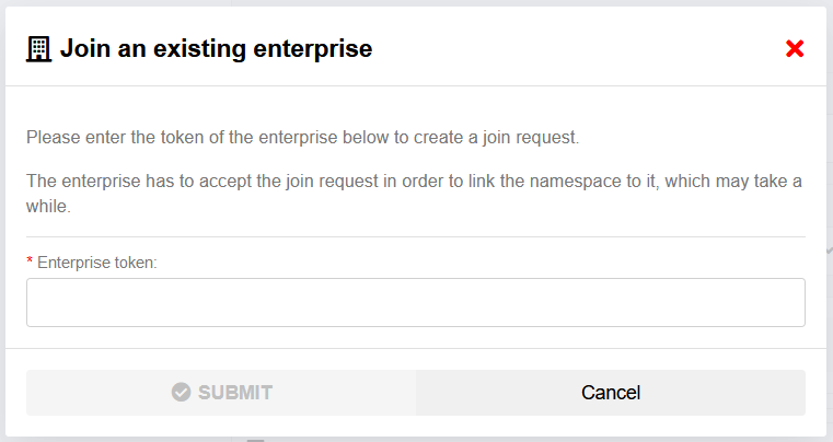
Join request
An administrator within the namespace has the ability to initiate a join request for an enterprise by inputting the enterprise token provided by the enterprise.
Unlink enterprise

To unlink namespaces from an enterprise it is required to have at least one active administartor within the namespace. When unlinking the enterprise, nothing within the current namespace will be lost and the users within will see the default embion theme again. To prevent unintended unlinking of the enterprise a user is requested to type the enterprise name, when the name is correctly entered the enterprise will be unlinked.
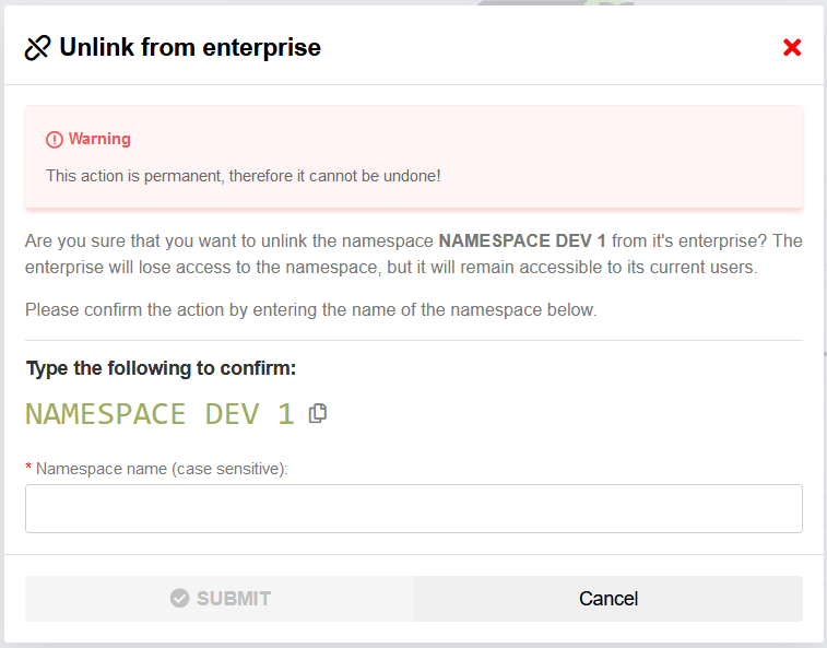
Unlinking a namespace from its enterprise requires at least one active administrator within the namespace.
Devices
The devices application can be accessed by selecting the devices icon located in the left side menu or by clicking the button on the homepage.
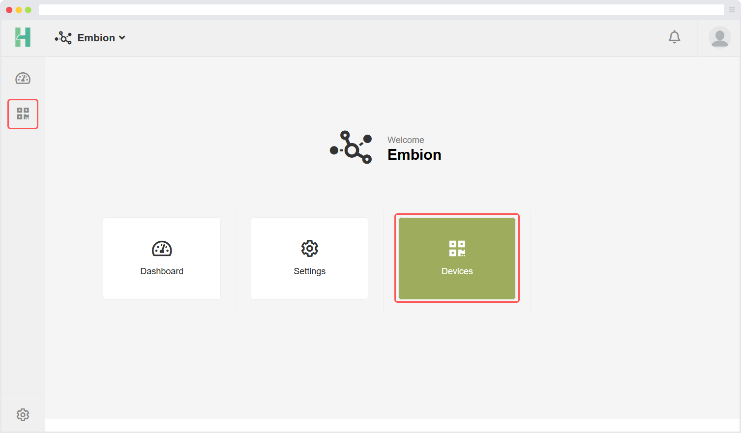
On this page, users can register devices within their namespace. The devices application offers several features that allow users to remotely access their devices:
Device Status: This feature displays the current status of devices within the namespace, providing users with real-time information.
Access Token: Users can obtain an access token to make requests and retrieve data from the API, ensuring secure and authenticated access.
Device Settings: This functionality allows users to remotely modify settings on their devices and apply the changes accordingly.
Support Mode: By enabling support mode, users can grant access to manufacturer support employees. This enables the support team to reach and assist with the device as needed.
These features provide users with convenient and efficient ways to manage and interact with their devices from a remote location.
Register new device
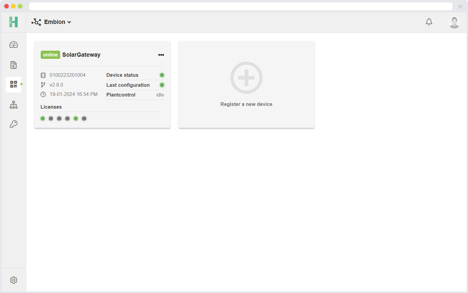
When registering a new device, users are required to input the serial number and pin code of the device to be registered. Both of these can be found on the label located at the right side of the device or read out via the device menu. Users should refer to the label or device menu in order to retrieve the necessary information for a successful registration.
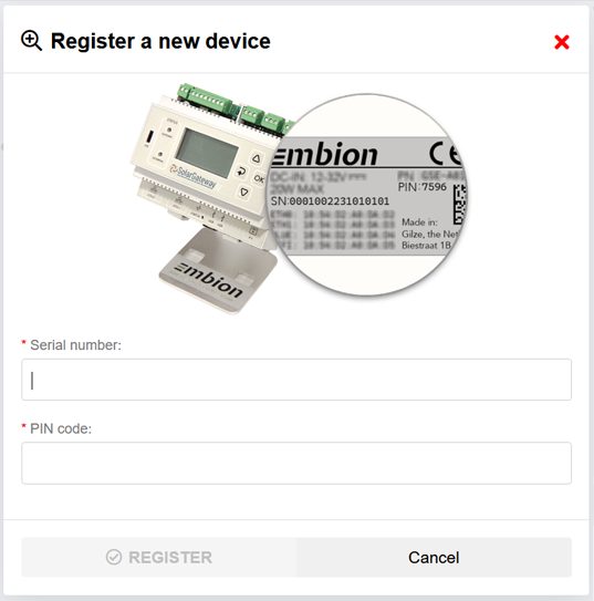
Device Status
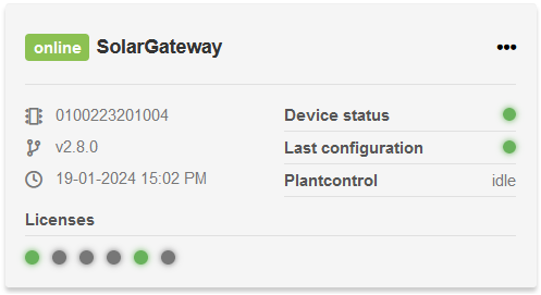
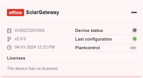
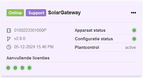
The device status feature allows users to quickly view an overview of all their devices and their respective statuses. A device can have one of the following statuses:
Online: The device is powered on and reachable over the internet.
Offline: The device is powered off and/or not reachable over the internet.
Support Mode: The device is online, reachable over the internet, and support mode is enabled by the user. This allows the manufacturer support team to remotely access the device to provide support.
Device overview
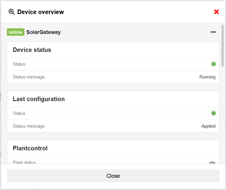
To get more information about a device, it is possible to open a device overview form by selecting the device. It will show more detailed information about:
- Device status
- Last configuration
- Plant control
- Device information
- Contact information
- Licenses
Device options
There are several device options accessible by opening the option menu located at the right corner of a listed device.
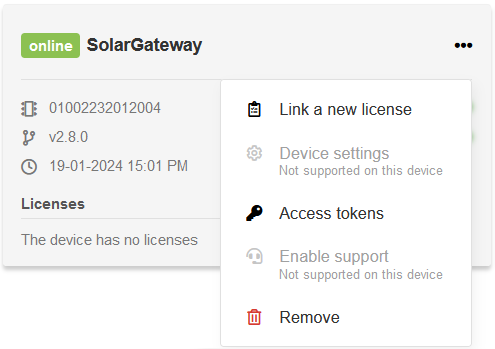
The following options are available:
Link a new license: Users can link new licenses to their devices. Please contact sales for the available licenses.
Device settings: Users can modify device settings and apply them remotely. This allows for convenient management of the device’s configuration.
Enable support: Users can enable support mode for their devices.
Access tokens: Users have the ability to obtain an access token. This token enables them to make requests and retrieve data from the public API securely and with authentication.
Remove: This option removes the device from the list of devices within the current namespace. It is important to note that deleted devices can be added again at a later time if needed (serial number and pin code are required).
These options provide users with flexibility and control over the management of their devices registered within the namespace.
Licenses
Device licenses
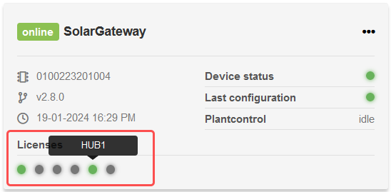
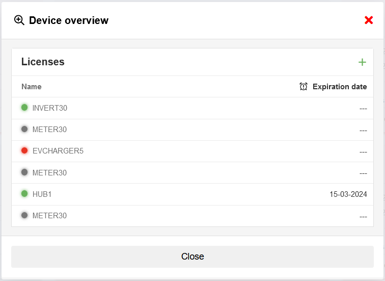
Licenses are displayed inside the device information with their expiration date. The status LED’s indicates the status of a license, possible statuses are:
Activated (green): The license is active on the device.
Expired (red): The license is expired.
Not activated (grey): The license is assigned to the device, but not activated yet.
Add license
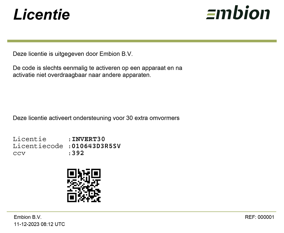
To add a license to a device, users needs to fill in the following details:
License code
CCV code
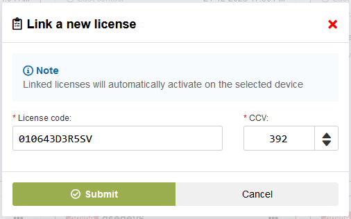
Example license
Access tokens
Multiple access tokens can be created for each device, granting access to the public API. These tokens enable interaction with the public API and remotely read or control the plant connected to the device. By default, a total of 250 API calls per day are permitted for each device, and these calls can be distributed among the multiple tokens associated with the device.
When generating an access token, users have the option to specify a maximum number of requests allowed for that particular token. This feature allows you to set a limit on the number of API requests that can be made using the token. If you prefer the token to have no request limit (always limited to the maximum of 250 calls per device), you can leave the maximum requests value as 0.
Managing access tokens and their corresponding request limits gives you the flexibility to control API usage and optimize resource allocation for each device effectively.
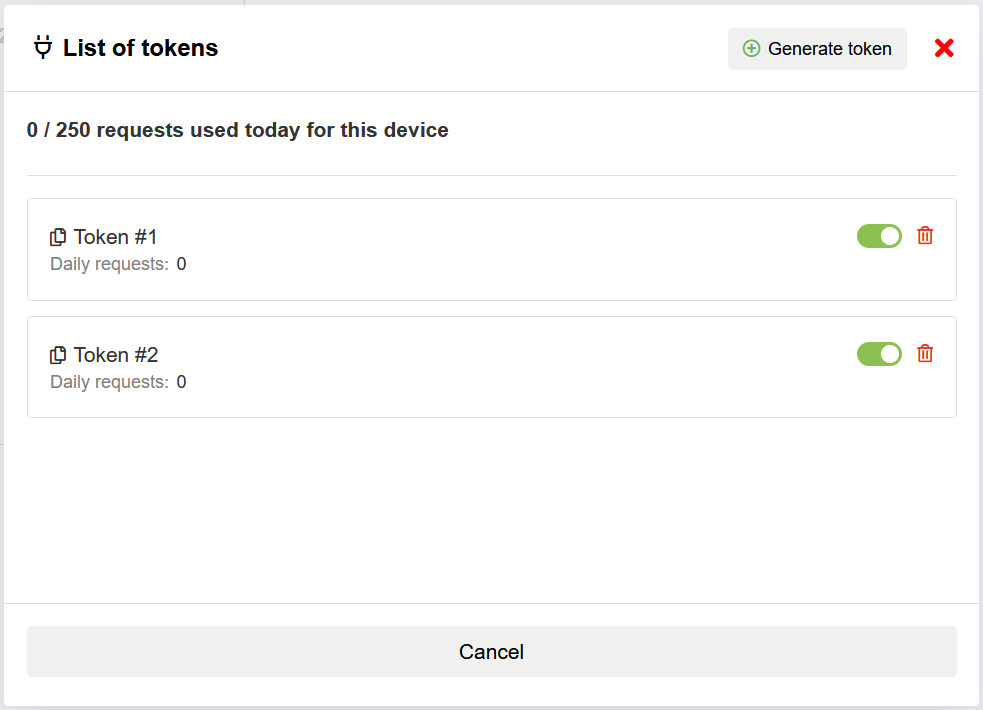
The list of tokens shows all the currently availible access tokens, and allows the user to create a new one by pressing the “Generate token” button. Per token the expiration date can be selected, and the uid’s (meters and inverter) to which the token has read access can be selected.
Additional licenses are available to increase the maximum number of API requests per day per device beyond the default limit. For more information about licensing options and pricing, please contact sales. They will assist you in selecting the suitable license to meet your specific needs.
Add tokens
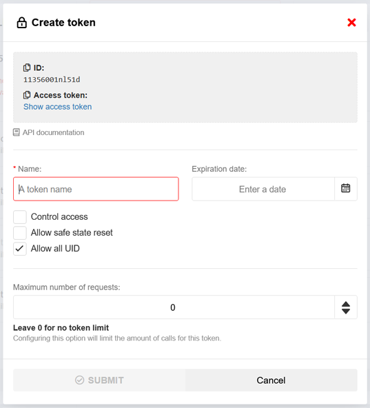
To add a new access token, users are required to provide the following inputs:
Token name: Users should enter a descriptive name for the access token to easily identify its purpose or the associated device.
Expire date: (Optional): Users can specify the expiration date for the access token. Once the expiration date is reached, the token will no longer be valid.
Enable control access (Optional): Users have the option to enable control access for the token.
Safe state reset (Optional): Users should indicate whether the access token should allow or disallow a safe state reset.
UID access: Users can select specific UIDs (like meters and inverters) which can be accessed by the token.
Request limit: Users have the ability to set a limit on the number of requests that can be made using the access token. By specifying a numerical value, users can control the maximum number of requests. Setting the limit to 0 will remove the limit. Keep in mind that by default the total number of request per device is 250 requests per day.
By providing these necessary inputs, users can successfully add a new access token with custom settings and access permissions for their devices.
Device settings
The remote settings modification functionality empowers users to make changes to the settings of their devices and apply/publish those changes remotely. This feature can be enabled or disabled on the device itself. If the menu is not visible, it indicates that synchronization with the device is required in order to begin modifying the settings. The “Last contact” information displays the date and time of the most recent synchronization with the device.
Incorrect ETH settings can cause the device to become unreachable
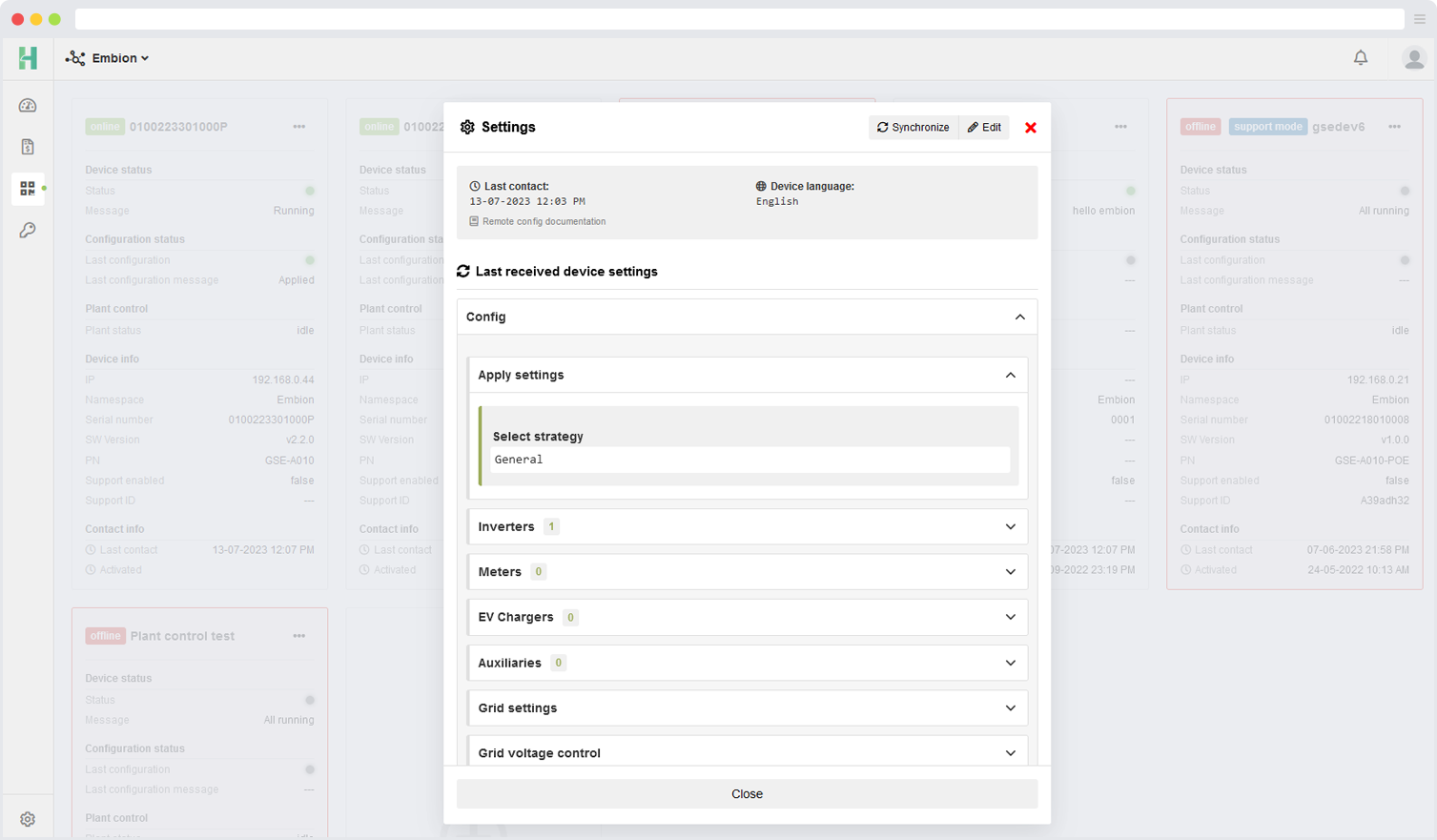
The displayed device settings are shown in the same language as the language settings on the device.
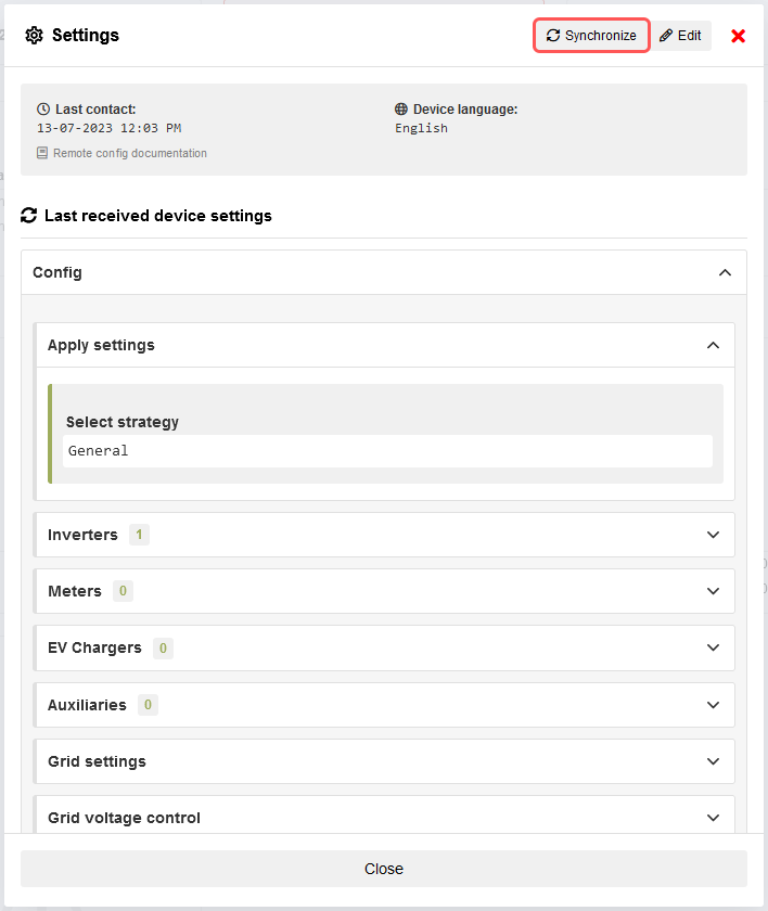
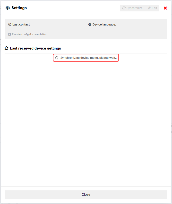
Synchronize device
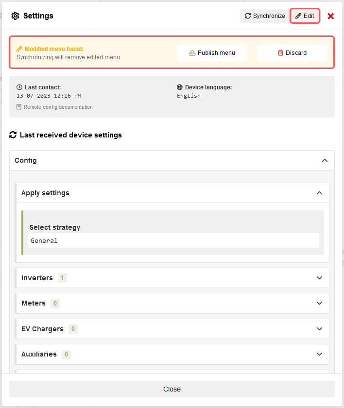
The synchronization feature allows users to request and retrieve the live settings from the device, listing them for review and modification. If a modified menu is already present on the device, a message will be displayed to notify the user.
Performing a synchronization will remove any previously edited menu, if one is present.
Edit device settings
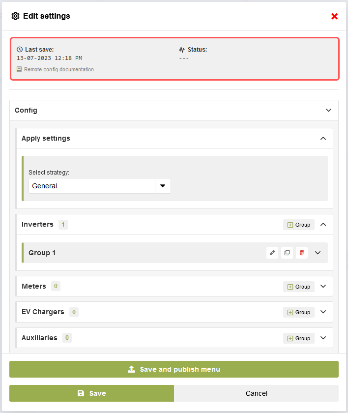
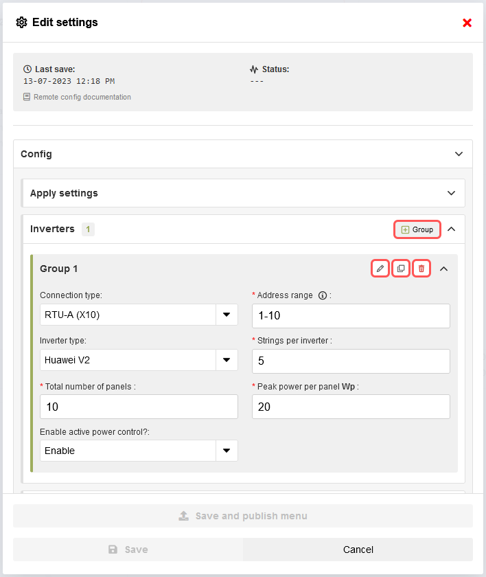
Once a device is synchronized, users can proceed to edit its settings by clicking the “Edit” button. This action will open a new form that includes all the necessary inputs for modifying the settings.
Group settings
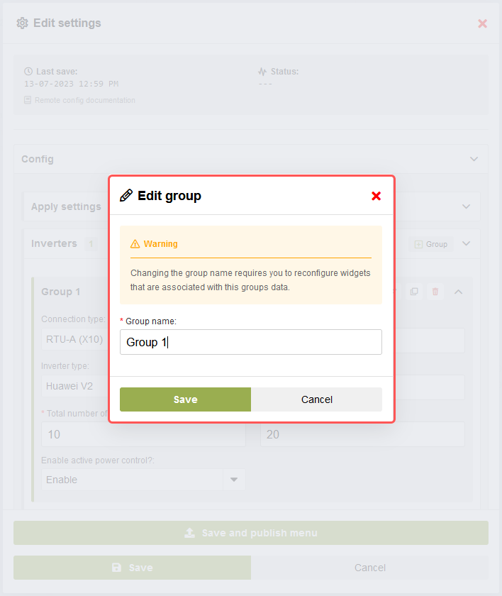
Users have the option to add a new empty group by pressing the “+ Group” button or make modifications to existing groups. Additionally, the clone button simplifies the process of duplicating groups when only minimal changes are required for creating a new group.
Discard or publish settings
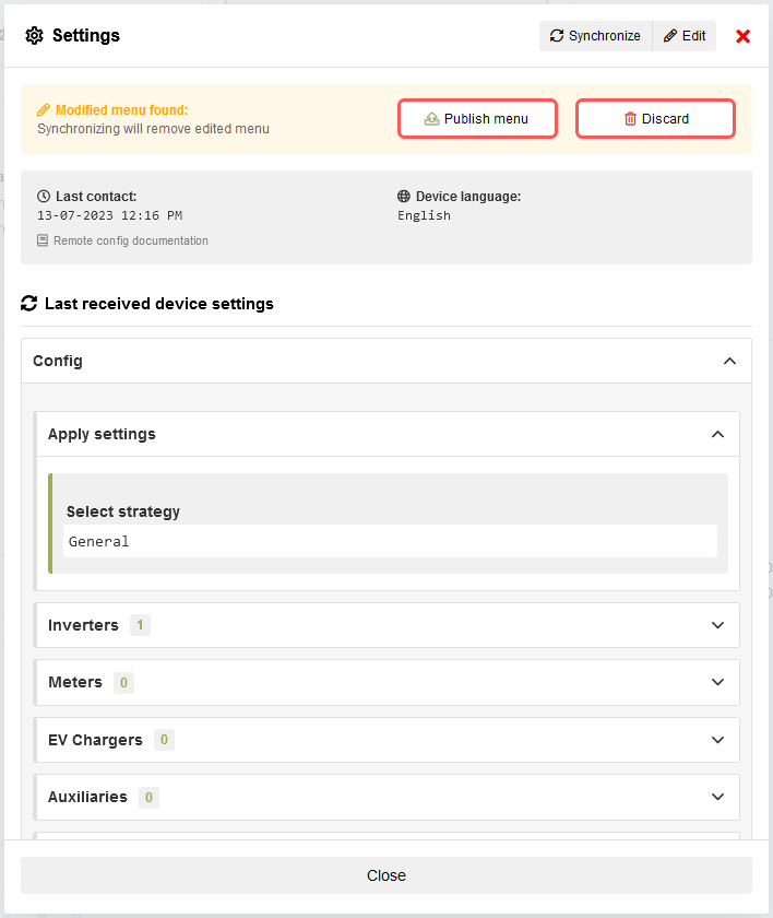
After modifying and saving the menu settings, two buttons, “Discard” and “Publish,” will appear at the top of the form. Here are the actions associated with each button:
Discard: Clicking the “Discard” button will remove the modified menu and revert the form back to the settings that were originally requested during the last synchronization with the device. This action allows users to discard any changes made and restore the previous settings.
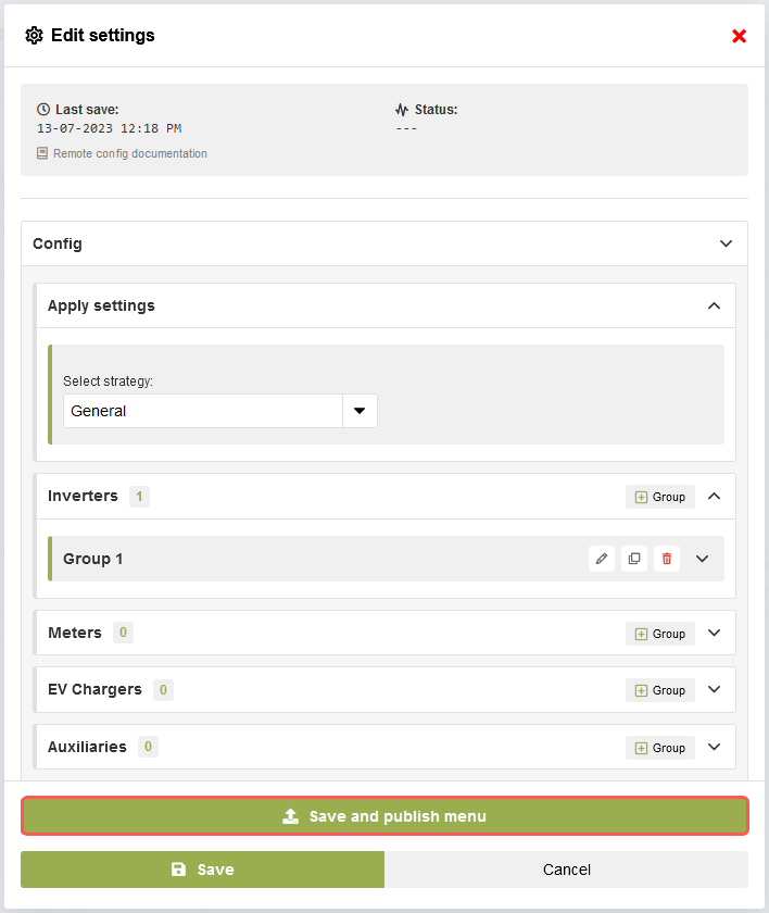
Publish: Clicking the “Publish” button will publish the modified settings to the device. The changes will be automatically applied to the device if the automatic application option is selected. Alternatively, users can manually apply the changes on the device. The “Publish” action ensures that the modified settings take effect on the device.
These buttons provide users with flexibility and control over managing the modifications made to the menu settings. Users can either discard the changes or publish them to the device based on their preferences and requirements.
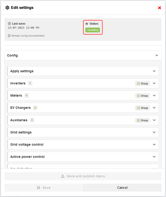
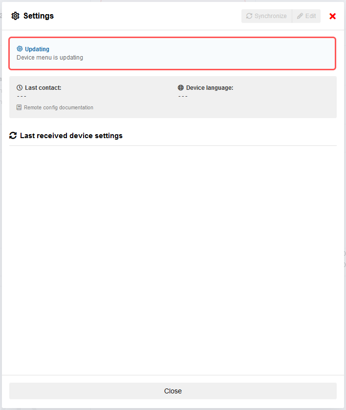
Settings published
When the modified settings are published to the device, the status section will provide users with information regarding the publishing process. It will indicate the progress of publishing and display any relevant messages or notifications. In case an error occurs during the publishing process, an error message will be shown, indicating that something went wrong and providing further details.
Additionally, after publishing the settings, the synchronize button will be disabled until the published settings are either applied or canceled on the device. This ensures that the device and the remote settings are in sync before allowing further synchronization actions.
Dashboards
Dashboards can be reached by clicking the dashboard symbol on the left side menu or on the buttons on the homepage.
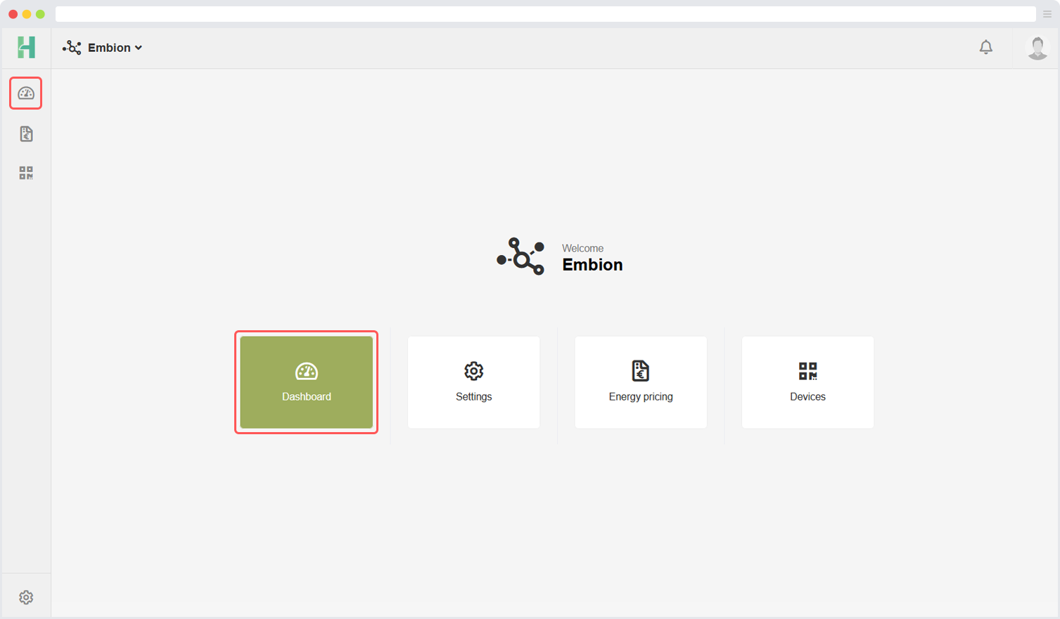
In this application multiple custom dashboards can be made to display an overwiew of the plant data. Several widgets are available and they can be configured with several options.
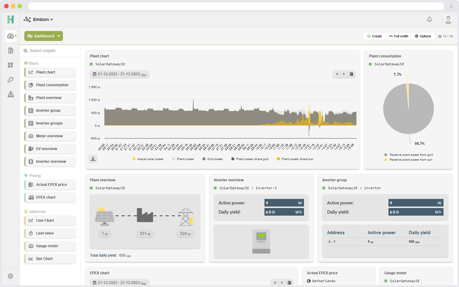
Dashboard example
This is an example of a configured dashboard. Users are able to configure and arrange the widgets according to their preferences.
Add dashboard
By default, there is a dashboard called “My dashboard” that gets added when a namespace is created or when the last dashboard in a namespace is deleted. This dashboard contains some standard plant widgets. The created dashboard can be removed, and new dashboards can be added.
By pressing the “Create” button, users can add a new dashboard to their namespace. Users can set a name, icon, and color to differentiate between dashboards. When creating a dashboard, it is possible to select a dashboard template to set it up easily. A list of available templates is displayed, and these templates can vary between namespaces based on whether they are managed by an enterprise or not.
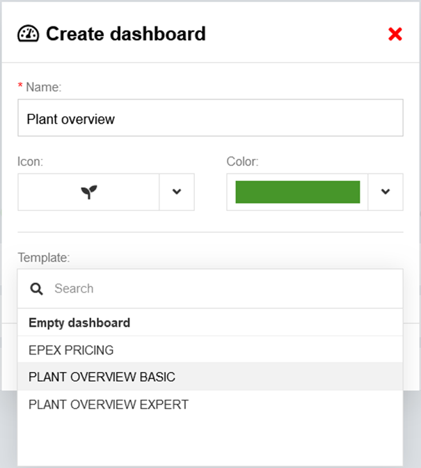
Select dashboard
By clicking on the button that displays the current dashboard name, users can access a list of all available dashboards. This action will open a menu or view where users can see a list of the available dashboards. From this list, users can select a different dashboard by choosing the desired option. This feature allows users to easily switch between different dashboards and navigate to the one they want to view or interact with.
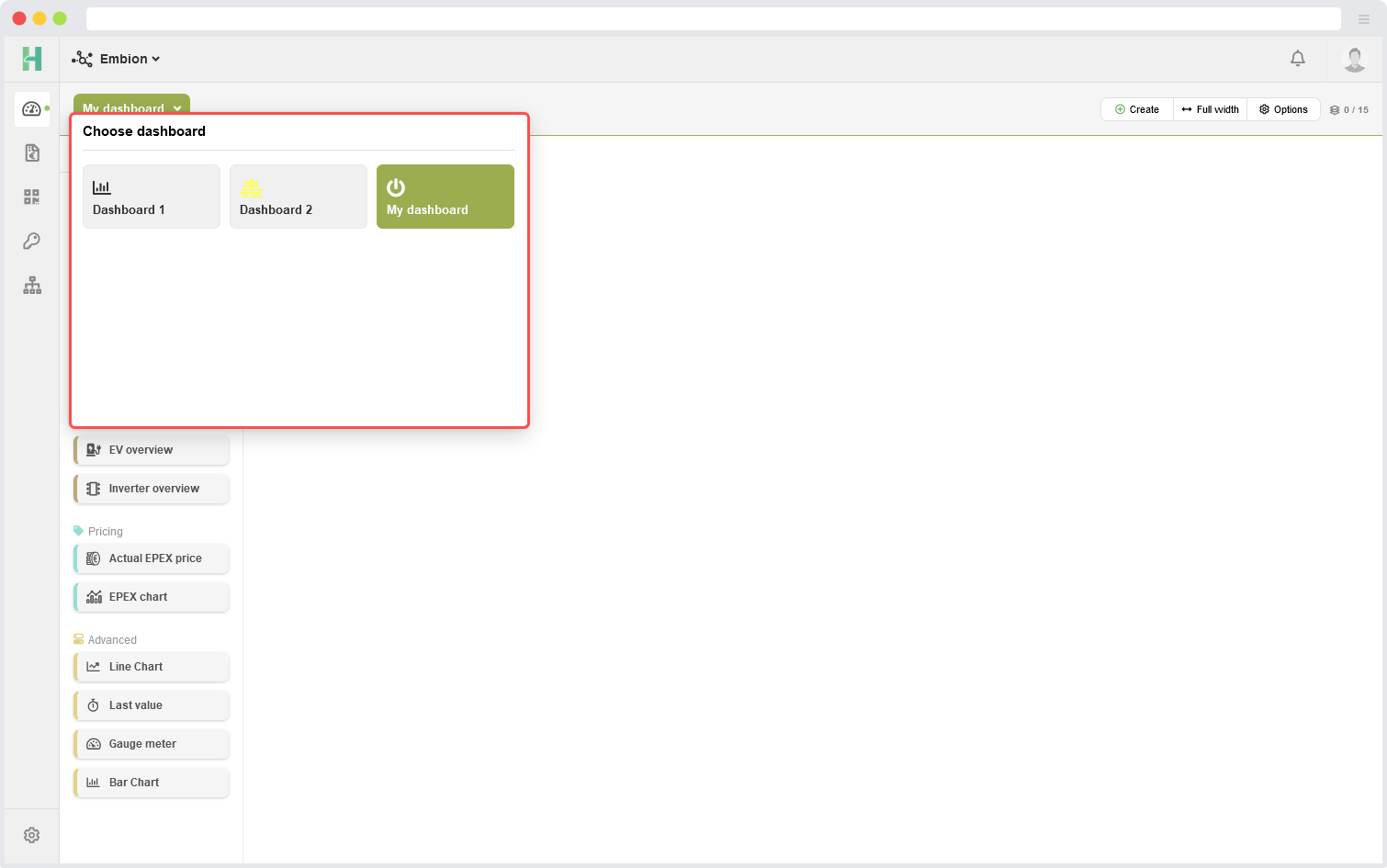
Dashboard options
By pressing the “Options” button on the dashboard, users can access a menu or set of actions specifically related to the currently active dashboard. Within this menu, users have the option to update or delete the active dashboard. The “Update” option enables users to modify and make changes to the existing dashboard.
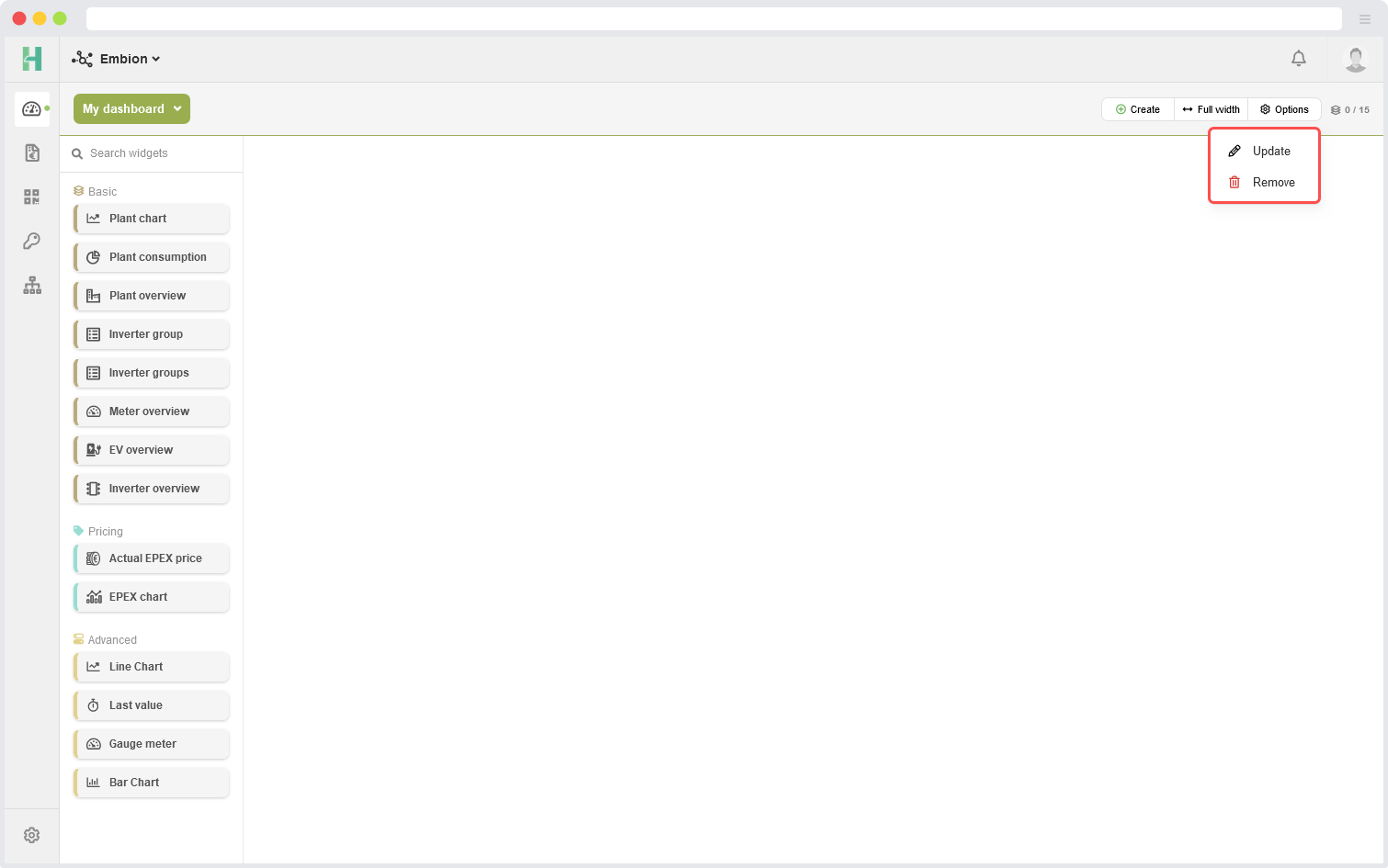
Widgets
The dashboard application provides a variety of widgets users can utilize to enhance their dashboards and visualize data effectively. Currently, there are multiple widgets available, organized into three different catagories. The widgets menu can be toggled by pressing the “Widgets” button.
Basic widgets
Plant overview
Plant chart
Plant consumption
Inverter overview
Inverter group
Inverter groups
Meter overview
EV charger overview
Pricing widgets
EPEX chart
Actual EPEX price
Advanced widgets
Bar chart
Line chart
Last value
Gauge meter
Widget status led
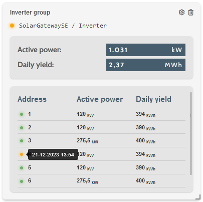
Several overview widgets use status LEDs to show the data’s status to users. These LEDs visually indicate whether the data is live, out of sync, or unavailable. Users can get more details, such as data timestamps or error/warning messages, by hovering over these status LEDs. For example user can indicate the status of their plant, inverter (addresses) or meter.
- Green
- Live data
- The widget is currently displaying real-time data. All data streams are active and up-to-date.
- Orange
- Data out of sync
- Data has been uploaded today, but it is not being updated in real-time so the widget won’t display any data.
- Red
- No data available
- No data has been uploaded today, and the widget won’t display any data.
Status example
In the example below, an inverter group widget displays a warning status LED. When hovering over the status LED, a message saying “address warning” is shown. Address statuses can be viewed by setting the widget configuration to expert mode.
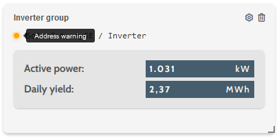
In the example below, the individual statuses for each address are displayed. This allows the user to identify which address is causing the warning within the inverter group widget.
Basic widgets
Basic widgets provide users with the ability to add widgets to their dashboard with minimal configuration steps.
Plant overview
The plant overview widget show users the basic information about their selected plant. The sun power, grid power and total consumed plant power is shown in an easy to read widget. The flow lines will move in the direction where the active power is going.
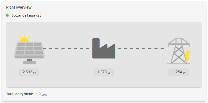
Negative values indicate that electricity is send back to the grid or inverter.
Configuration
To configure the plant overview widget, users only have to select their SolarGatewaySE device from the list. It is also possible to add a prefered icon to the widget that is shown by plant power.
More configuration information for widgets is found at section 8.9 Configure widgets
Plant chart
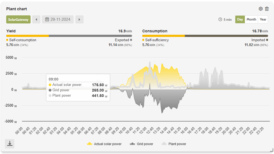
Chart data
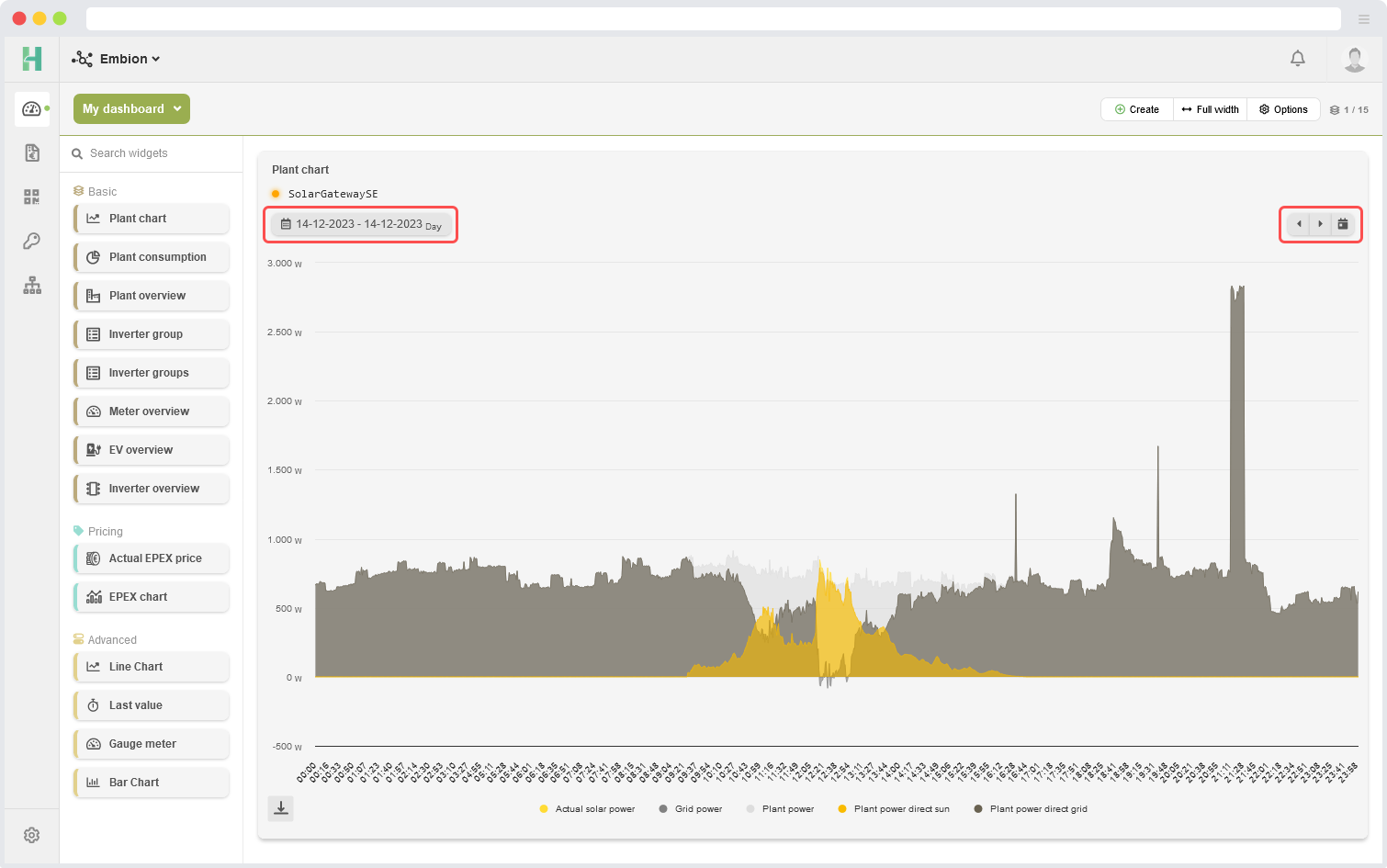
The plant chart widget can provide the following data in an area chart:
- Solar power
- The generated solar power over time
- Grid power
- The power sourced from the grid (positive) or returned to the grid (negative) over time
- Plant power
- The power consumed whitin the plant (solar power - grid power) over time
- Plant power direct sun
- The plant power directly sourced from sun power
- Plant power direct grid
- The plant power directly sourced from grid
- Relative plant solar
- The relative (0-100%) plant power which is directly sourced from sun
- Relative plant grid
- The relative (0-100%) plant power which is directly sourced from grid
- Actual reduction
- The actual (relative) inverter power limit (100% is no limit, 0% is fully limited).
- Battery power
- The actual battery power.
- State of charge
- The state of charge of total battery capacity in the plant.
- EV charger power
- The actual EV charger power.
The plant data can’t become negative at the moment. When the plant returns energy, the plant power is limited at 0W.
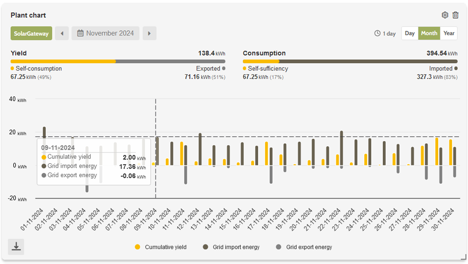
Yield and consumption
Yields can be displayed above the chart for the selected range. When switching to a larger range than ‘day,’ such as ‘month,’ the chart will show yields and consumption instead of the selected plant data.
Configuration
To configure the plant chart widget, users have to select their SolarGateway and select which data is shown in the chart. Also it’s possible to enable yield to be displayed above the chart. The data can be shown five-minutely or quarter-hourly by changing the period.
More configuration information for widgets is found at section 8.9 Configure widgets
Plant consumption
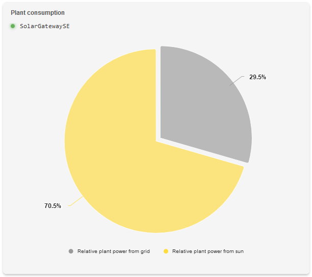
The plant consumption widget displays the following data inside a pie chart:
- Relative plant power from solar
- The relative (0-100%) plant power which is directly sourced from sun
- Relative plant power from grid
- The relative (0-100%) plant power which is directly sourced from grid
The values shown in the plant consumption pie are determined from actual measured powers and therefore only represent the relative actual power consumption.
Configuration
To configure the plant consumption widget, users have to select their SolarGatewaySE.
More configuration information for widgets is found at section 8.9 Configure widgets
Meter overview
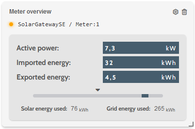
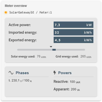
The meter overview widget provides the following data based on the selected data type:
Selectable data types
Basic
Active power
Imported energy
Exported energy
Used grid energy (if split solar/grid is enabled for the load meter)
Used solar energy (if split solar/grid is enabled for the load meter)
Expert
All the basic data which is available
Phases (one or three phases based on the meter used)
Reactive power (not available for all energy meters)
Apparant power (not available for all energy meters)
Configuration
To configure the meter overview widget, users have to select their SolarGatewaySE and energy meter of which the data should be shown. The user is able to select basic or expert mode for the data that needs to be shown.
The user is able to configure the time range from which the energy values are shown. E.g. setting the time range to hour will only show the imported, exported, solar and grid energy for the consumed or delivered in the last hour.
More configuration information for widgets is found at section 8.9 Configure widgets
Inverter overview
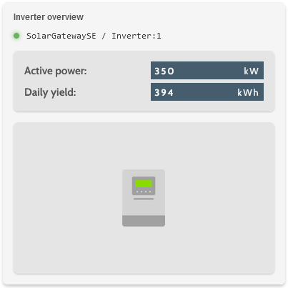
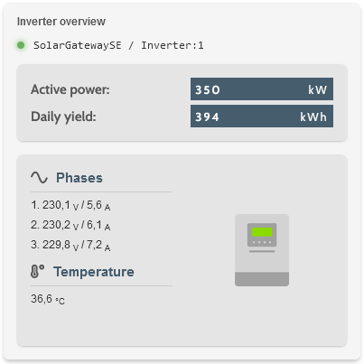
The inverter overview widget provides the following data based on the selected data:
Selectable data
Basic
Active power
Daily yield
Inverter image based on selected inverter (More inverter images will be added later)
Expert
All the basic data which is available
Phases (one or three phases based on the inverter that is used)
Inner temperature of the inverter
Configuration
To configure the inverter overview widget, users have to select their SolarGatewaySE and inverter of which the data should be shown. The user is able to select basic or expert mode for the data that needs to be shown.
More configuration information for widgets is found at section 8.9 Configure widgets
Inverter group
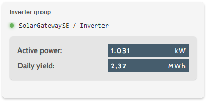
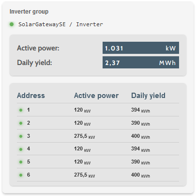
Selectable data
Basic
Total active power of the inverter group
Total daily yield of the inverter group
Expert
Total active power and daily yield of the inverter group
Active power and daily yield for each address in the inverter group
Addresses that have uploaded data in the last 7 days will be shown in the widget. If an address has no data from the past 7 days, it will be removed from the address list.
Configuration
To configure the inverter group widget, users only have to select their group of inverters which the data should be shown. The user is able to select basic or expert mode for the data that needs to be shown.
More configuration information for widgets is found at section 8.9 Configure widgets
Inverter groups
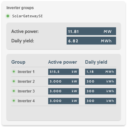
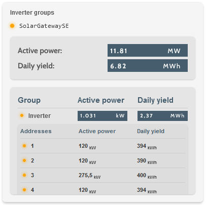
The inverter groups widget provides the following data based on the selected data:
Selectable data
Basic
Total active power of all the inverter groups in the selected plant
Total daily yield of all the inverter groups in the selected plant
Expert
Total active power and daily yield of each inverter group
Active power and daily yield for each address in the inverter group
Addresses that have uploaded data in the last 7 days will be shown in the widget. If an address has no data from the past 7 days, it will be removed from the address list.
Configuration
To configure the inverter groups widget, users only have to select their plant of which the data should be shown. The user is able to select basic or expert mode for the data that needs to be shown.
More configuration information for widgets is found at section 8.9 Configure widgets
EV charger overview
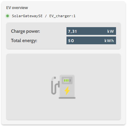
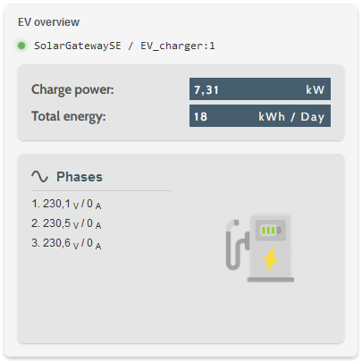
The EV charger overview widget provides the following data based on the selected data:
Selectable data
Basic
Charge power
Total energy
Expert
All the basic data which is available
Phases (one or three phases based on the meter used)
Configuration
To configure the EV charger overview widget, users have to select their SolarGatewaySE and charger of which the data should be shown. The user is able to select basic or expert mode for the data that needs to be shown.
The user is able to configure the time range from which the energy values are shown. E.g. setting the time range to hour will only show the total energy for the consumed or delivered in the last hour.
More configuration information for widgets is found at section 8.9 Configure widgets
Pricing widgets
Pricing widgets provide users with the ability to add widgets to their dashboard which give insight to their energy price based on EPEX.
EPEX chart
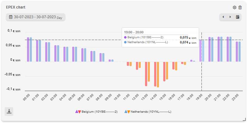
The EPEX chart widget is used to display graphs of the EPEX price in hours. It is possible to get insight in the prices of next day when they are available, mostly around 1:00 pm. To improve clarity, the chart uses distinct colors for negative and positive values. Both colors are included in the legend for easy reference.
Configuration
To configure the EPEX chart widget, the only input that is needed are the biddingzones needed to be shown. It is possible to add up to 4 different biddingzones in one chart. It is possible to show the data in a line, area or bar chart.
More configuration information for widgets is found at section 8.9 Configure widgets
Actual EPEX price
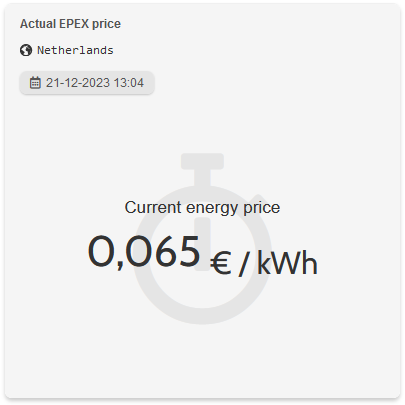
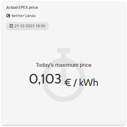
The actual EPEX price widget is used to display the actual or daily EPEX price based on the selected data.
Selectable data
- Actual price: displays the actual live EPEX price for the current time and date.
Daily period
Average: displays today’s average EPEX price.
Minimum: displays today’s minimum EPEX price.
Maximum: displays today’s maximum EPEX price.
Possible units
kWh: displays the EPEX price in EUR/kWh.
MWh: displays the EPEX price in EUR/MWh.
Configuration
To configure the actual EPEX price widget, users are able to choose which value and unit should be shown in the widget.
More configuration information for widgets is found at section 8.9 Configure widgets
Advanced widgets
Advanced widgets provide users with the ability to add widgets to their dashboard with certain configuration possibilities. Users are more free to configure a chart based on preferred data of their plant.
Bar chart
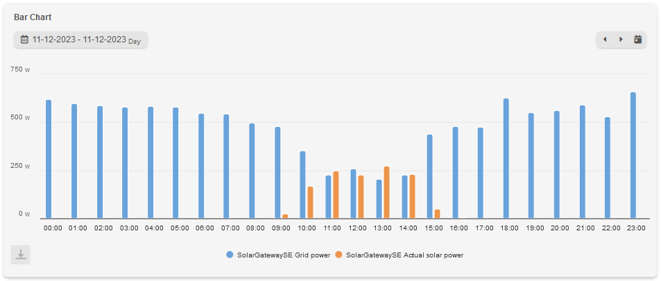
The bar chart widget allows users to present data using vertical bars, making it easy to compare different categories or values visually. This widget is ideal for displaying categorical or discrete data and showcasing comparisons or distributions.
Configuration
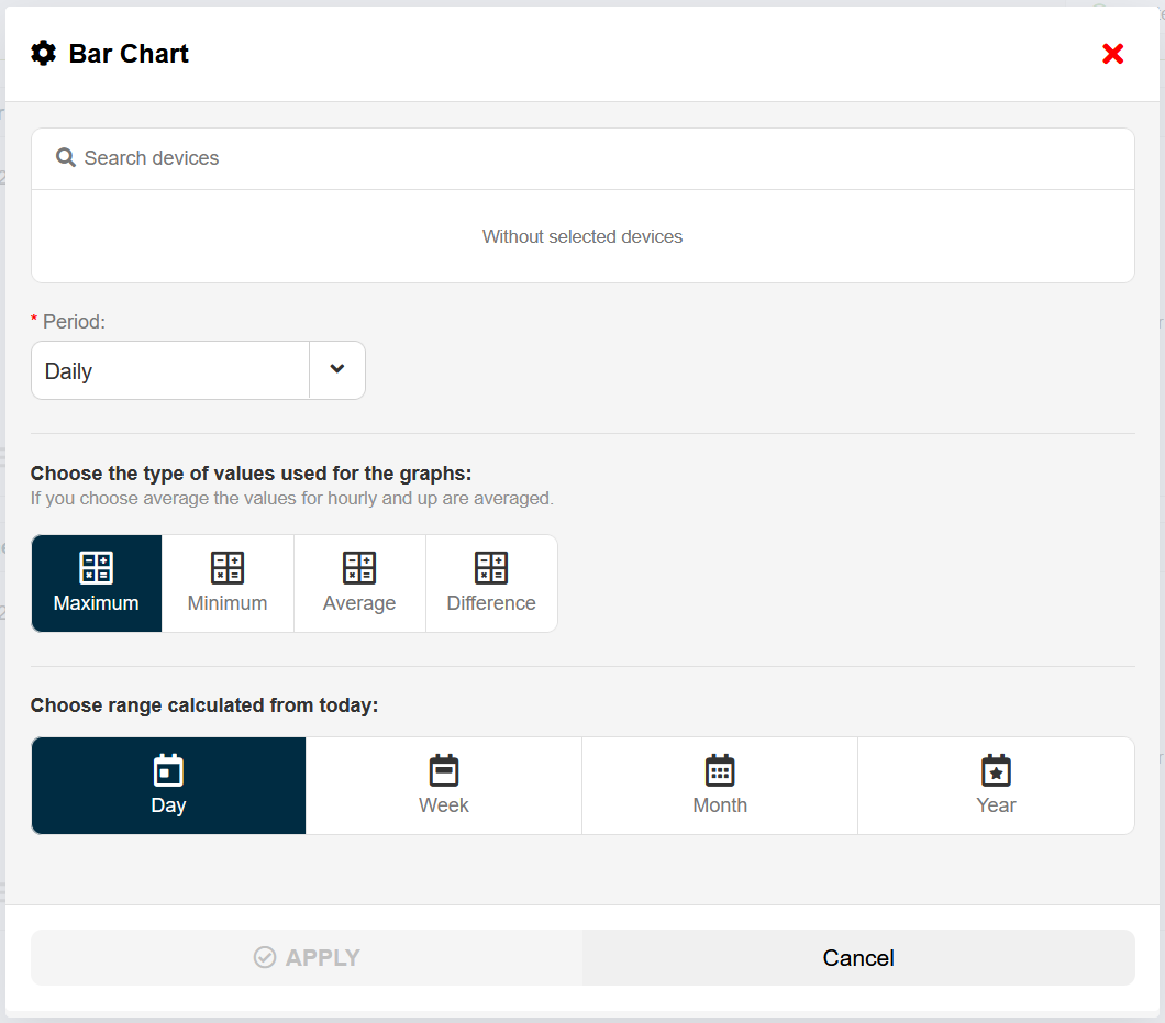
To configure the bar chart widget, users are able to select up to 10 data series. It is also possible to select a period, range and type of values (min, max, difference and average).
More configuration information for widgets is found at section 8.9 Configure widgets
When more than four data series are selected, only the daily, weekly, and monthly periods are available, and the graph’s range is set to the corresponding period.
Line chart
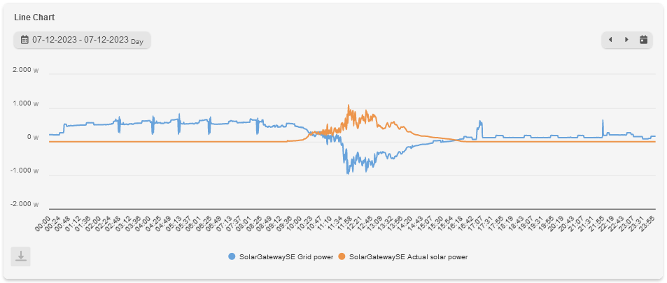
This line chart widget enables users to create interactive line charts that display trends, patterns, and variations over time. It is a powerful tool for visualizing data with continuous variables and analyzing data trends.
Configuration
To configure the line chart widget, users are able to display up to 4 data series as line or area chart. It is also possible to select a period, range and type of values (min, max, difference and average).
More configuration information for widgets is found at section 8.9 Configure widgets
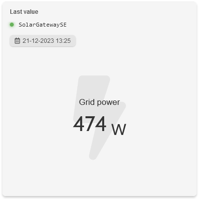
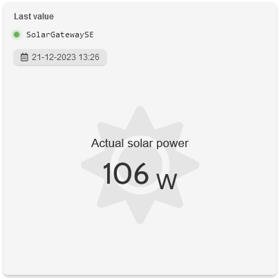
Last value
The last value widget provides a quick and concise representation of the most recent value or data point.
Configuration
To configure the last value widget, users need to select a data serie. It is also possible to select a period (last value, hourly, daily). When the selected period is not last value, a type of value (min, max, difference and average) can be set.
More configuration information for widgets is found at section 8.9 Configure widgets
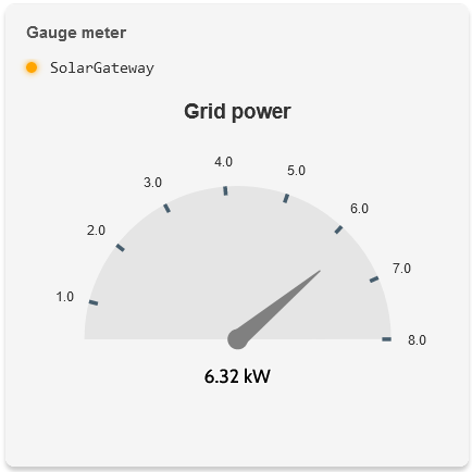
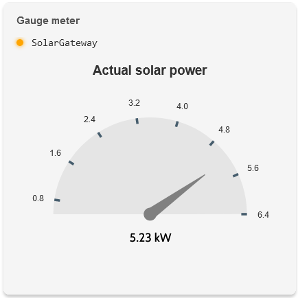
Gauge meter
The gauge meter widget provides a quick and concise representation of the most recent value or data point.
The minimal and maximun value of the gauge meter is based on data of the last 30 days.
Configuration
To configure the gauge meter, users can select a plant, meter or inverter (group) data serie which needs to be shown.
More configuration information for widgets is found at section 8.9 Configure widgets
Add widget
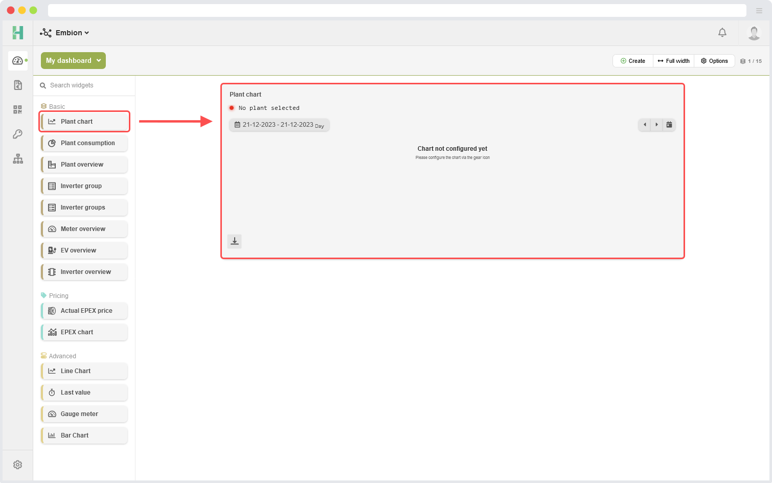
Users can add widgets to their dashboard by utilizing a simple drag-and-drop functionality from the widget list. Once a widget is dragged and dropped onto the dashboard, it will appear ready to be configured according to the user’s requirements.
Arrange widgets
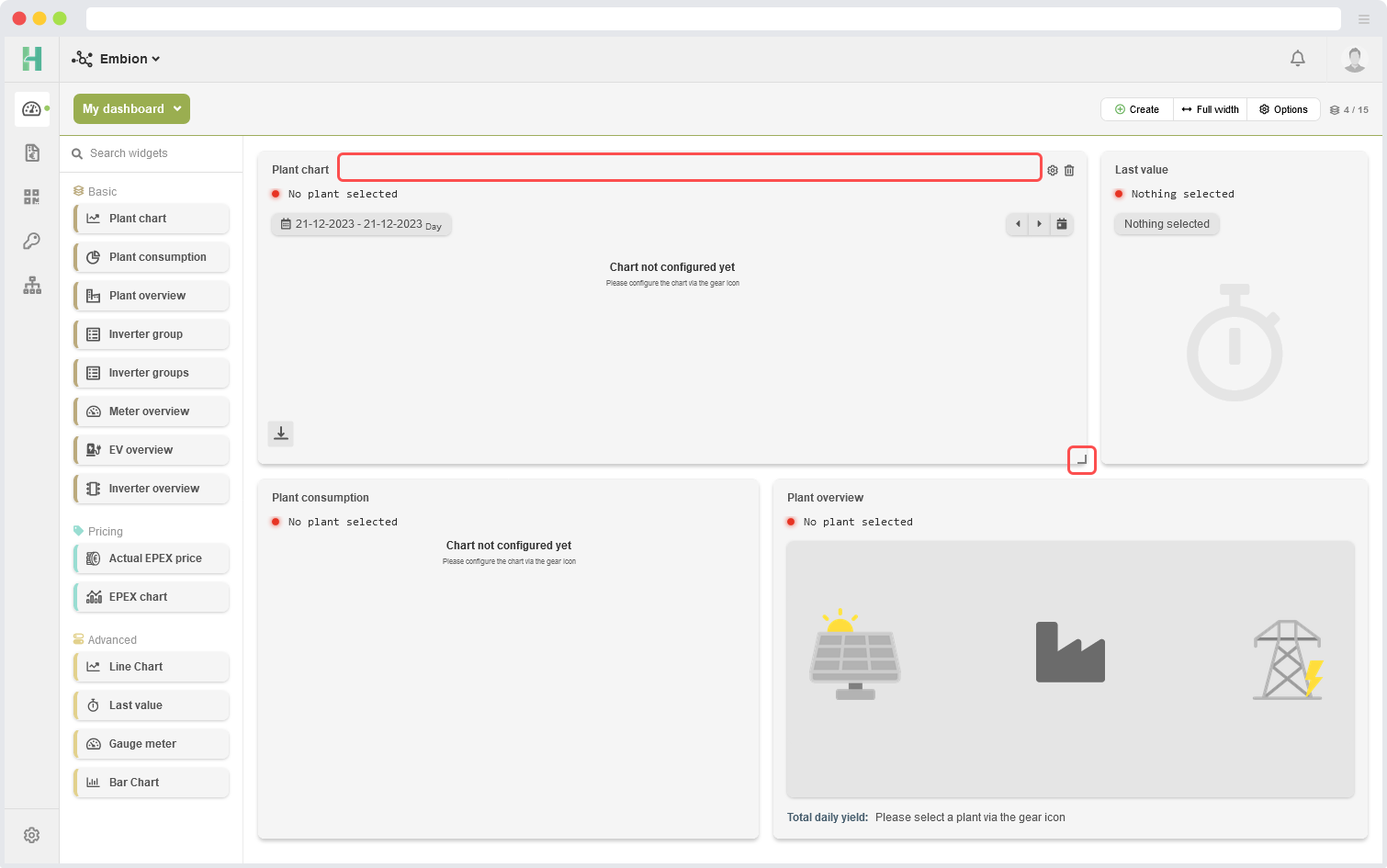
Users have the ability to arrange multiple widgets on the dashboard according to their preferences. This can be done by dragging the widgets using the top bar of the header and repositioning them within the dashboard. By simply clicking and holding the top bar of a widget, users can move it to a new location on the dashboard.
In addition to rearranging the widgets, users can also resize them to fit their desired dimensions. This can be achieved by selecting a widget and dragging the corner of the widget to adjust its size. By dragging the corner handle, users can increase or decrease the width and height of the widget, allowing for precise customization and optimal use of available space.
Configure widgets
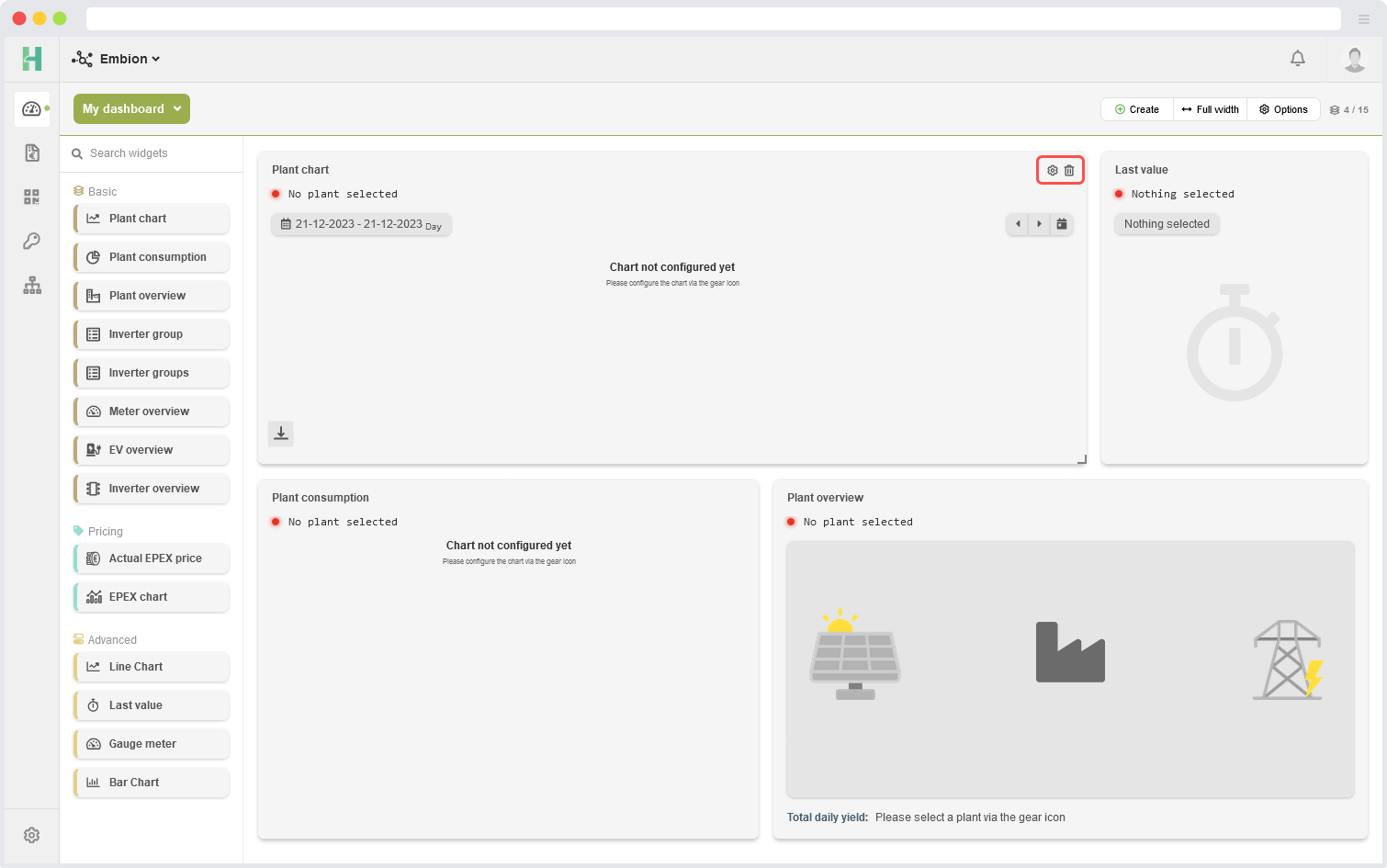
Users can easily configure their widgets by accessing the settings options available within each widget. To access the settings, users simply need to click on the settings icon located within the widget itself. By clicking on this icon, users can access a panel where they can adjust various settings specific to that particular widget.
Additionally, users have the ability to change the name of a widget by directly clicking on its existing name. Clicking on the widget name activates an editing mode, allowing users to modify the name as desired. This feature enables users to provide descriptive and meaningful names to their widgets, making it easier to identify and understand the purpose or content of each widget within the dashboard.
Configure form example
Devices
To select the data of a specific device for display in a graph, users have the option to choose up to four data lines to represent different variables or metrics. Users can search in all the possible devices and variables to access them easy.
The UIDs are arranged as follows: [device name] / [group identifier]_[group name]:[device address]:[string id] Where the string id is only applicable for solar inverter.


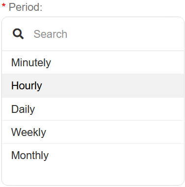
Period
Select a period or interval for the widgets to be shown. Selecting Hourly will show one datapoint for each hour.

Value type
Select the value type that is needed to be shown in the widget.

Maximum returns the maximum measured value in the selected period
Minimum returns the minimum measured value in the selected period
Average returns the average of all values in the selected period
Difference returns the difference between the first and last sample in the selected period
Range
Select the time range for the widget. Depending on the selected period, not all range options are availabe.

Unit
Select the unit for values within the widget.

Icon
Select an icon for the widget, this icon is shown in the back of the widget.

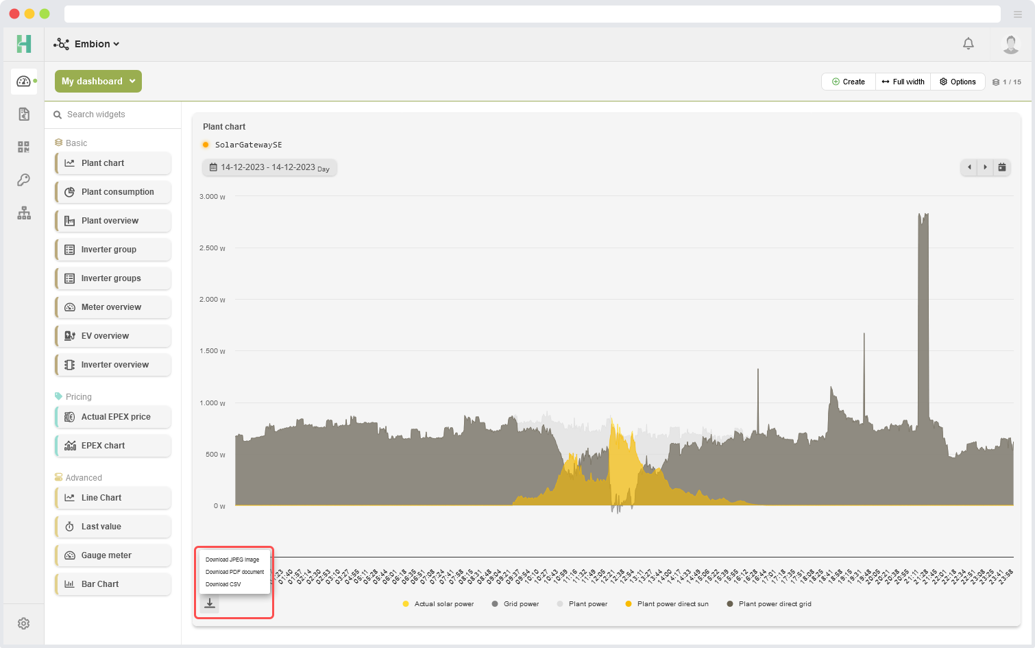
Export graphs
Users have the option to export graph widgets by utilizing the menu button located in the bottom left corner of the widget. Clicking on this menu button will open a set of options, including the ability to export the graph widget as a JPEG image or a PDF document.
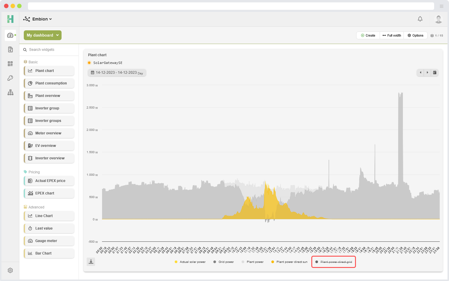
Disable graphs
Users have the ability to disable one or multiple data lines in a graph by simply clicking on their corresponding names in the legend.
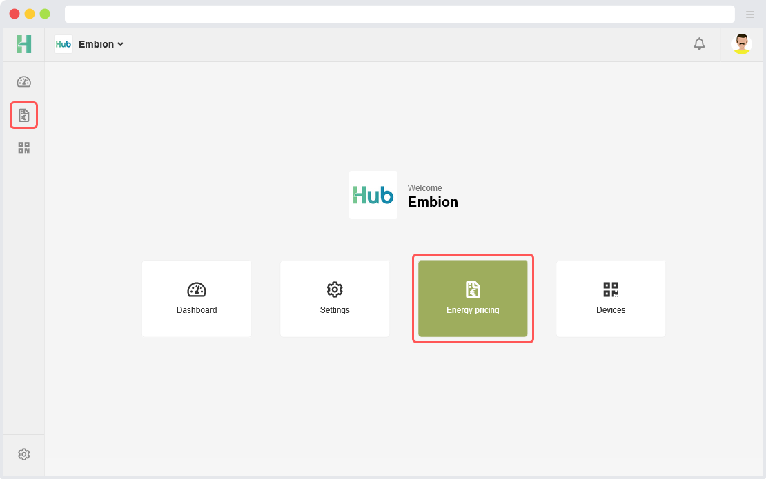
Energy pricing
The Energy Pricing app can be reached by clicking the symbol on the left side menu or on the buttons on the homepage.
In the Energy Pricing app, users can fill out energy pricing information for each device, which then allows users to control their devices based on the current energy price via control rules (if plant control is enabled).
Pricing schemes
On the Pricing Schemes page, users can fill out energy pricing information by creating a pricing scheme, allowing them to be used in multiple devices in the namespace. A list of pricing schemes will be displayed with their selected bidding zone and provider margin.
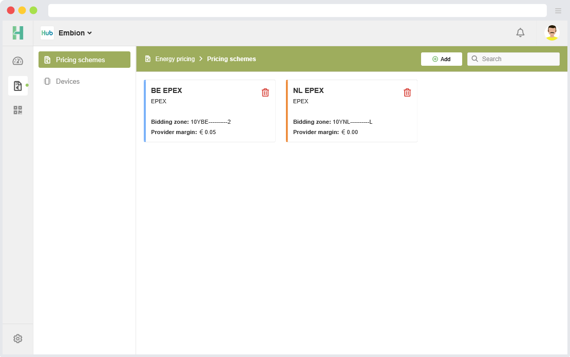
Add or edit pricing schemes
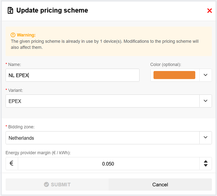
It is not recommended to edit pricing schemes that are already being used in other devices, as any changes made will also affect them. For historical accuracy, it is generally a good practice to create a new pricing scheme when changes in your energy contract were made, instead of editing an existing pricing scheme.
To configure a pricing scheme, the following parameters are required:
Name: this name will be displayed when selecting pricing schemes on devices.
Color: is optional for recognizability when configuring multiple schemes.
Variant: the variant of the pricing scheme (see Pricing scheme variants below).
Pricing scheme variants
At the moment, only the EPEX pricing scheme variant is available. This variant makes use of the European Power Exchange day ahead pricing.
The EPEX pricing scheme variant requires the following additional parameters:
Bidding zone: bidding zone of the country/countries users want to use.
Energy provider margin: the amount of margin based on your energy provider.
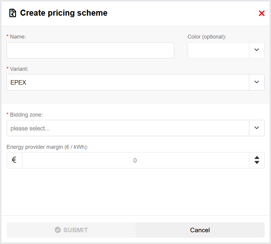
Devices
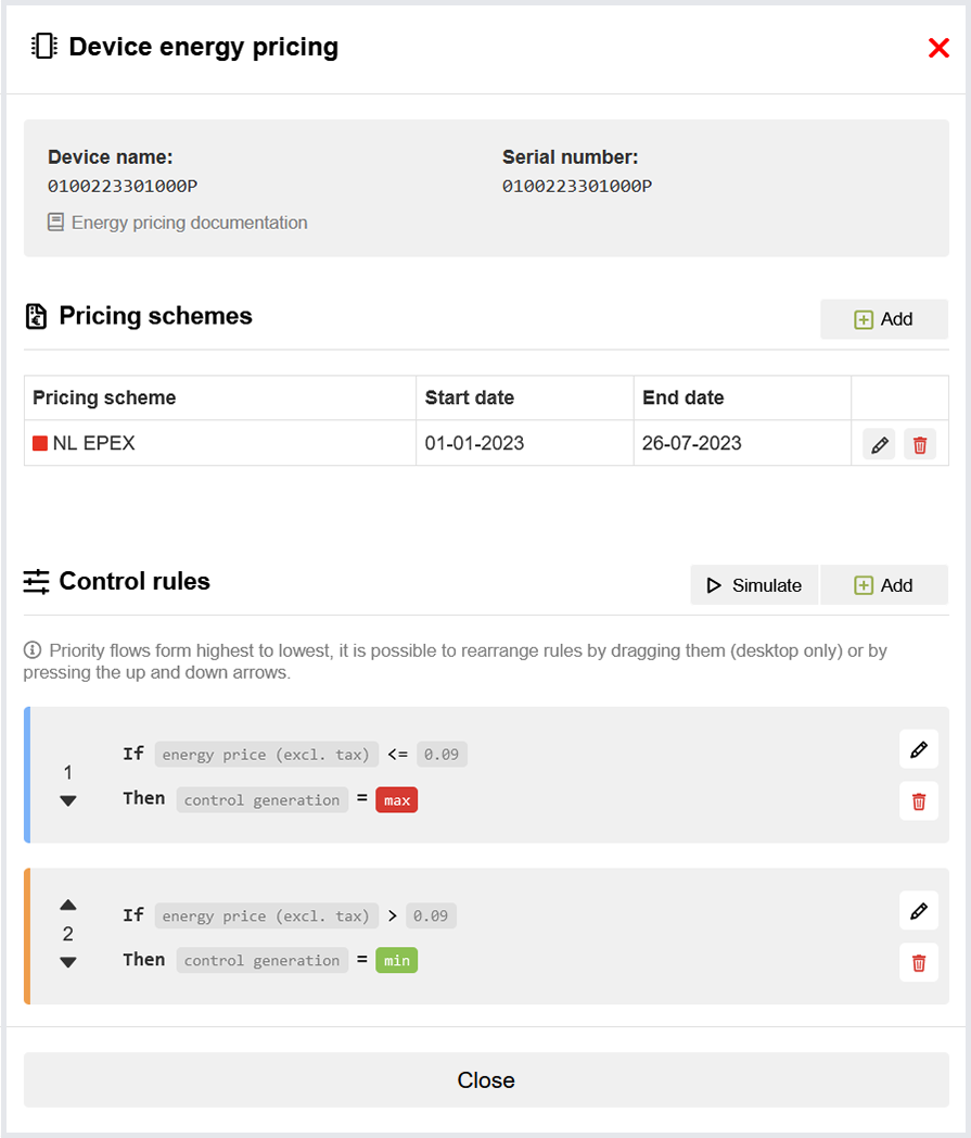
On the Devices page, users can configure their devices with pricing schemes and define control rules. A list of devices in the users namespace is shown with their current active scheme and amount of control rules.
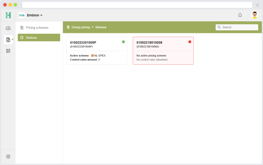
Device settings
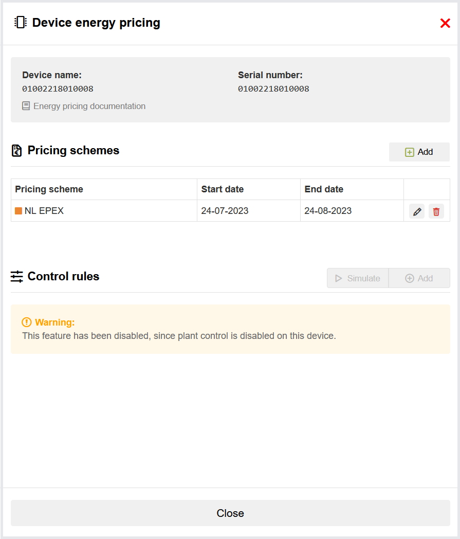
Users are able to assign multiple pricing schemes to their device that will be used based on the date that is set. A list of the pricing schemes will be shown, sorted on date. If plant control is enabled on the to be configured device, users can set control rules to their device and manage them by dragging them or use of up/down arrows.
Pricing Schemes
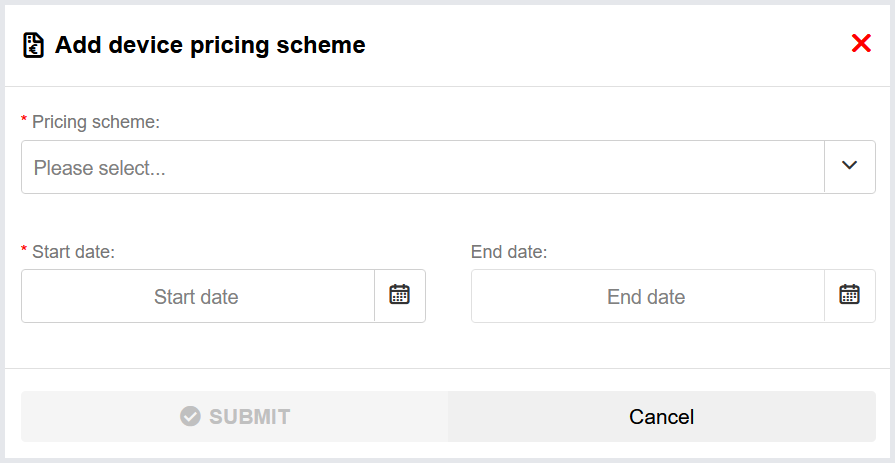
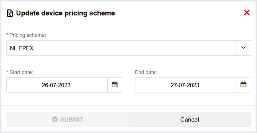
Add or edit pricing scheme
To assign a pricing scheme to the selected device, the following inputs are required:
Pricing scheme: select one of configured pricing schemes.
Start date: start date of when pricing scheme needs to be used.
End date: end date of the pricing scheme (can be left empty, meaning it will indefinitely stay active).
Control rules
Plant control needs to be enabled on the device in order to control it via control rules. The device must also have an active pricing scheme.
Devices that have plant control enabled and have an active pricing scheme assigned can automatically be controlled based on energy price and/or time using control rules. These control rules allow you to minimize power generation and maximize power consumption when the energy price becomes negative for example.
The order of the control rules on the device page matter, as only the first occurrence of a command will be sent to the device. If the current control rule doesn’t contain a given command, but a rule below does, then that command is also sent to the device. The priority flow from the top to the bottom of the list, with the rule at the top having the highest priority.
You can change the order of the control rules by dragging them (desktop only) or by clicking the up and down arrows on the control rule.
Add or edit control rules
Control rules are divided into various ‘blocks’, which can be enabled or disabled depending on the requirements of the control rule.
All enabled blocks must become true in order for a control rule to activate, so if you have both an if and a between block, the condition of the if block must be valid, and the current time must be included in the between block.
Control rules must meet the following requirements:
- Have either an active ‘If’ or ‘Between’ block (or both)
- Have at least one command with an explicit value in the ‘Then’ block.
In addition to the various blocks, an optional color can be selected in order to make it visually distinct from other control rules in the list.
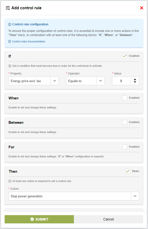
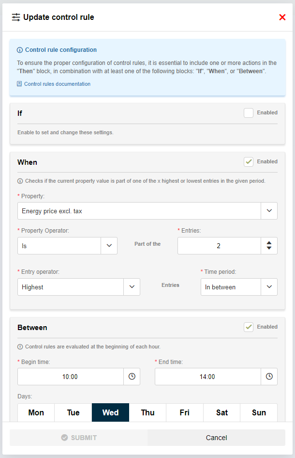
If block

In the ‘If’ block, users can create a condition that must become true in order for the control rule to activate, which can be used to check whether the energy price is higher or lower than a given value for example.
The following parameters are required:
Property: the property to check for.
Operator: the operator that is used to evaluate the condition (greater than, less than, equals to, etc.).
Value: the value that the property will be evaluated against.
An example:
If you want the control rule to activate when the energy price becomes or is lower than 0, the parameters will have to be set to the following values:
Property: Energy price excl. tax
Operator: Under or equals to
Value: 0
Equals to: Is true when both values are equal.
Above: Is true when value A is higher than value B.
Above or equals to: Is true when value A is either higher than or equal to value B.
Under: Is true when value A is lower than value B.
Under or equals to: Is true when value A is either lower than or equal to value B.
Not equals to: Is true when value A is not the same as value B.
When block
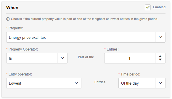
The ‘When’ block allows users to trigger certain control rule commands on moments when the energy price is at their highest or lowest in between the given time period, which can be used to limit consumption on the 4 occurrences that the energy price is at their highest for example.
It is also possible to fetch the x lowest or highest consecutive hours, which will look for the lowest or highest average spanning the specified length.
The following parameters are required:
Property: The property to check for.
Property operator: Specifies whether the entry should occur in the x lowest/highest entries.
is: The entry occurs in the x lowest/highest entriesis not: The entry doesn’t occur in the x lowest/highest entries.
Entries: The amount of lowest/highest entries that the control rule should validate for.
Entry operator: Specifies which entries to fetch
Lowest: Fetches the entries where the property value is at it’s lowest.Highest: Fetches the entries where the property value is at it’s highest.Lowest consecutive: Fetches the moment where the average of the x consecutive entries is at it’s lowest.Highest consecutive: Fetches the moment where the average of the x consecutive entries is at it’s highest.
Time period: Specifies from which time window the entries are evaluated.
Of the day: Checks all entries of the current day (0:00 - 23:59).In between: Checks the entries specified in the ‘Between’ block.
An example:
If you want to charge an EV that requires 2 consecutive hours to charge when the energy price is at it’s lowest point of the day, the parameters will have to be set to the following:
Property: Energy price excl. tax
Property operator: Is
Entries: 2
Entry operator: Lowest consecutive
Time period: Of the day
For block
This block only works in conjunction with the ‘If’ and/or ‘When’ block.

The ‘For’ block can be used to check if the condition in the ‘If’ block is true for an x amount of consecutive hours, which can be used to ensure that the condition is true for the duration that longer tasks may have or to prevent the rule from activating if the condition is matched for too long (i.e. for subsidies).
If the ‘When’ block is enabled. The ‘For’ checks if the condition in the ‘When’ block is true for an x amount of consecutive hours, so if the ‘When’ block is set to check for the lowest 4 entries, the ‘For’ validates if the x consecutive entries occur in the lowest 4 entries.
The following parameters are required:
Operator: the operator that is used to evaluate the condition (greater than, less than, equals to, etc.).
Value: the amount of consecutive hours that will be evaluated against
An example:
If you want the control rule to activate when the ‘If’ block condition was met for at least two consecutive hours, the parameters will have to be set to the following values:
Operator: Above or equals to
Value: 2
Between block
The ‘Between’ block currently uses the Amsterdam timezone (CET / CEST) to evaluate the given time constraints.
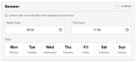
The ‘Between’ block can be used to specify when a control rule may activate, which can be used so that some control rules may only validate outside working hours or only on weekends.
The ‘Between’ block can be fully standalone, activating the control rule between the given time constraints, or to work in conjunction with other blocks (to only activate a rule when the energy price is low on weekdays for example).
The following parameters are required:
Start time (hours and minutes): Time from when the control rule may activate (24 hour format)
End time (hours and minutes): Time from when the control rule will stop activating (24 hour format)
Days of the week The days of the week that the control rule can activate (works in conjunction with the time constraints) (click to select / deselect)
An example:
If you want the control rule to activate on weekdays between 9:00 and 17:00, the parameters will have to be set to the following values:
Start time (hours and minutes): 9 : 00
End time (hours and minutes): 17 : 00
Days of the week monday, tuesday, wednesday, thursday, friday
Then block

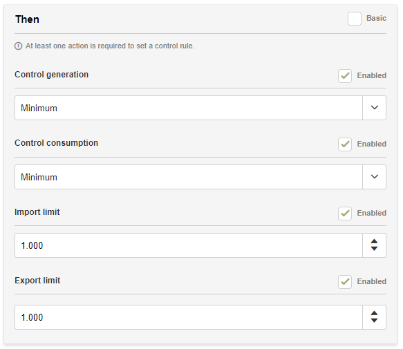
In the ‘Then’ block, you can define the commands that will be sent to the device once the control rule activates. It is possible to send multiple commands at once.
The ‘Then’ block has 2 different modes:
Basic: In the basic mode, you can choose a predefined action to execute. If you switch to the expert mode, you can view the underlying commands that are sent to the device.
Expert: In the expert mode, you are able to adjust all commands that can be sent to the device. The expert mode is further explained below.
Commands can either be enabled or disabled. When a command is disabled, it will make the command available for changes by a control rule with a lower priority, but at least one command is required for the control rule to be effective.
The order of the control rules on the device page matter, as only the first occurrence of a command will be sent to the device. If the current control rule doesn’t contain a given command, but a rule below does, then that command is also sent to the device.
The following commands can be assigned:
Control generation: Affects power generation of the plant (see further explanation below)
Control consumption: Affects power consumption of the plant (see further explanation below)
Active power import limit (W): Limit in Watts for importing power
Active power export limit (W): Limit in Watts for exporting power
Further explanation of control generation and consumption commands
The control_generation and control_consumption commands can be used to control plant generation and consumption independently of the plant configuration.
Setting control_generation to min reduces the power generation to the minimum, resulting in solar power converters to shutdown and wind turbines to stop.
Setting control_generation to nom allows generation of solar and wind to operate normally.
Setting control_generation to max allows the start of any extra generators (if available at plant) or start discharing available batteries.
Setting control_consumption to min reduces the controllable loads like heat pumps and EV-chargers to minimum consumption.
Setting control_consumption to nom enables normal controllable loads to operate within the plant limits.
Setting control_consumption to max increases the power for controllable loads to maximum. EV-chargers will increase charging power to maximum (within plant limits) and heat pumps will increase or decrease setpoint to increase power consumption. Connected battery systems will be allowed to charge within battery and plant limits.
Actions triggered by the energy price will overwrite any existing plant control actions. All triggered actions have a valid time of 1hour. Sending a new plant control action will counteract the action done by the energy price.
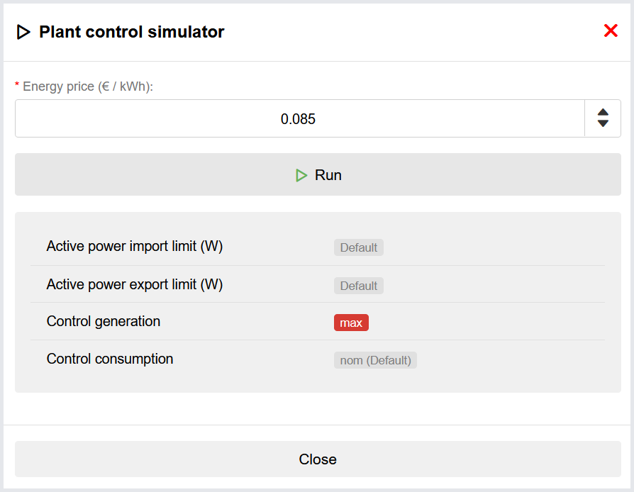
Control rule simulator
The control rule simulator can be used to simulate which plant control commands are sent to the device depending on a given energy price, which is useful for validating if your control rules are set up correctly.

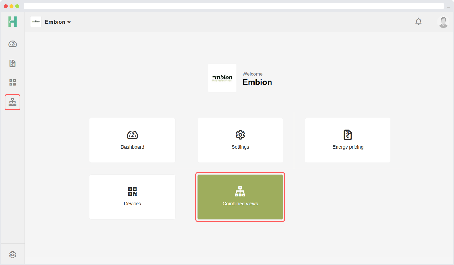
Combined views
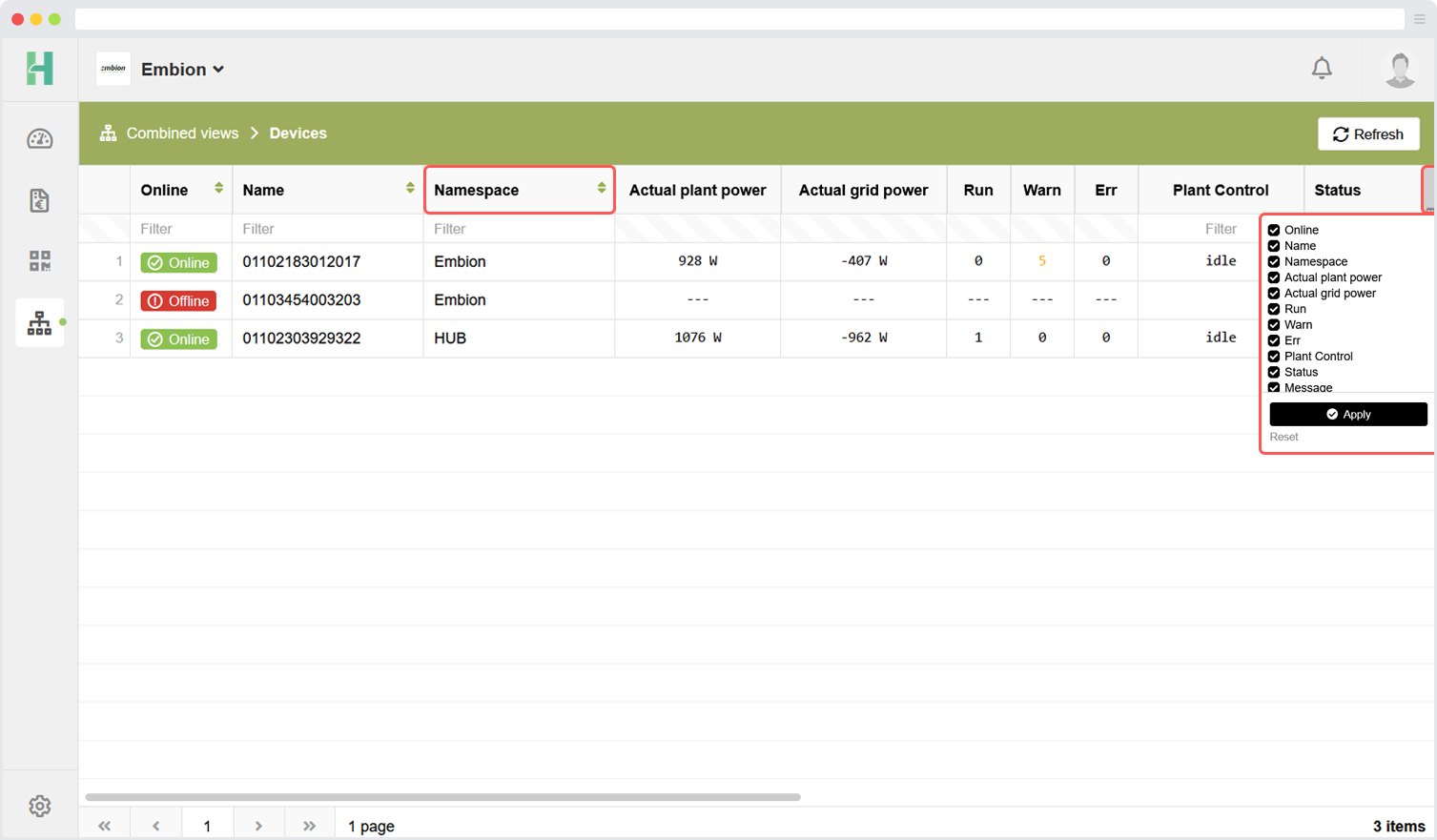
Combined views can be reached by clicking the symbol on the left side menu or on the buttons on the homepage. Users can use this application to get an overview of all their namespaces and the devices in a single table.
Users need the right role and read permissions for the information displayed in the combined view, otherwise it will not be shown. This can be enabled by enabling Combined views permission for the role of choice.
Devices
In the combine view for devices user can view details about devices in their joined namespaces. The user needs the role with correct permissions within the namespace to see the device in this overview, otherwise it won’t be displayed.
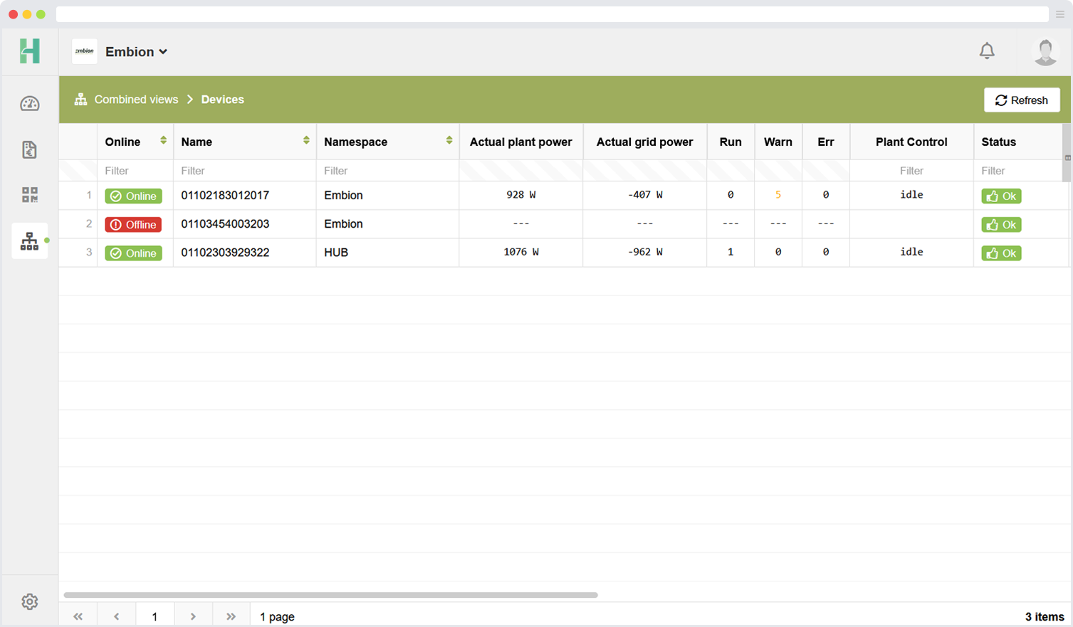
The following details can be read from the devices:
- Online / offline status
- Name of the device
- Namespace where the device is registered in
- Actual plant power
- Actual grid power
- Run status amount
- Amount of warnings
- Amount of errors
- Plant control status
- Status message
- Device software status
- Serial number of the device
- Product number of the device
- Date of last data call
- Date of last status call
Arrange and filter options
Users can arrange the columns of the table by dragging the top of the column to the left of right. It is also possible to select which columns should be displayed in the view, this can be done by opening the filter on the top right side of the columns.
