Introduction
This is a public manual for the HUB portal.
About this document
Purpose
This document introduces the SolarGatewaySE (GSE) in terms of installation, electrical connections, system operation and maitenance and troubleshooting. Understand the SolarGatewaySE features, functions and safety precautions provided in this document before installing and operating the SolarGatewaySE.
Intended Audience
This document is intended for operating personnel, system engineers adopting the SolarGatewaySE in there system design.
Symbol coventions
The symbols that may be found in this document are defined as follows:
Used for gernal notes in this documentation
Used for expressing warnings in this documentation
Used for important notes in this documentation
Used for genral tips in this documentation
Used for caution notess in this documentation
Change history
V1.4.0 - First release of the HUB manual 24/05/2023
V1.4.1 - Several new features and improvements.
New features added:
- Remote device configuration
- Plant control
- Default namespace roles
Improvements:
- Ability to resend invite emails
- Remember me option at login formn
- Several small bugs fixed
- API improved with better status codes.
the HUB in general
Introduction
The HUB is an online portal used to monitor, configure and control your SolarGatewaySE devices. Each SolarGatewaySE can be connected to a single namespace, where a namespace can hold multiple SolarGatewaySE devices. The namespace can be shared with multiple users, where each user has there own privileges.
Extra licenses are always bought for a single device, independend on the number of devices in the namespace.
User account for the HUB
Every user making use of the HUB should create their own account. Per account your specific settings like country and language can be set. Each user account can create a new or join a excisting namespace.
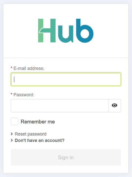
Creating an account
To create an account only a name, a valid email address and a safe password is required. To proceed with creating your account please visit https://hub.embion.nl and click on “Don’t have an account?”.
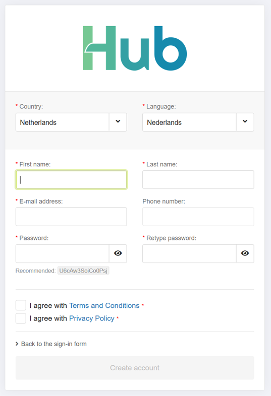
A registratin form will open, allowing the user to supply all the required information for the new HUB account. A phone number is not required. If needed, two factor authentication can be enabled once the account has been activated.
Please carfully read the terms and conditions and the privacy pollicy before agreeing with them.
When all field are correctly filled, the “Create account” button becomes active and the account can be created.
An email with the account activation link is send to the entered email adres. Please open the email and press the “activate account” button. This will guide the user to the HUB, logged in to the user’s account.
If the user is not added to a namespace yet the user has the option to create a new namespace.
Acount recovering
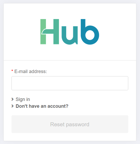
When a user has forgotten their password, they can recover it by pressing the “Reset password” button. This will open a pop-up requesting the user’s email address. Please provide the email address associated with the HUB.
If the entered email address is recognized, an email containing a reset password link will be sent to the provided email address. By clicking on the link, the user can enter a new password.
If you do not have access to the email address associated with your account, please contact your sales representative for assistance.
Namespaces
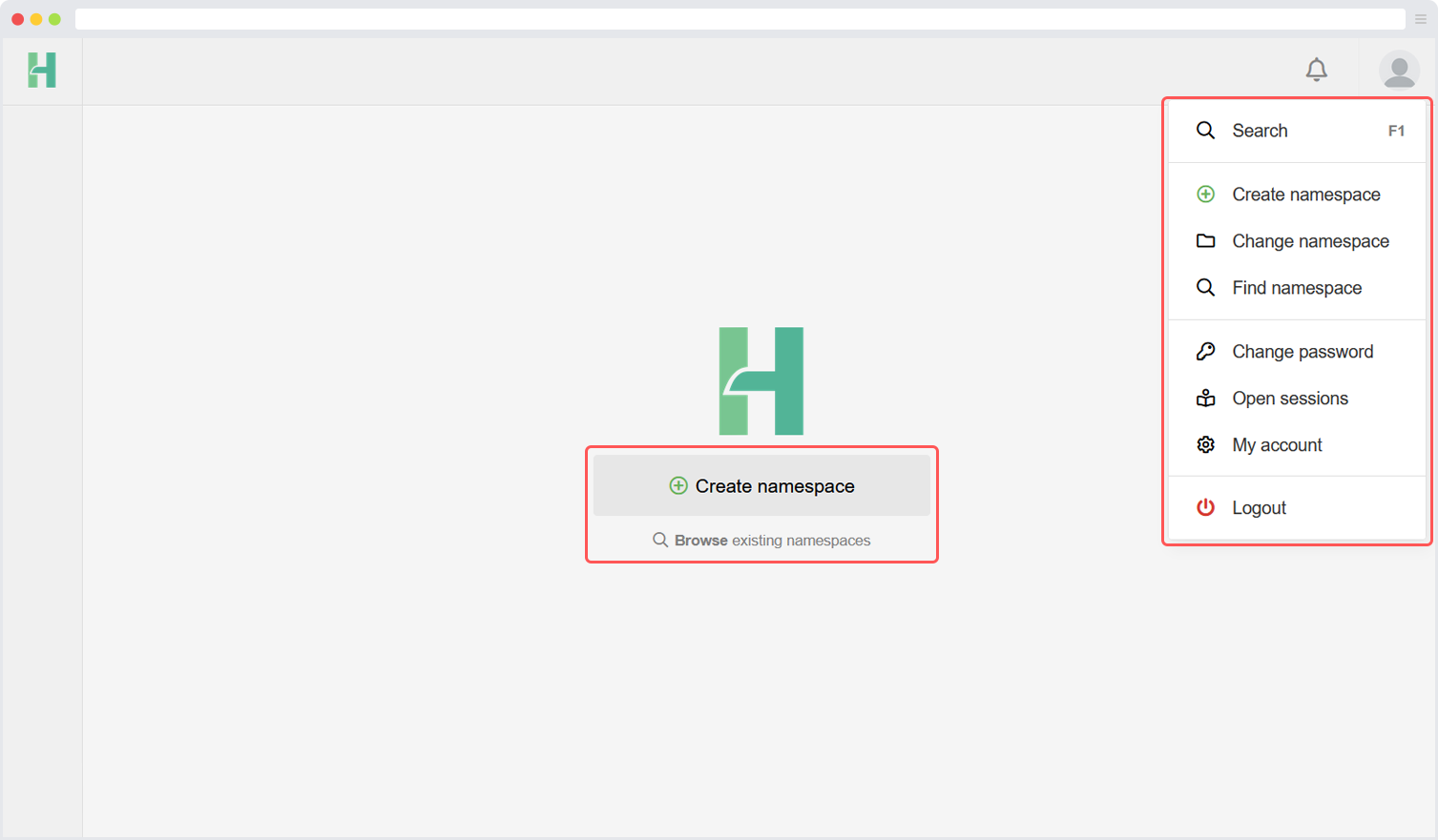
A namespace is basicly a group of users, where each user has there own permissions based on their role inside the namespace. Multiple SolarGatewaySE devices can be connected to a namespace and the device data can be monitored on dashboards which can be created or read by the users with correct permissions. This way a namespace can be created and managed by a company who invites their customers to their namespace and provide roles based on their preferences.
When a user who does not have access to any namespace logs in, they will be prompted to create a new namespace. Additionally, a namespace can be created by clicking on the “Create Namespace” button located in the top right corner of the user menu.
Create a namespace
When a user without access to any namespace is logged in, it will be prompted to create a new namespace. Also, a namespace can be created by clicking on the “create namespace” button in the top right corner user menu.
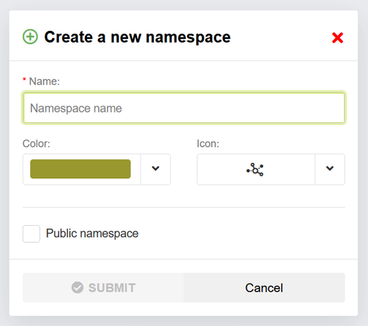
During the process of creating a namespace, you have the freedom to choose a name for the namespace. It is advised to select a distinguishable name that helps to differentiate it from other namespaces. You are free to use any name of your choice.
Additionally, you have the option to select a symbol and color to enhance the visibility and divisibility of the namespace. This allows you to customize the appearance of the namespace according to your preferences.
If required, the namespace can be made public. By checking the “public namespace” checkbox the namespace becomes visible for all HUB users. All HUB users can see the namespace and request access to the namespace. The namespace administrator should still accept the requests.
When the namespace is created the current users becomes namespace administrator of the namespace. The administrator can invite, accept and create new administrators within the namespace. Each namespace should have at least one administrator.
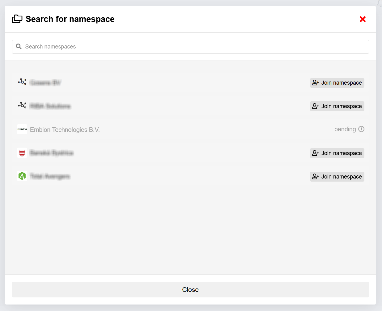
Join a namespace
When a namespace is public, it is possible to join. An administrator of the joined namespace has to approve your request. When a namespace isn’t public, another user with the correct permissions has to invite people to let them join.
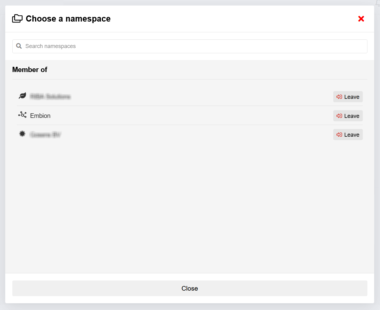
Change namespace
When a user wants to switch between namespaces they are already a member of, the following steps should be taken:
- Locate the namespace selection button situated in the top left corner of the interface.
- Press the namespace selection button to initiate a pop-up window.
- Within the pop-up window, all the namespaces accessible to you will be displayed.
- Identify the desired namespace from the list and click on it.
By selecting the namespace, you will be instantly switched to the chosen namespace, and the interface will be updated accordingly. By following these steps, users can seamlessly switch between the namespaces they are already members of, granting them access to the specific content and features associated with each respective namespace.
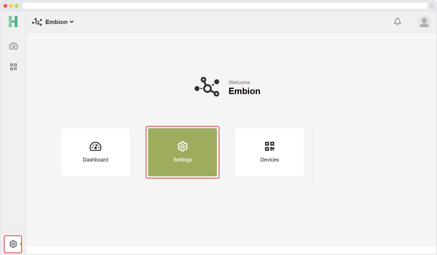
Namespace settings
Namespace settings can be reached by clicking the settings symbol at the bottom left corner or the buttons on the homepage. In this application users can manage their namespace based on their permissions. The namespace settings application offers the following settings:
Users: Users can invite or approve users to their namespace and assign roles to them.
Roles: User roles can be managed here, different roles can be made with their own permissions.
Devices: All devices that are connected to the namespace are listed in a table view for easier access.
Settings: Namespace settings like the name and image can be changed here.
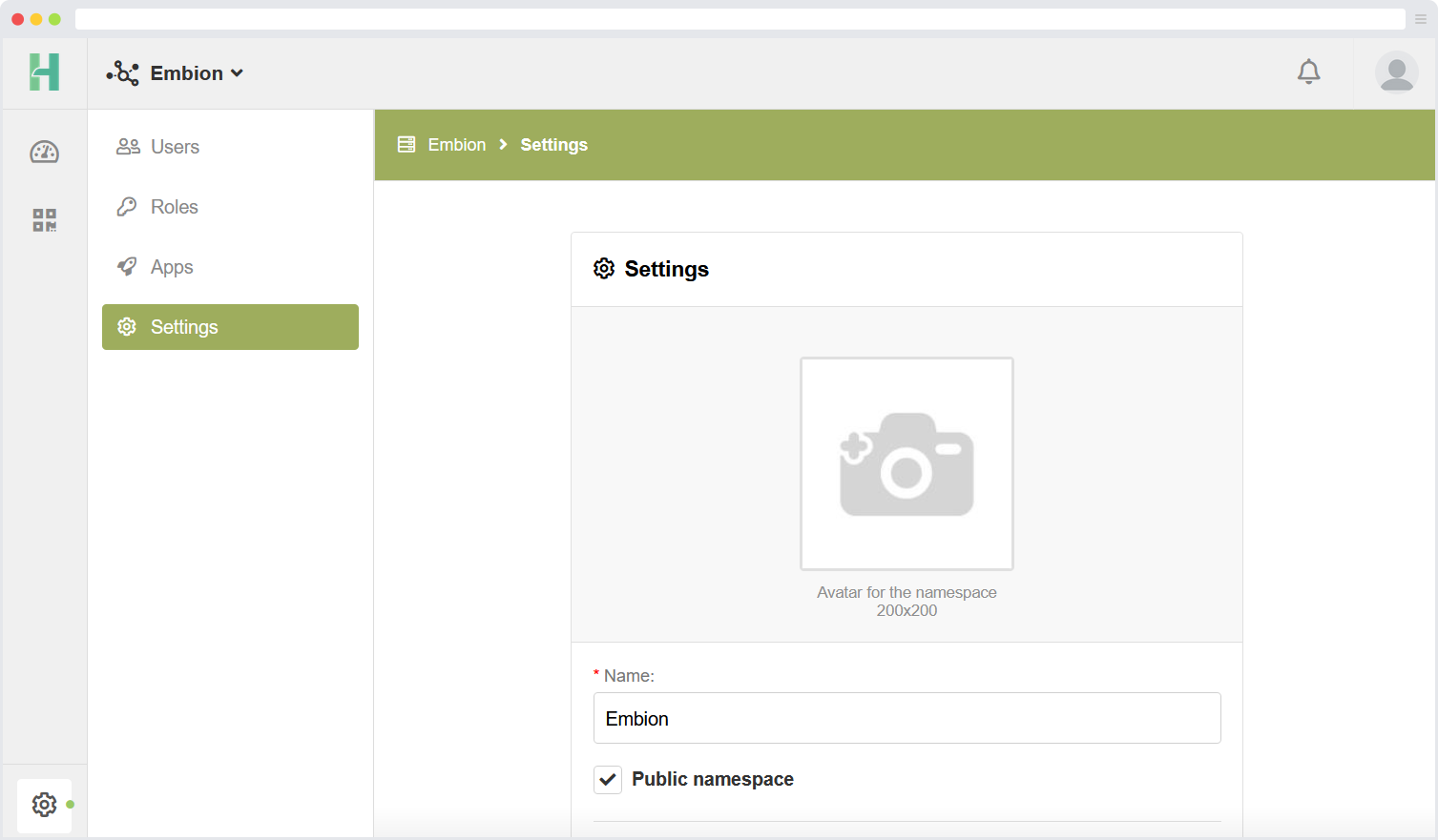
Settings
Namespace settings like name and image can be set here. By pressing the image a new avatar can be uploaded. The recommended size of the avator is 200x200 pixels.
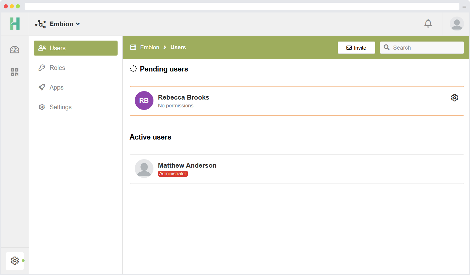
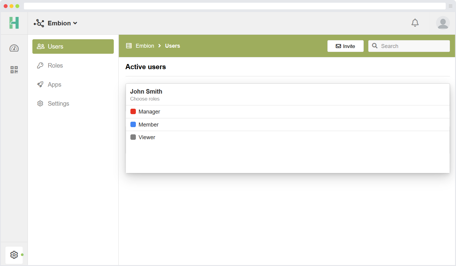
Namespace users
The Users page shows all active and pending users within the namespace. By pressing on the username the user roles can be applied. By pressing the settings icon the user can be made admin or can be removed.
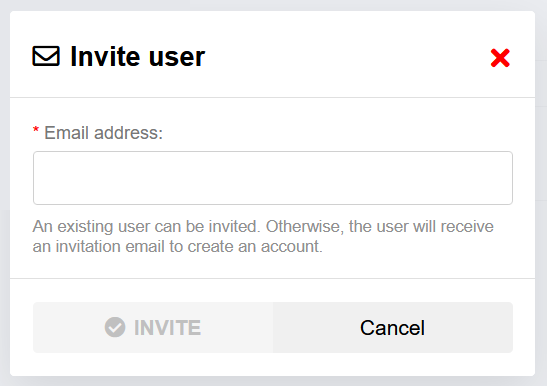
Invite user
New users can be invited by pressing “Invite” in the top right corner. A pop-up will appear asking the users email adres.
Assign user role
By pressing on active or pending users, one or more roles can be applied to the selected user.
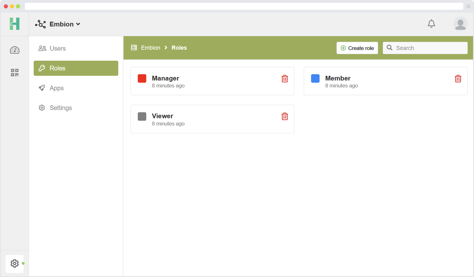
Namespace roles
In each namespace, custom roles can be assigned to users. By default, certain roles are available, but they can be modified as per the requirements. If needed, new custom roles can be created.
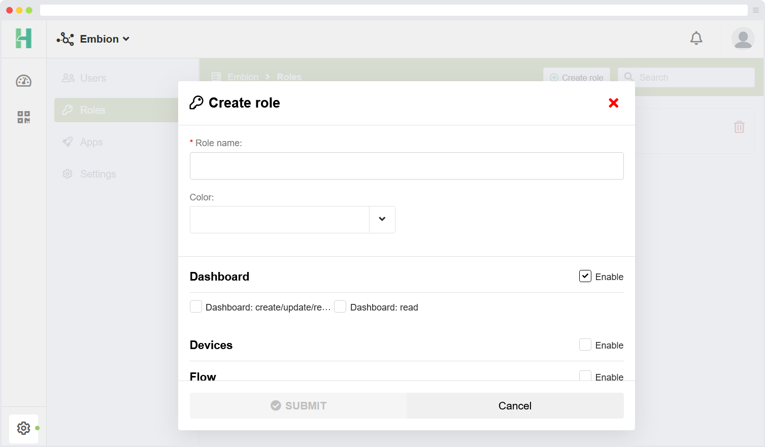
Make new roles
New custom roles can be created by following these steps:
- Click on the “Create role” button located in the top right corner of the interface.
- This action will initiate the role creation process.
- Provide a name and define the specific permissions and access levels associated with the new role.
- Save the created role to add it to the list of available roles within the namespace.
By utilizing the “Create role” functionality, you can tailor the roles within the namespace to suit your specific needs. This allows for fine-grained control over user permissions and ensures that each user has the appropriate access and privileges based on their assigned role.
Devices
The devices application can be accessed by selecting the devices icon located in the left side menu or by clicking the button on the homepage.
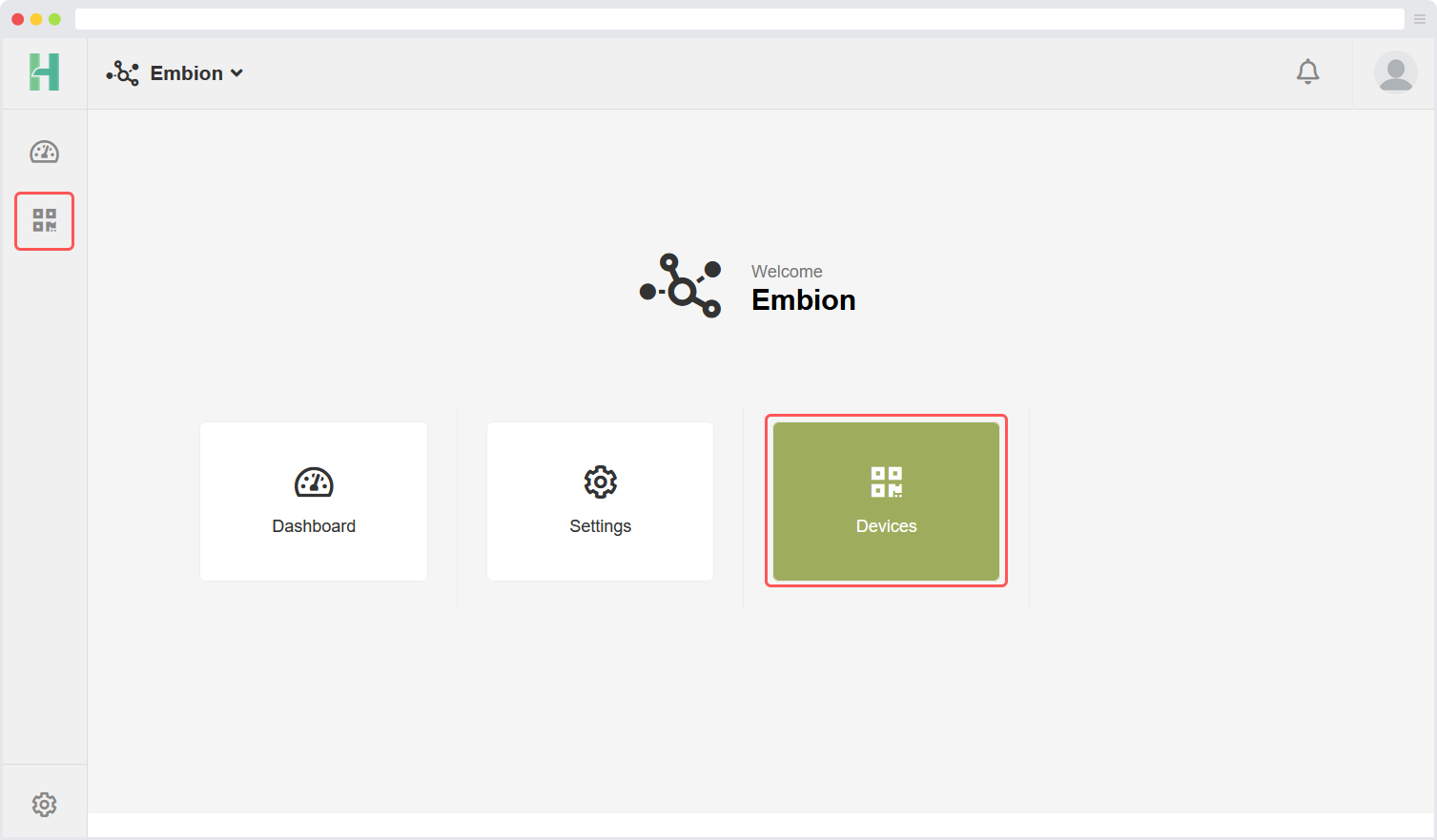
On this page, users can register devices within their namespace. The devices application offers several features that allow users to remotely access their devices:
Device Status: This feature displays the current status of devices within the namespace, providing users with real-time information.
Access Token: Users can obtain an access token to make requests and retrieve data from the API, ensuring secure and authenticated access.
Device Settings: This functionality allows users to remotely modify settings on their devices and apply the changes accordingly.
Support Mode: By enabling support mode, users can grant access to manufacturer support employees. This enables the support team to reach and assist with the device as needed.
These features provide users with convenient and efficient ways to manage and interact with their devices from a remote location.
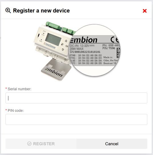
Register new device
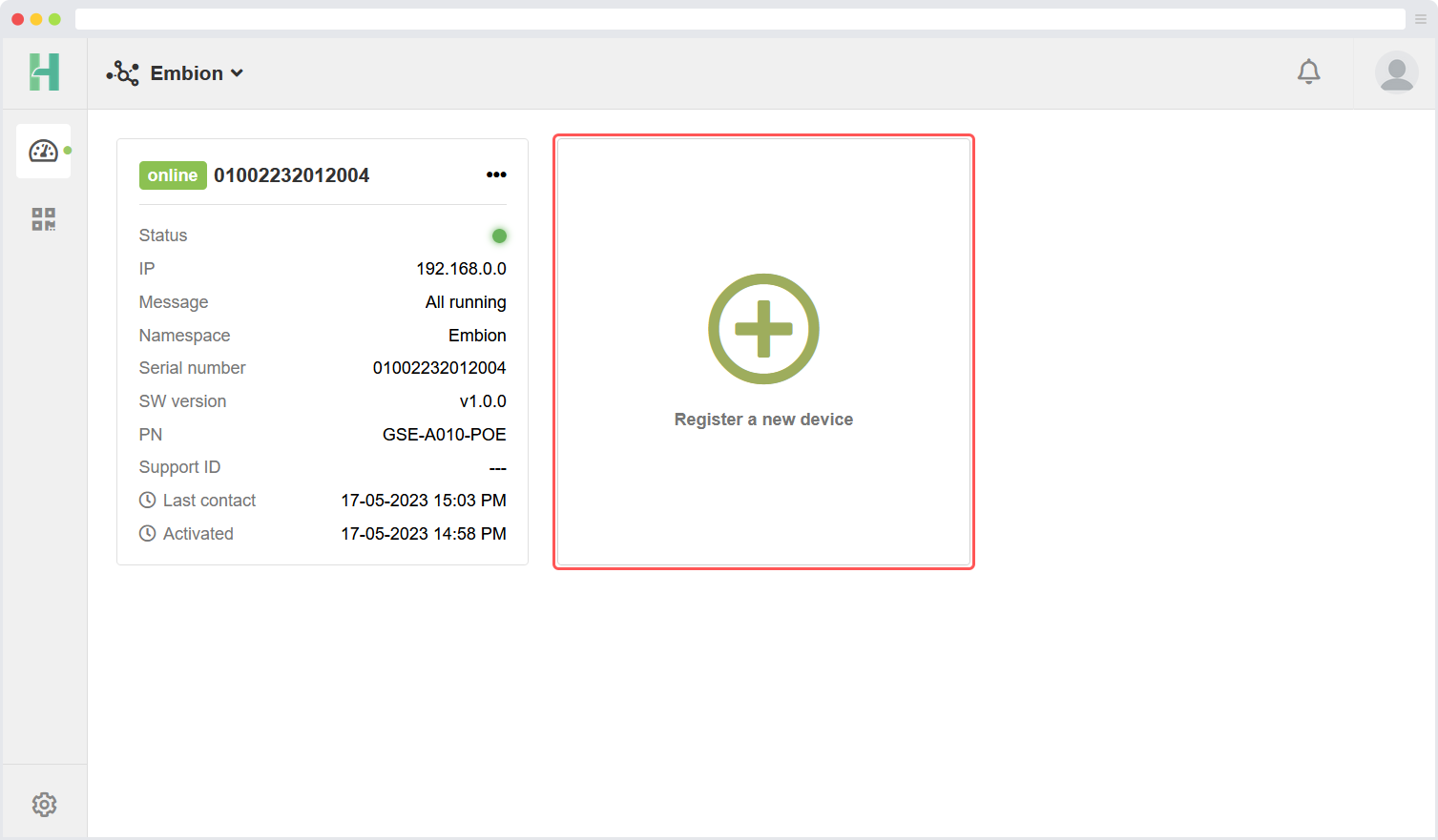
When registering a new device, users are required to input the serial number and pin code of the device to be registered. Both of these can be found on the label located at the right side of the device or read out via the device menu. Users should refer to the label or device menu in order to retrieve the necessary information for a successful registration.
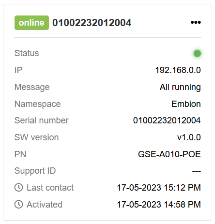
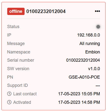
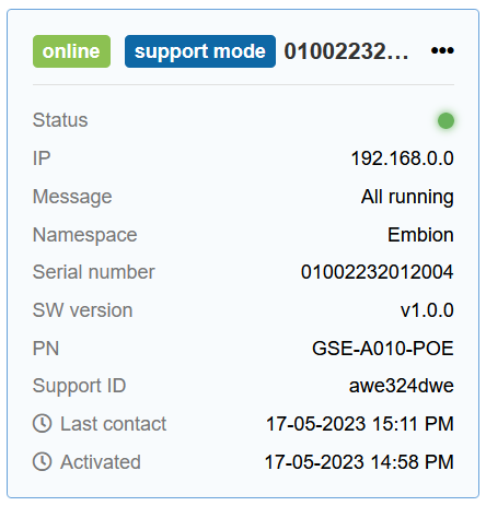
Device Status
The device status feature allows users to quickly view an overview of all their devices and their respective statuses. A device can have one of the following statuses:
Online: The device is powered on and reachable over the internet.
Offline: The device is powered off and/or not reachable over the internet.
Support Mode: The device is online, reachable over the internet, and support mode is enabled by the user. This allows the manufacturer support team to remotely access the device to provide support.
Device options
There are several device options accessible by opening the option menu located at the right corner of a listed device.
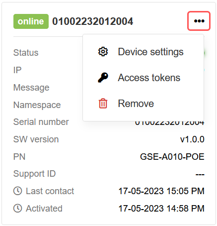
The following options are available:
Device settings: Users can modify device settings and apply them remotely. This allows for convenient management of the device’s configuration.
Access token: Users have the ability to obtain an access token. This token enables them to make requests and retrieve data from the API securely and with authentication.
Delete device: This option removes the device from the list of devices within the current namespace. It is important to note that deleted devices can be added again at a later time if needed (serial number and pin code are required).
These options provide users with flexibility and control over the management of their devices registered within the namespace.
Access tokens
Multiple access tokens can be created for each device, granting access to the public API. These tokens enable interaction with the public API and remotly read or control the plant connected to the device. By default, a total of 250 API calls per day are permitted for each device, and these calls can be distributed among the multiple tokens associated with the device.
When generating an access token, you have the option to specify a maximum number of requests allowed for that particular token. This feature allows you to set a limit on the number of API requests that can be made using the token. If you prefer the token to have no request limit (always limited to the maximum of 250 calls per device), you can leave the maximum requests value as 0.
Managing access tokens and their corresponding request limits gives you the flexibility to control API usage and optimize resource allocation for each device effectively.
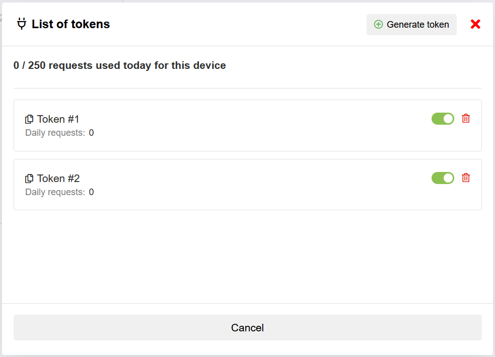
The list of tokens shows all the currently availible access tokens, and allows the user to create a new one by pressing the “Generate token” button. Per token the expiration date can be selected, and the uid’s (meters and inverter) to which te token has read access can be selected.
Additional licenses are available to increase the maximum number of API requests per day per device beyond the default limit. For more information about licensing options and pricing, please contact sales. They will assist you in selecting the suitable license to meet your specific needs.
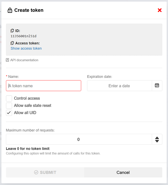
Add tokens
To add a new access token, users are required to provide the following inputs:
Token name: Users should enter a descriptive name for the access token to easily identify its purpose or the associated device.
Expire date: (Optional): Users can specify the expiration date for the access token. Once the expiration date is reached, the token will no longer be valid.
Enable control access (Optional): Users have the option to enable control access for the token.
Safe state reset (Optional): Users should indicate whether the access token should allow or disallow a safe state reset.
UID access: Users can select specific UIDs (like meters and inverters) which can be accessed by the token.
Request limit: Users have the ability to set a limit on the number of requests that can be made using the access token. By specifying a numerical value, users can control the maximum number of requests. Setting the limit to 0 will remove the limit. Keep in mind that by default the total number of request per device is 250 requests per day.
By providing these necessary inputs, users can successfully add a new access token with custom settings and access permissions for their devices.
Device settings
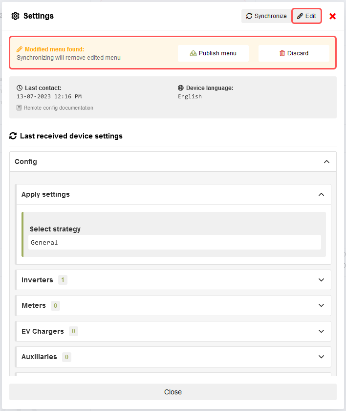
The remote settings modification functionality empowers users to make changes to the settings of their devices and apply/publish those changes remotely. This feature can be enabled or disabled on the device itself. If the menu is not visible, it indicates that synchronization with the device is required in order to begin modifying the settings. The “Last contact” information displays the date and time of the most recent synchronization with the device.
Incorrect ETH settings can cause the device to become unreachable
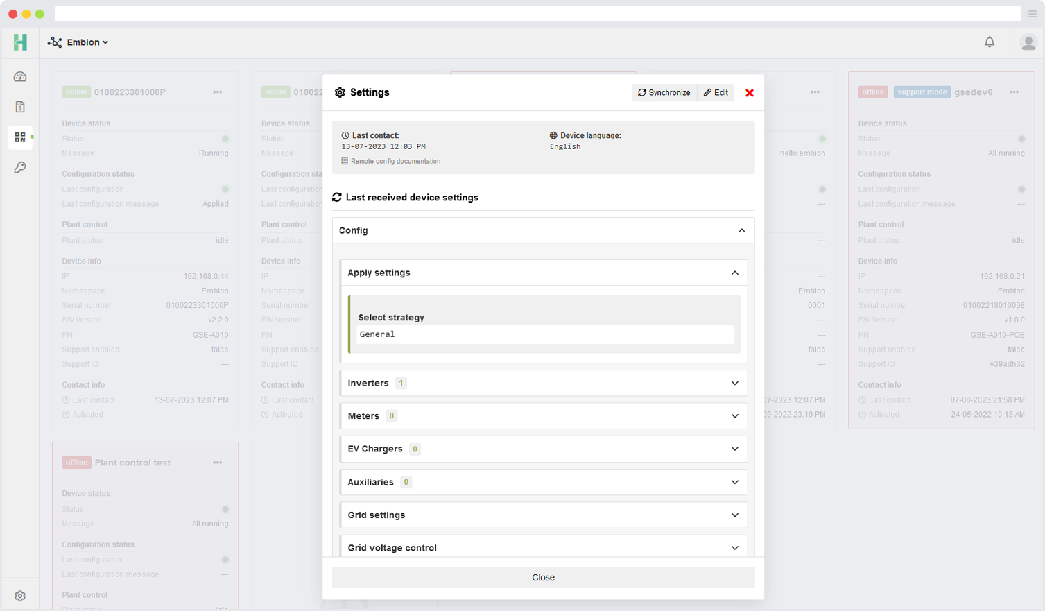
The displayed device settings are shown in the same language as the language settings on the device.
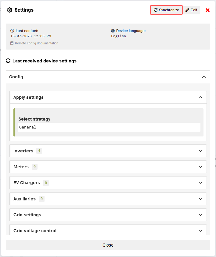
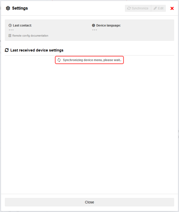
Synchronize device
The synchronization feature allows users to request and retrieve the live settings from the device, listing them for review and modification. If a modified menu is already present on the device, a message will be displayed to notify the user.
Performing a synchronization will remove any previously edited menu, if one is present.
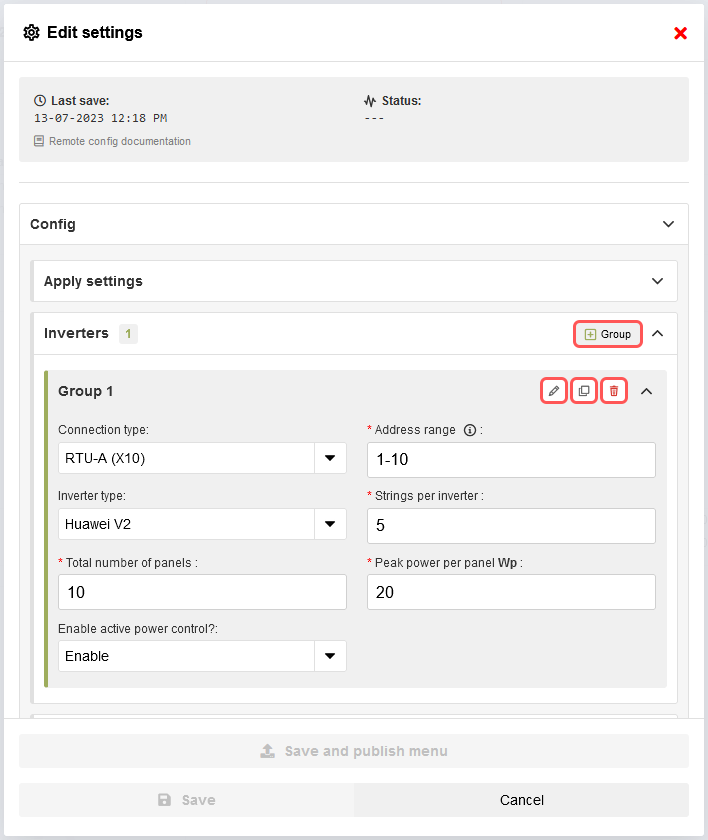
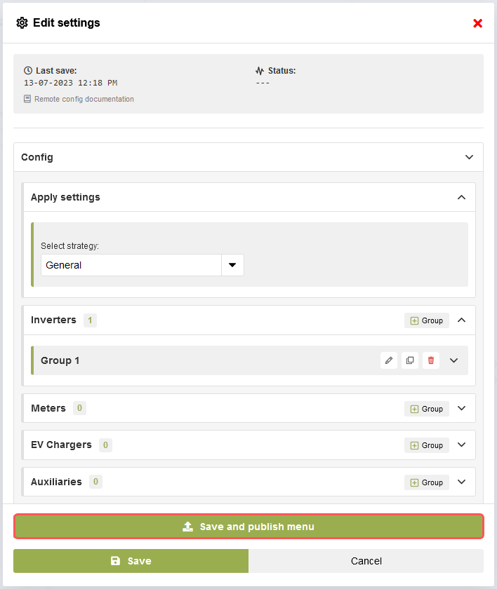
Edit device settings
Once a device is synchronized, users can proceed to edit its settings by clicking the “Edit” button. This action will open a new form that includes all the necessary inputs for modifying the settings.
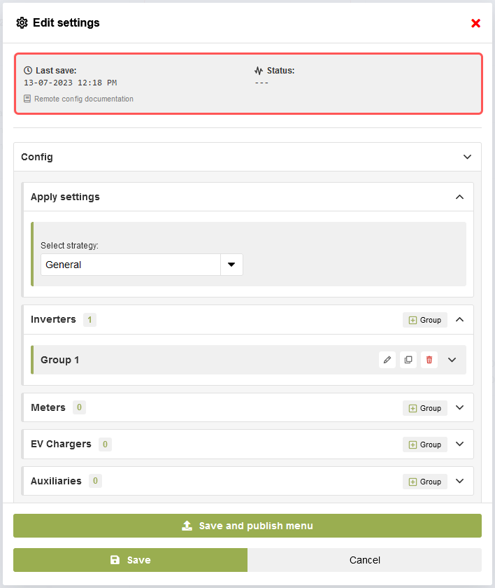
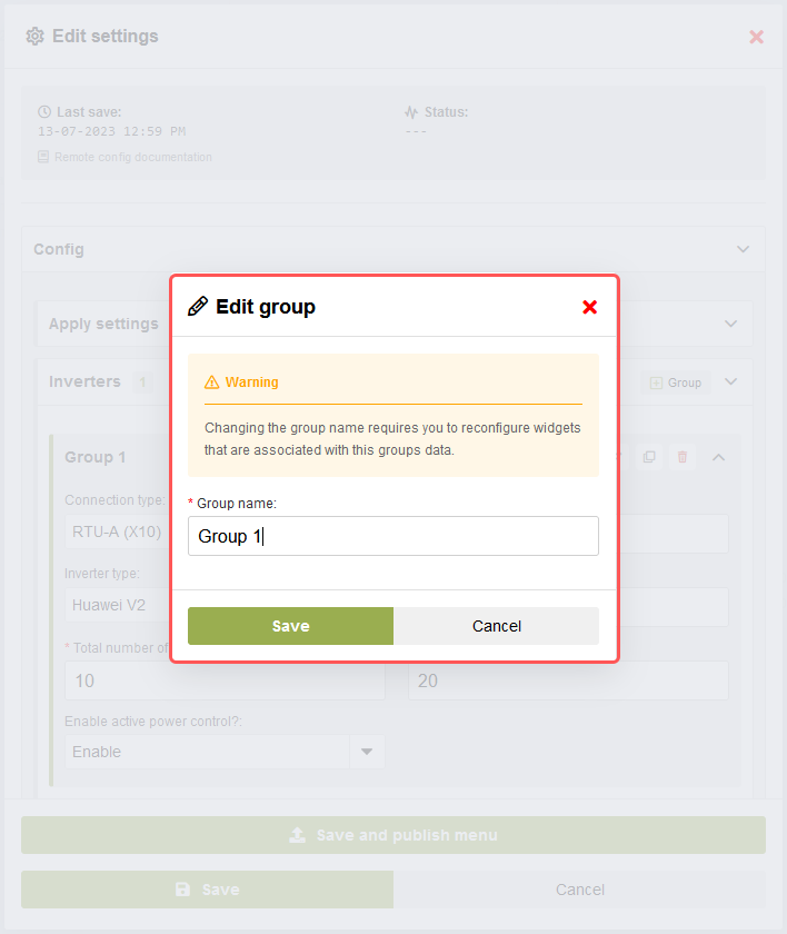
Group settings
Users have the option to add a new empty group by pressing the “+ Group” button or make modifications to existing groups. Additionally, the clone button simplifies the process of duplicating groups when only minimal changes are required for creating a new group.
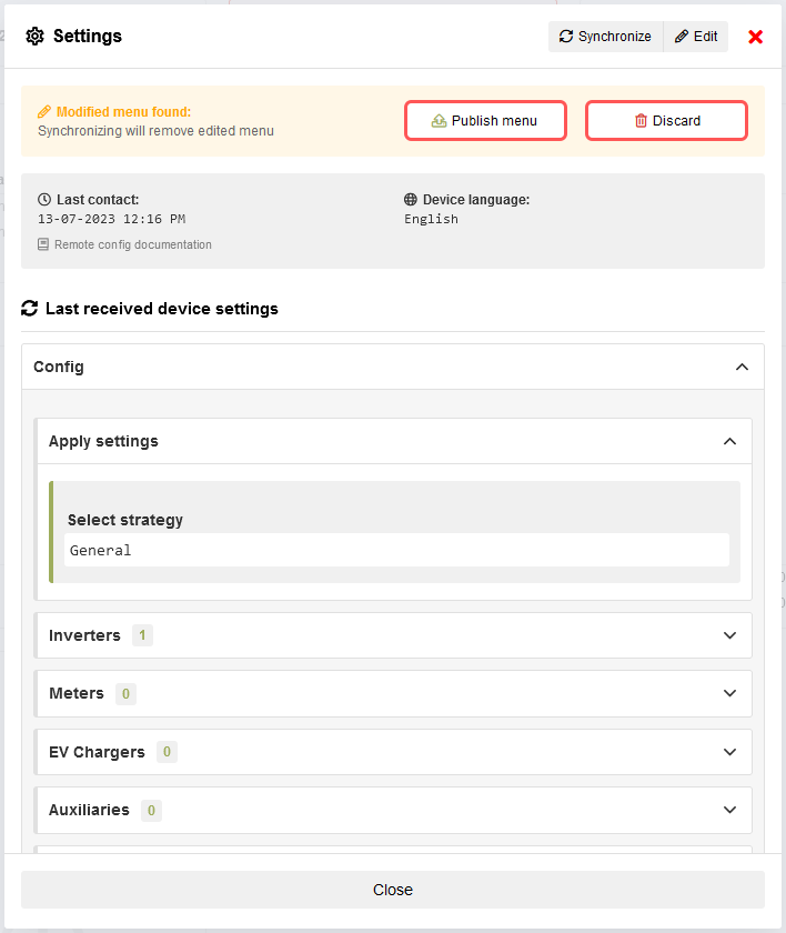
Discard or publish settings
After modifying and saving the menu settings, two buttons, “Discard” and “Publish,” will appear at the top of the form. Here are the actions associated with each button:
Discard: Clicking the “Discard” button will remove the modified menu and revert the form back to the settings that were originally requested during the last synchronization with the device. This action allows users to discard any changes made and restore the previous settings.
Publish: Clicking the “Publish” button will publish the modified settings to the device. The changes will be automatically applied to the device if the automatic application option is selected. Alternatively, users can manually apply the changes on the device. The “Publish” action ensures that the modified settings take effect on the device.
These buttons provide users with flexibility and control over managing the modifications made to the menu settings. Users can either discard the changes or publish them to the device based on their preferences and requirements.
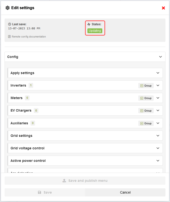
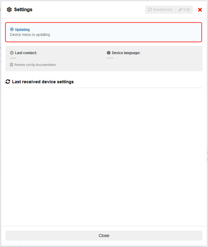
Settings published
When the modified settings are published to the device, the status section will provide users with information regarding the publishing process. It will indicate the progress of publishing and display any relevant messages or notifications. In case an error occurs during the publishing process, an error message will be shown, indicating that something went wrong and providing further details.
Additionally, after publishing the settings, the synchronize button will be disabled until the published settings are either applied or canceled on the device. This ensures that the device and the remote settings are in sync before allowing further synchronization actions.
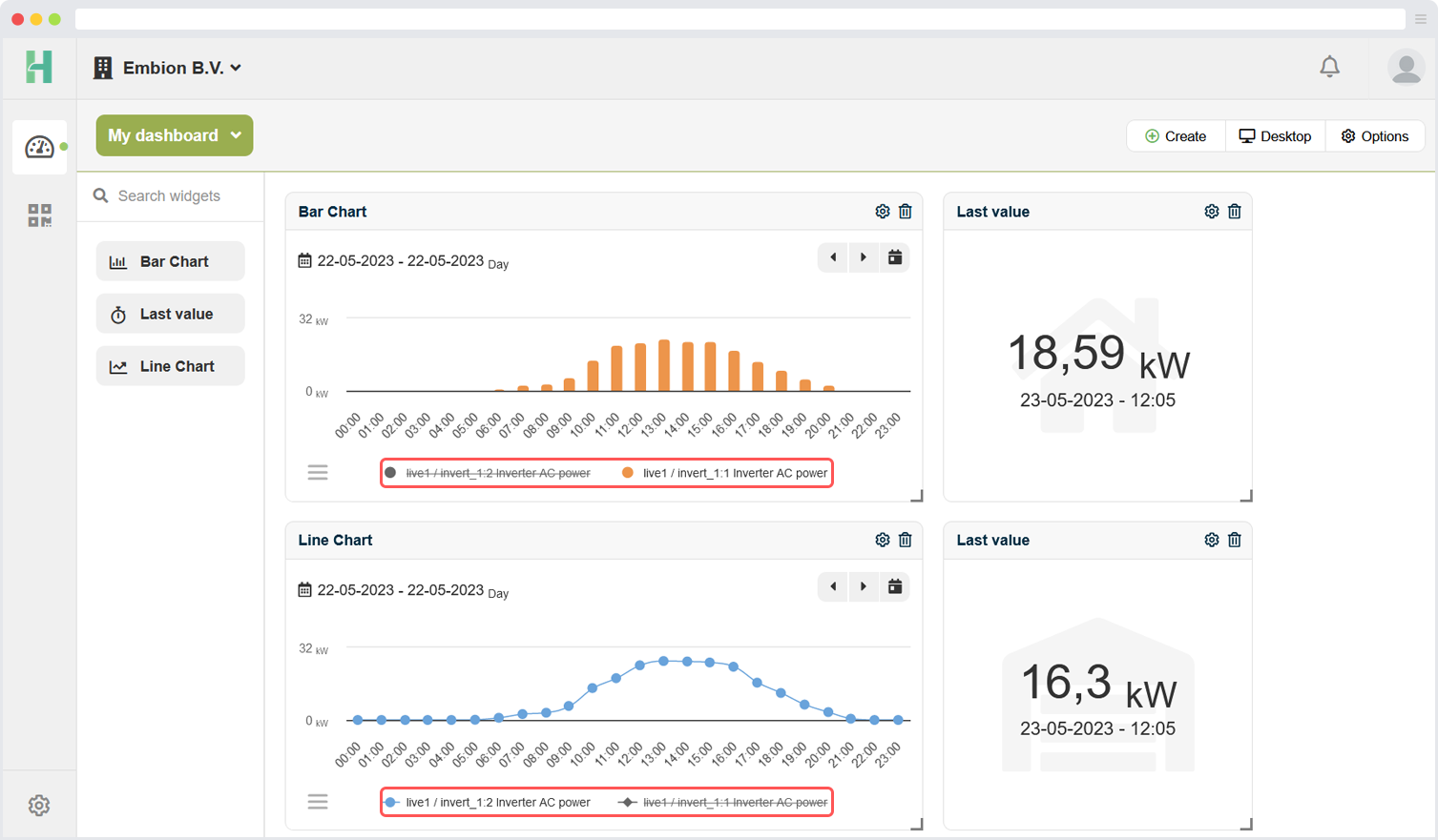
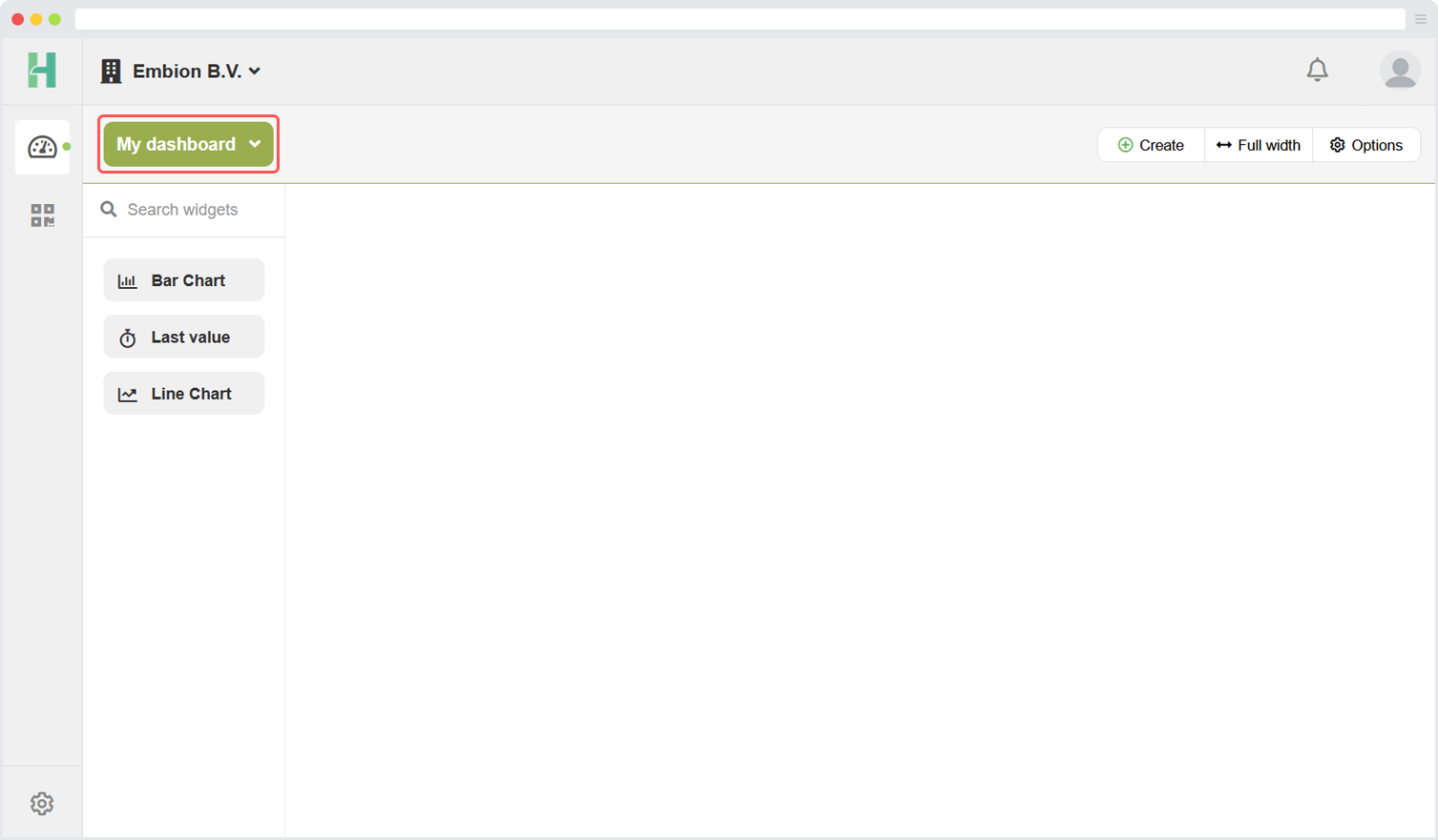
Dashboards
Dashboards can be reached by clicking the dashboard symbol on the left side menu or on the buttons on the homepage.
In this application multiple custom dashboards can be made to display an overwiew of the plant data. Several widgets are available and they can be configured with several options.
By default, there is a dashboard called ‘My dashboard’ that gets added when a namespace is created or the last dashboard from a namespace is deleted.
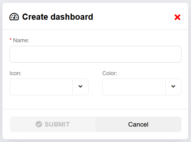
Add dashboard
By clicking the “Create” button, users have the ability to add a new dashboard to their interface.
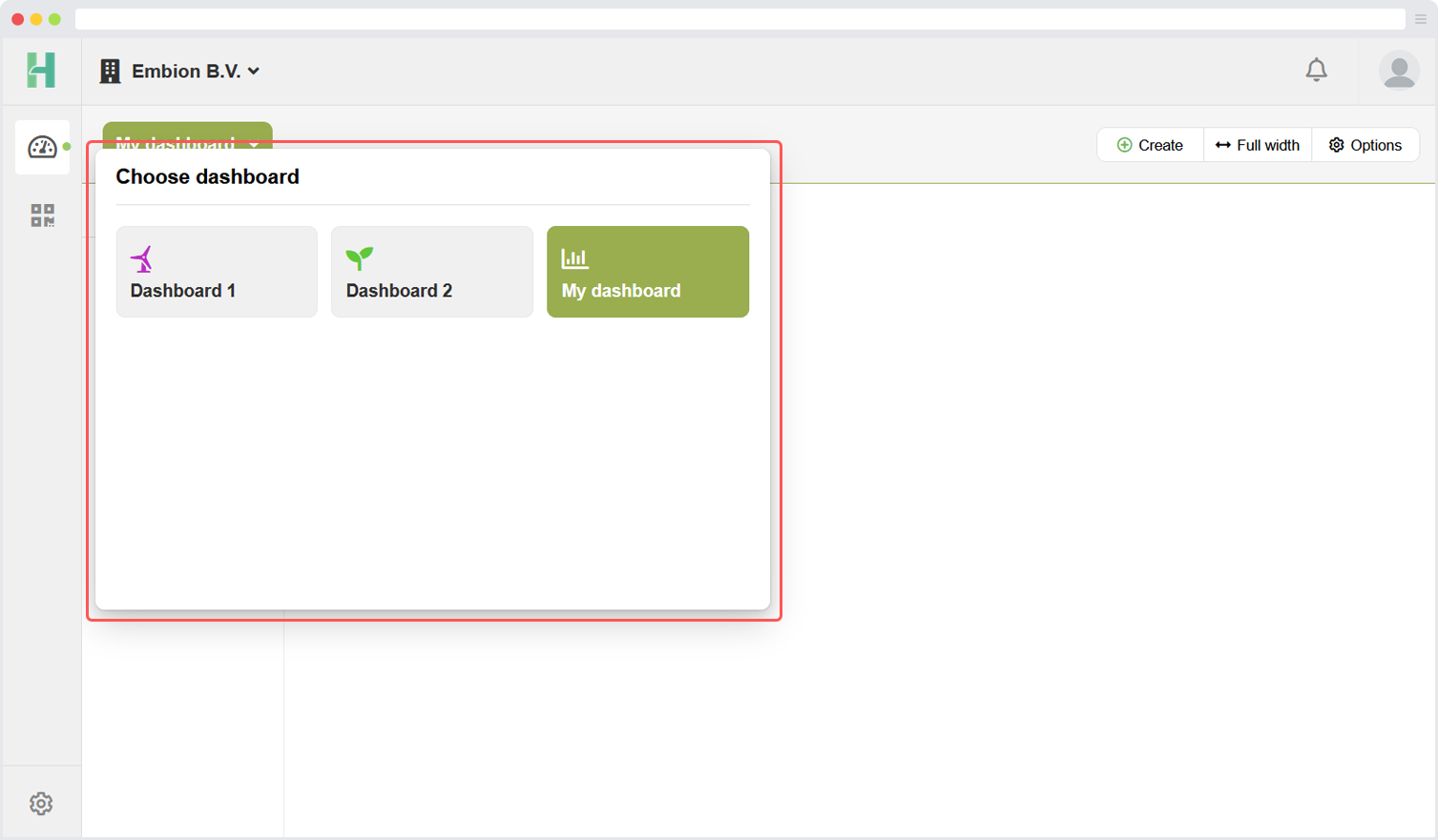
Select dashboard
By clicking on the button that displays the current dashboard name, users can access a list of all available dashboards. This action will open a menu or view where users can see a list of the available dashboards. From this list, users can select a different dashboard by choosing the desired option. This feature allows users to easily switch between different dashboards and navigate to the one they want to view or interact with.
Dashboard options
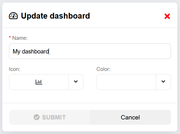
By clicking the “Options” button on the dashboard, users can access a menu or set of actions specifically related to the currently active dashboard. Within this menu, users have the option to update or delete the active dashboard. The “Update” option enables users to modify and make changes to the existing dashboard.
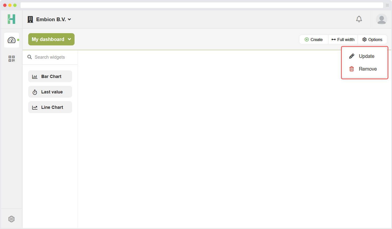
Update dashboard
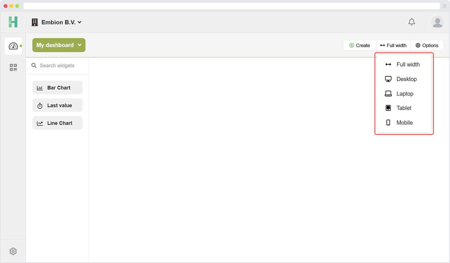
Dashboard screen width
The platform offers the flexibility to customize the appearance of dashboards across various devices by adapting to different screen widths. Users have the option to tailor the dashboard’s layout specifically for five distinct screen sizes: full width, desktop, laptop, tablet, and mobile.
Regardless of the device being used, users can effortlessly add widgets to their dashboards and resize them according to their preferences on different screen views. This allows for a personalized and optimized viewing experience, ensuring that the dashboard’s content and layout are displayed effectively on each specific device.
With the ability to adapt and customize dashboards based on screen sizes, users can create a consistent and user-friendly interface across various devices, enhancing accessibility and usability for their intended audience.
Dashboard widgets
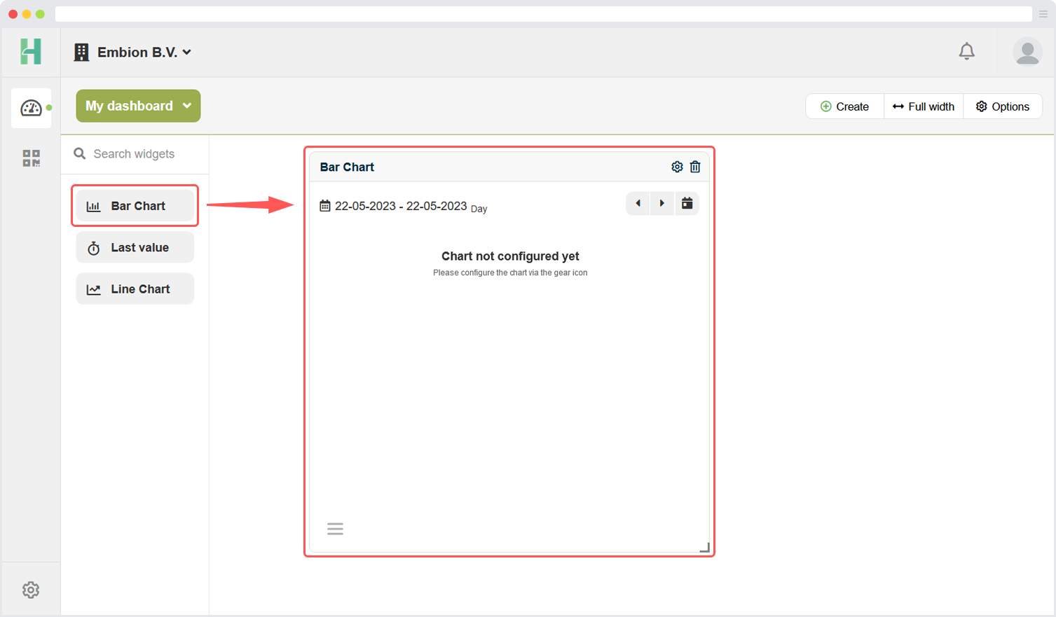
The dashboard application provides a variety of widgets that users can utilize to enhance their dashboards and visualize data effectively. Currently, there are three types of widgets available:
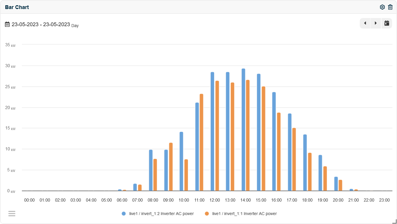
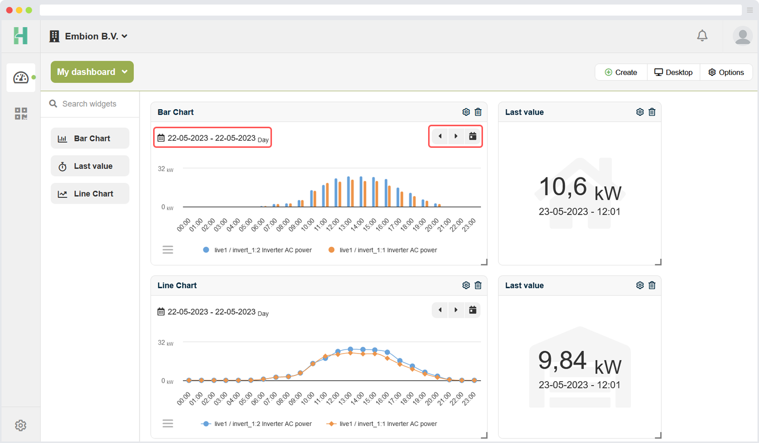
Bar chart
The bar chart widget allows users to present data using vertical or horizontal bars, making it easy to compare different categories or values visually. This widget is ideal for displaying categorical or discrete data and showcasing comparisons or distributions.
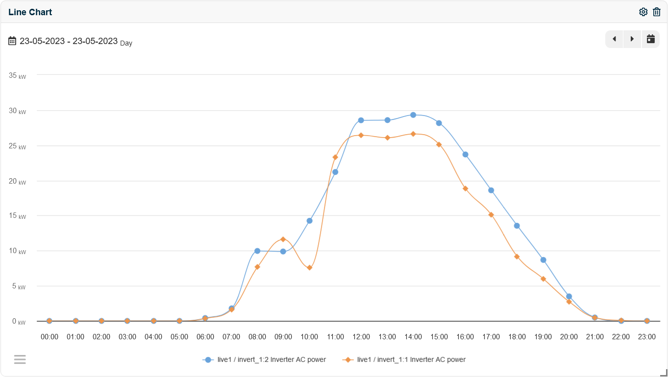
Line chart
This line chart widget enables users to create interactive line charts that display trends, patterns, and variations over time. It is a powerful tool for visualizing data with continuous variables and analyzing data trends.
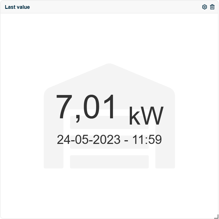
Last value
The last value widget provides a quick and concise representation of the most recent value or data point.
Add widget
Users can add widgets to their dashboard by utilizing a simple drag-and-drop functionality from the widget list. Once a widget is dragged and dropped onto the dashboard, it will appear ready to be configured according to the user’s requirements.
Arrage widgets
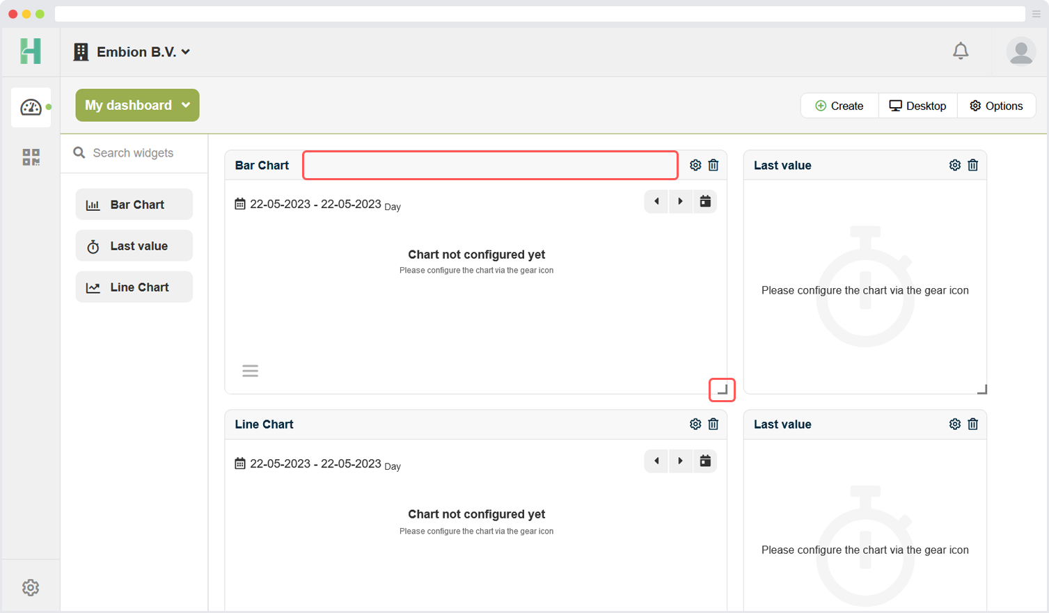
Users have the ability to arrange multiple widgets on the dashboard according to their preferences. This can be done by dragging the widgets using the top bar of the header and repositioning them within the dashboard. By simply clicking and holding the top bar of a widget, users can move it to a new location on the dashboard.
In addition to rearranging the widgets, users can also resize them to fit their desired dimensions. This can be achieved by selecting a widget and dragging the corner of the widget to adjust its size. By dragging the corner handle, users can increase or decrease the width and height of the widget, allowing for precise customization and optimal use of available space.
Configure widgets
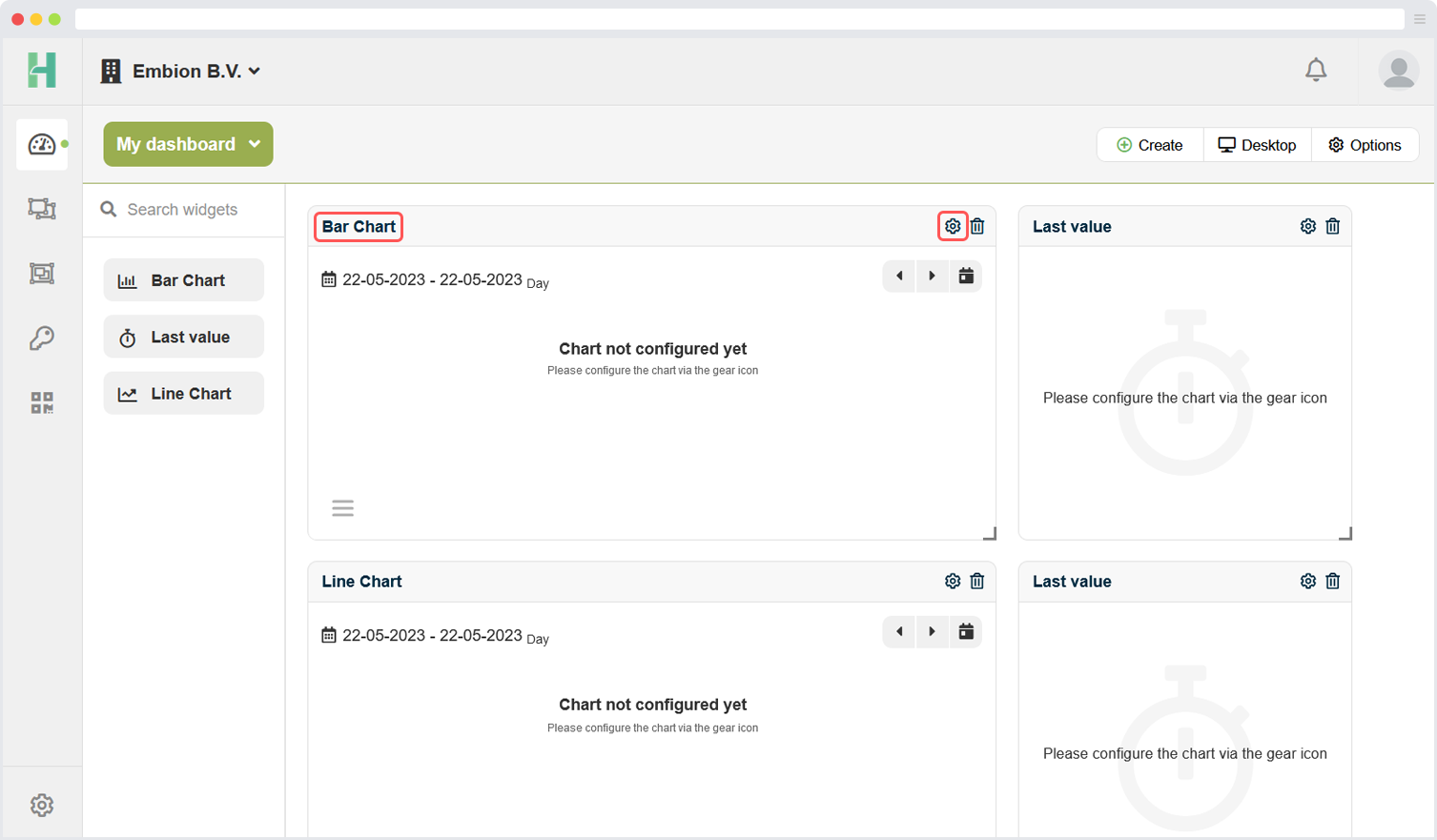
Users can easily configure their widgets by accessing the settings options available within each widget. To access the settings, users simply need to click on the settings icon located within the widget itself. By clicking on this icon, users can access a panel where they can adjust various settings specific to that particular widget.
Additionally, users have the ability to change the name of a widget by directly clicking on its existing name. Clicking on the widget name activates an editing mode, allowing users to modify the name as desired. This feature enables users to provide descriptive and meaningful names to their widgets, making it easier to identify and understand the purpose or content of each widget within the dashboard.
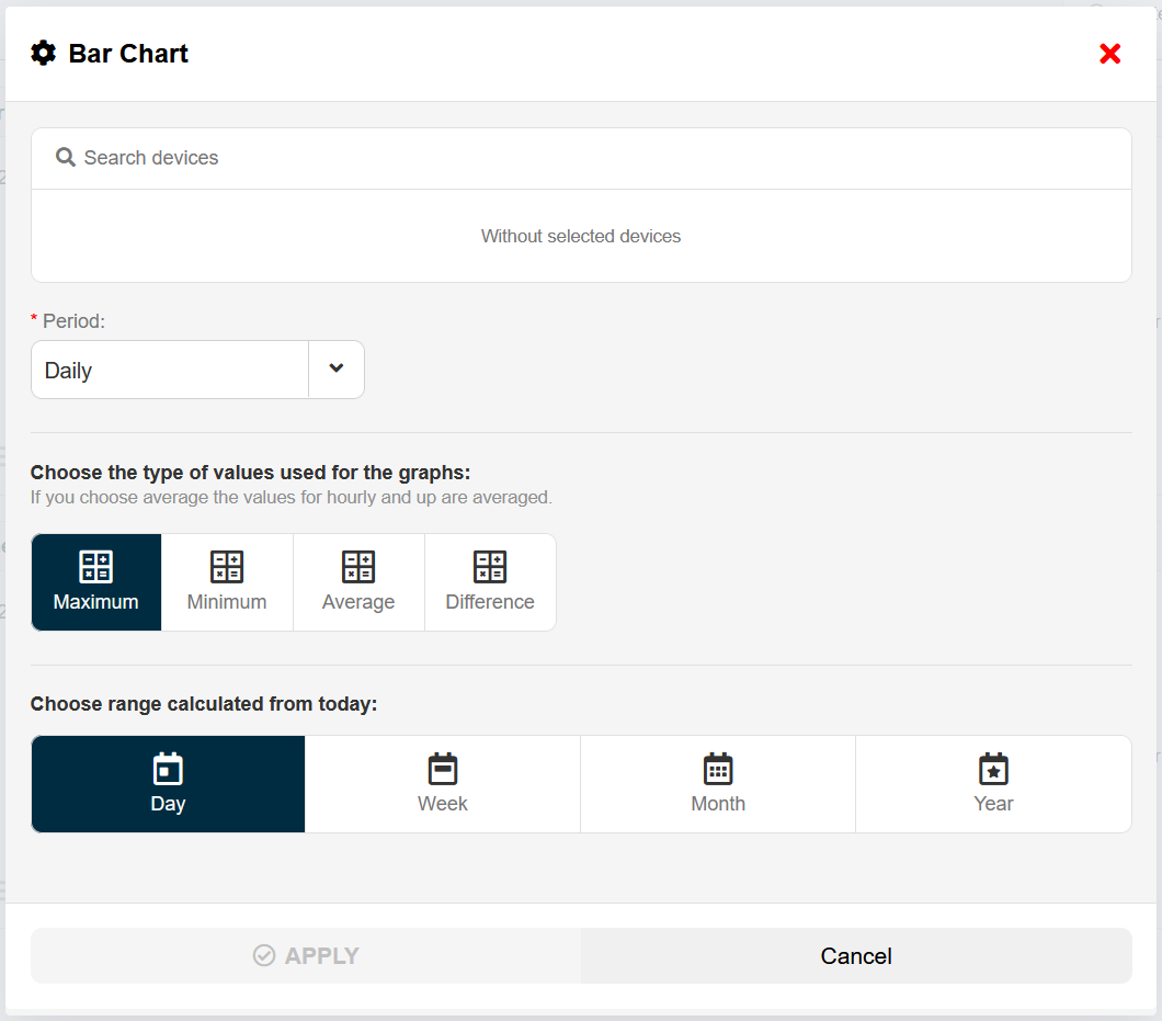
Configure form example
Devices
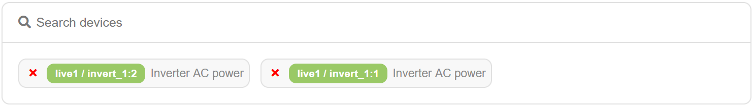
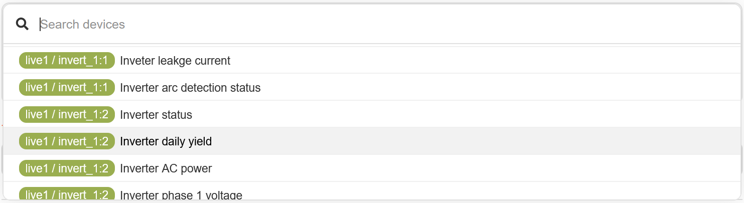
To select the data of a specific device for display in a graph, users have the option to choose up to four data lines to represent different variables or metrics. Users can search in all the possible devices and variables to access them easy.
The UIDs are arranged as follows: [device name] / [group identifier]_[group name]:[device address]:[string id] Where the string id is only applicable for solar inverter.
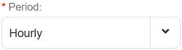
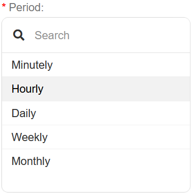
Period
Select a period or interval for the to be shown widget. Selecting Hourly will show one datapoint for each hour.
Value type
Select the value type that is needed to be shown in the widget.
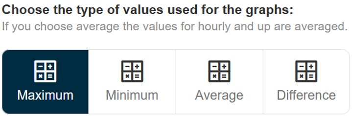
Maximum returns the maximum measured value in the selected period
Minimum returns the minimum measured value in the selected period
Average returns the average of all values in the selected period
Difference returns the difference between the first and last sample in the selected period
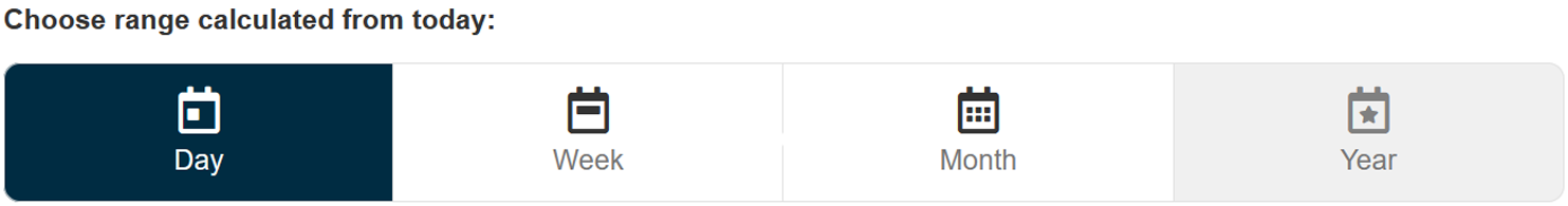
Range
Select the time range for the widget.
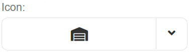
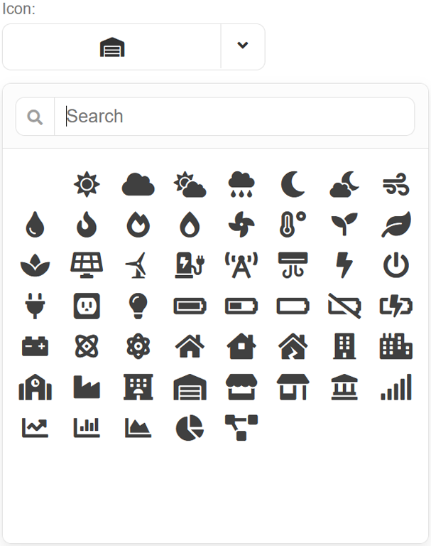
Icon
Select a icon for the widget
Navigate graphs
Users have the convenience of navigating through their graph widgets using the arrow buttons provided. These arrow buttons allow users to move forward or backward in time, enabling them to explore different time periods or intervals within the graph data.
In addition to the arrow buttons, there is an agenda button available. Clicking on the agenda button will automatically set the graph widget back to the current date, providing users with an easy way to quickly return to the most up-to-date data and view.
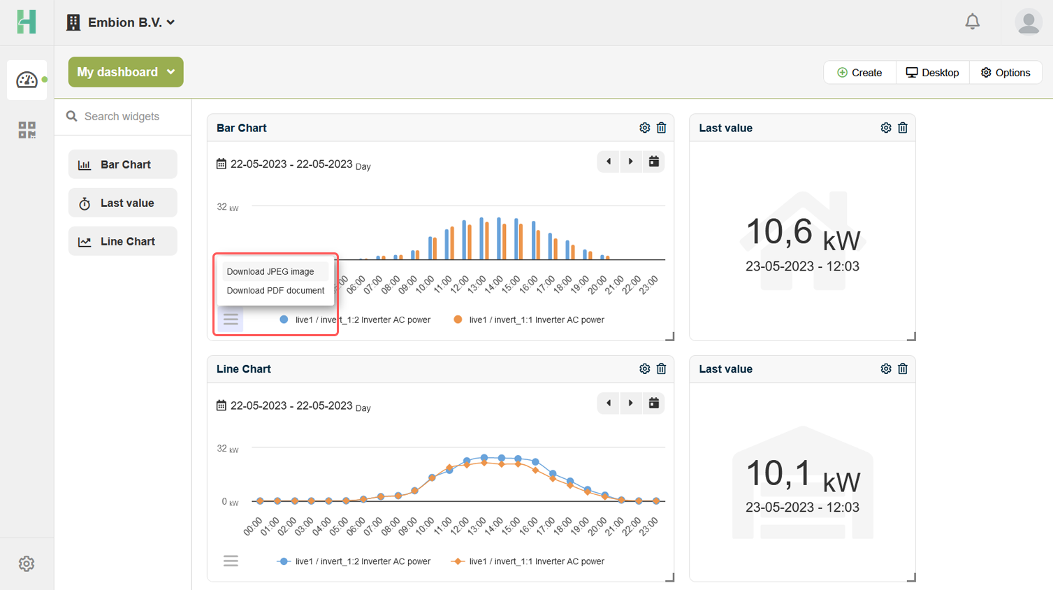
Export graphs
Users have the option to export graph widgets by utilizing the menu button located in the bottom left corner of the widget. Clicking on this menu button will open a set of options, including the ability to export the graph widget as a JPEG image or a PDF document.
Disable graphs
Users have the ability to disable one or multiple data lines in a graph by simply clicking on their corresponding names in the legend.